These designs range from small wrist crosses and floral details to full forearm forests requiring solid black coverage.
The choice comes down to how much open skin the design needs to read clearly and which part of the body keeps that skin visible.
Pain sits highest at the elbow, where thin skin and constant joint movement make placement the first decision.
1. Negative Space Skin Tattoo
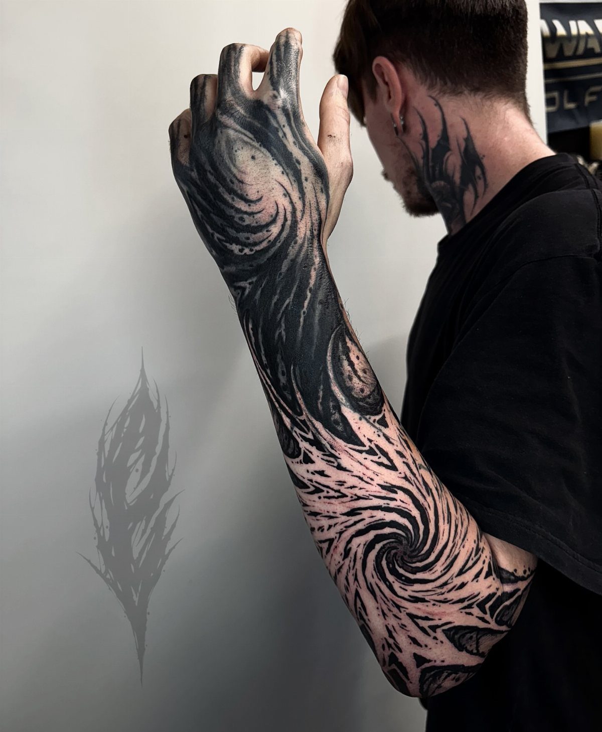
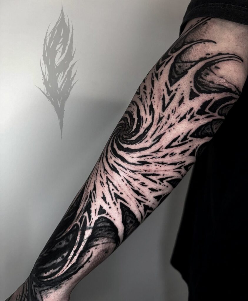
The contrast here is the point: black ink fills the background while your skin forms the actual image. That reversal makes a forearm piece read from across a room, and it stays bold even when the edges soften over time.
Swirling shapes like these suit large, visible placements best.
The design needs enough room for the negative space to register as a shape of its own, not just a gap. If you want something smaller, stick to simpler silhouettes; complex curves lose their definition when they shrink.
2. Floral Negative Space Tattoo
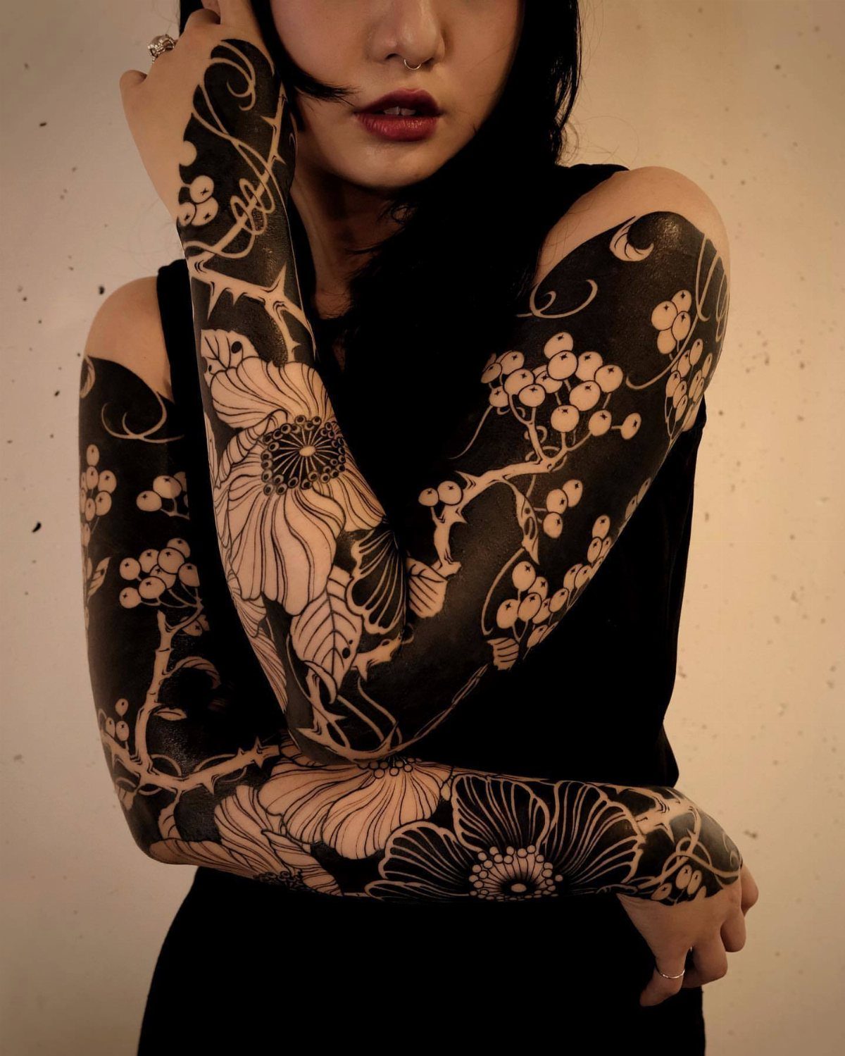
Flowers built this way flip the usual approach: petals and leaves show as bare skin, and the black ink sits around them.
That reversal gives you 2 images at once, depending on whether your eye goes to the flowers or the shapes between them.
Coverage like this takes multiple sessions. Each flower needs clean edges, and filling all that background ink without blowouts or patchiness means working slowly.
The black will age into your best feature here. Negative space reads cleanest when the surrounding ink stays dark and saturated.
3. Negative Space Lettering Tattoo
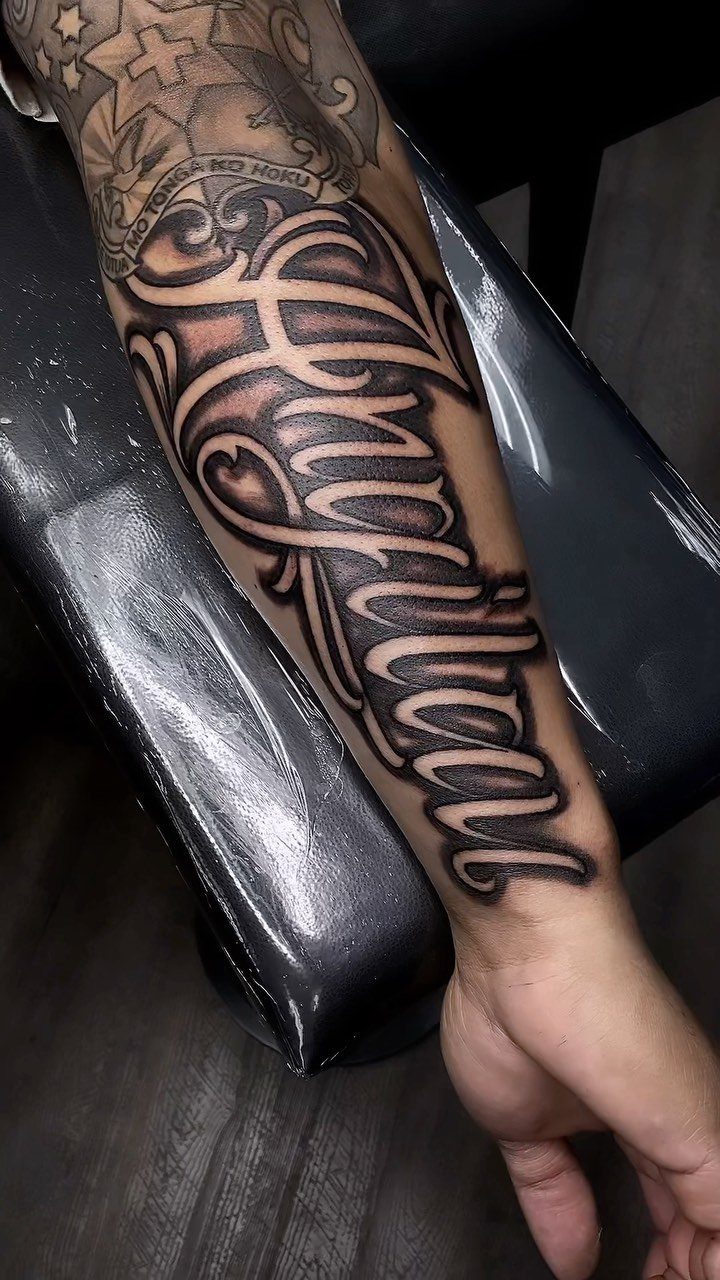
The letters themselves stay untouched, so the contrast is immediate and the words stay readable even from a distance.
Script like this needs a skilled hand.
If the shading isn’t perfectly consistent, the letters will look uneven or start to blur into the background. Look for an artist who posts close-up shots of healed work, not just fresh ink under studio lighting.
Placement matters more than usual. This style works best on flat surfaces where the text won’t warp when you move: forearms, ribs, or the outside of your calf.
4. Negative Space Cross Tattoo
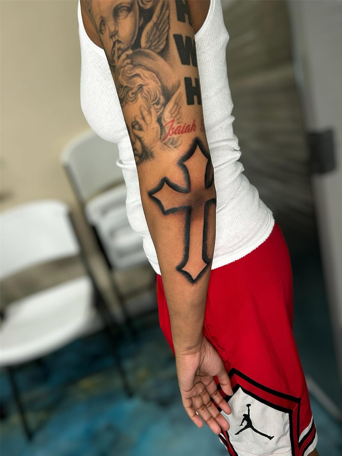
A cross formed by bare skin, outlined by solid black ink, gives you a religious symbol that doesn’t lock you into one exact look.
I like this approach for anyone adding to existing work.
The black background ties into other pieces without forcing everything to match styles. If you already have scattered tattoos on that arm, this can help unify them.
Size and placement are wide open. A small cross on your wrist reads just as clearly as a larger one spanning your forearm.
5. Negative Space Forest Tattoo
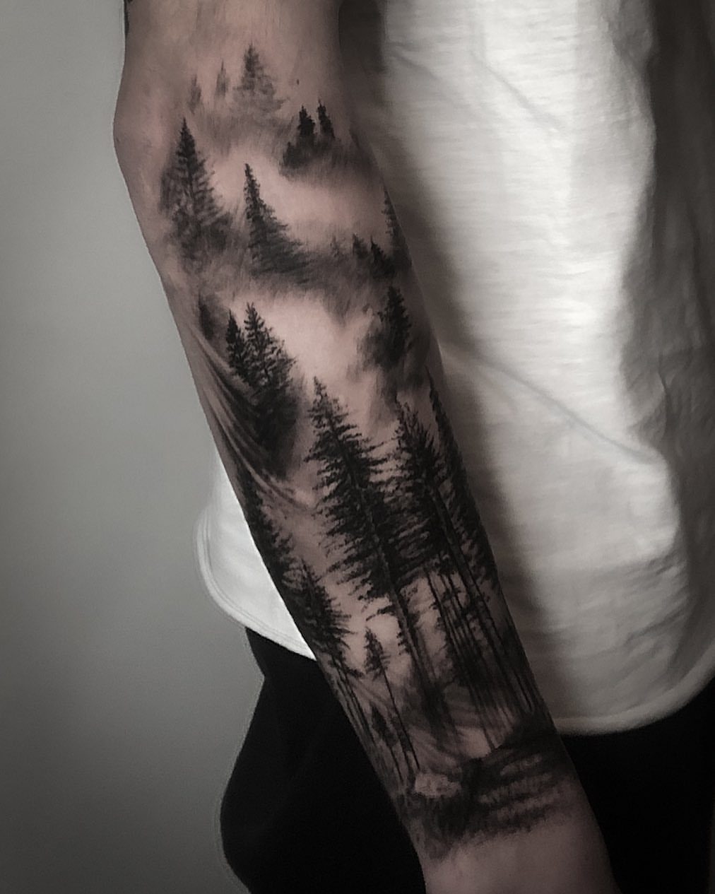
Mist and fog are what make this work.
The trees themselves are solid black, but the negative space between them creates depth, like looking into a forest where the background fades into haze. That layering effect is what separates this from a flat silhouette.
Pine trees suit the technique because their shapes are distinct even in shadow.
If you want a different tree, pick something with a recognizable outline: oaks, aspens, or dead timber all translate well. Avoid anything with too much fine detail in the canopy.
Forearms handle this size comfortably. If you want it larger, an upper arm or thigh gives you more vertical room for additional tree layers.
6. Cursive Negative Space Tattoo
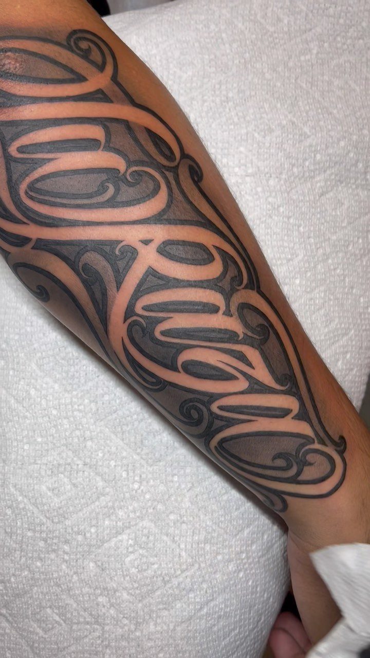
Cursive lettering here is carved out as bare skin, surrounded by dense black shading that makes the letters pop.
The style reads softer than block lettering but still holds up at a distance because the negative space keeps the words clear.
Pick a font with enough weight to it.
Thin, delicate script will look elegant fresh but can blur as the black ink spreads slightly over the years. I’d go with something that has thicker strokes and open loops.
Wrist, forearm, or collarbone all work. Just make sure the letters are large enough that the negative space doesn’t close up when your skin moves or stretches.
7. Negative Space Candle Tattoo
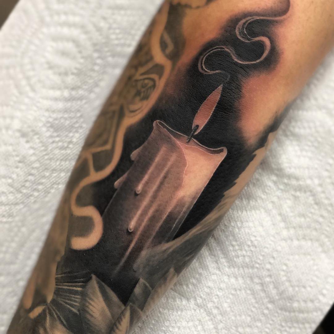
The negative space candle tattoo uses uninked skin to create the flicker and movement without needing color or shading inside the candle itself.
Candles carry weight: light in the dark, time running out, memory. The melting wax adds a memento mori angle if that suits what you’re marking.
This reads cleanly on an arm or forearm. The vertical shape fits that placement, and the negative space flame will stay distinct even as the black settles over time.
8. Negative Space Galaxy Tattoo
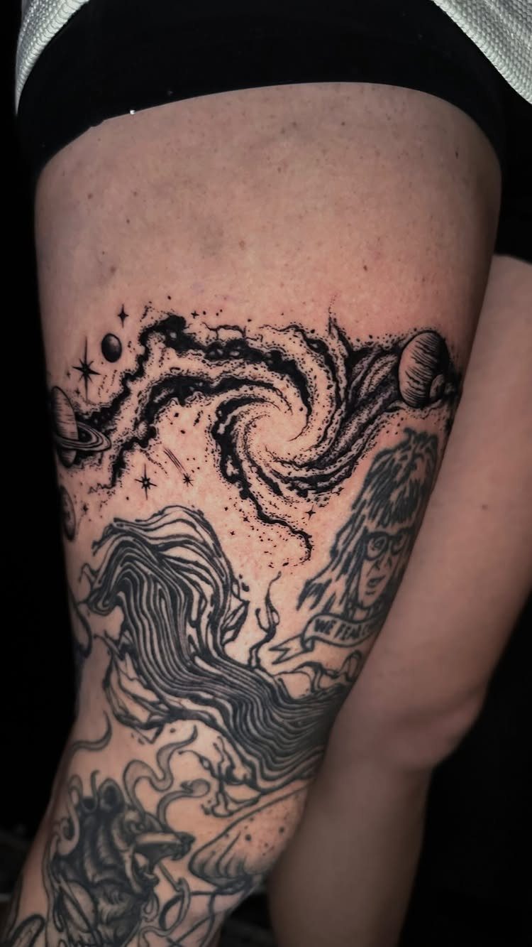
Swirling ink forms the dark matter, and the bare skin becomes stars, planets, or light breaking through. That reversal gives you depth without needing white ink, which fades faster than most people expect.
Celestial work like this suits a thigh or upper arm where you have room for the spiral to stretch.
If you compress it too much, the planets lose their shape and the negative space starts reading as random gaps instead of light.
Faces or banners can anchor the design if you want it tied to something personal, but the galaxy alone carries enough visual weight to stand on its own.
9. Negative Space Elbow Tattoo
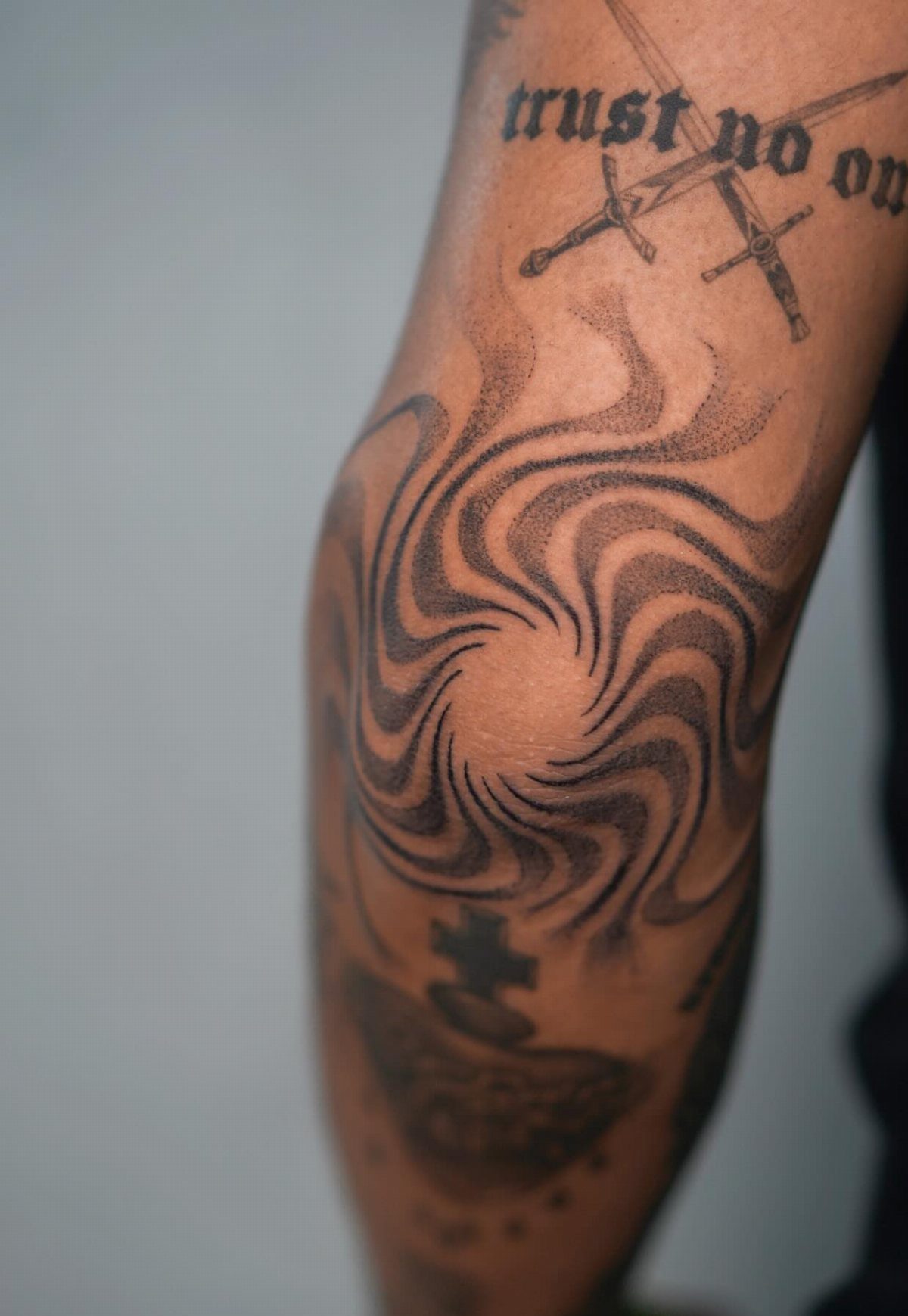
Spirals fit the elbow because the shape follows the joint. When you bend your arm, the design moves with you instead of distorting the way a straight image would.
Pain here is high.
The skin is thin, the bone sits right underneath, and there’s no cushion. If this is your first tattoo, start somewhere else.
Black ink on the elbow holds up better than fine detail.
The skin stretches constantly, so anything too delicate will blur. This spiral approach keeps it bold.
Planning for a Negative Space Tattoo
Your artist needs to see the design before you book. An experienced artist will tell you whether your idea works in this style or needs adjusting.
Not every design translates. Simple, bold shapes hold up better than intricate details.
If your concept has fine lines or complex shading, ask how it will look reversed. Some ideas need to stay traditional.
You want to see how the black settled and whether the skin-tone portions stayed clean. If the artist has never done this style, keep looking.
Plan for longer sessions. Solid black coverage takes time to do right, and rushing it leads to patchy fills that need touch-ups later.
Choosing the Right Placement
Your skin becomes part of the design, so anything that breaks up the bare area will show. Scars, moles, and uneven pigmentation all sit inside what should read as a clean shape.
If you have a scar on your forearm, move the tattoo or adjust the design so the scar sits in the black, not the negative space.
Hair growth matters more here than with traditional work.
A few hairs won’t ruin it, but if the placement grows thick body hair, the negative space will blur. Waxing or shaving helps, but if you don’t want to maintain that, pick a naturally smooth area.
Avoid placements that shift when you move.
The stomach, inner elbow, and back of the knee all distort the design when the skin folds. Flat, stable areas like the outer forearm, calf, or shoulder blade keep the image intact through movement.
Symbolism of Negative Space Tattoos
The reversal itself carries meaning: presence and absence at once, depending on where your eye lands. That duality makes these tattoos popular for anyone marking a contradiction, a balance, or 2 sides of the same thing.
Geometric shapes add their own layer.
Circles signal unity or something without an end. Triangles point to balance or a trio of forces.
Squares read as stability or grounding. If you’re building a design around one of those shapes, the symbolism stacks.
Negative space also codes as creative.
The technique is less common than solid ink, and pulling it off well takes a different kind of planning. If you want a tattoo that signals you thought it through, this approach does that without needing to be loud.