A spinal tattoo sits over bone for most of its length, so the pain runs sharper than rib or shoulder work, and placement near the neck or lower back hurts more than the mid-spine where a bit of muscle cushions the needle.
The design you choose depends on how much width you can work with: a single vertical line or dagger reads cleanly in the narrow space, while a phoenix or dragon needs the full span of your back to balance the composition.
Symmetry matters here because the spine is your body’s natural center line, and any design that pulls to one side will look unintentional.
1. Floral Tattoos
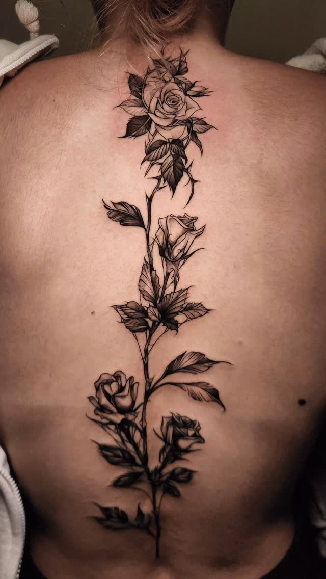
Roses and stems follow the natural line of the spine, and the vertical placement lets you run as many blooms as the design needs without fighting the shape of your back.
Black and grey shading reads cleanly here because the spine sits close to the surface, so fine detail holds.
The center line means symmetry matters. A skilled artist will mirror the leaves and petals so nothing pulls to one side, and that balance is what makes floral spine work look intentional rather than like filler that wandered.
2. Butterfly Tattoos
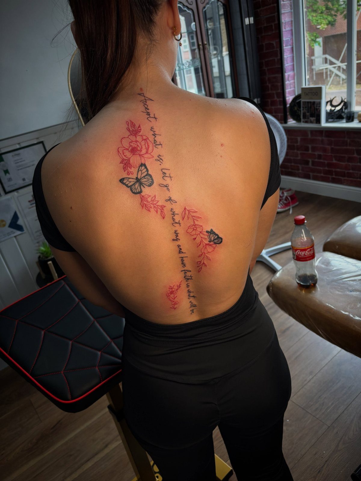
Butterflies land anywhere along the spine, and pairing them with flowers or script gives you a full composition that still reads as one piece.
Red ink shows up bold on most skin tones, though it can fade faster than black if you spend a lot of time in the sun.
Placement over the mid-spine hurts less than work near the neck or lower back, where the bone sits closest. I’d keep the butterflies large enough that the wings stay readable as the ink settles over time.
3. Sunflower Spine Tattoo
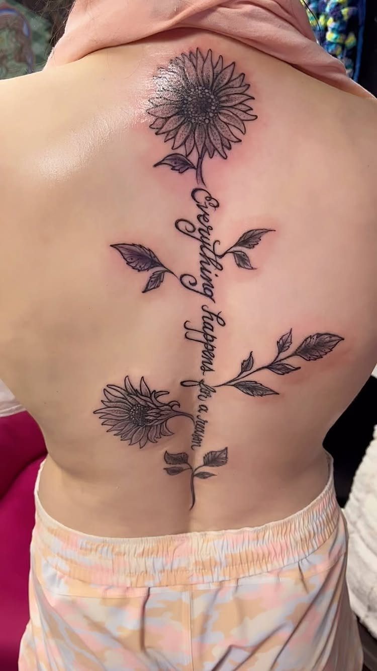
Sunflowers fill space without needing a dense background, so the piece stays light even when it runs most of the spine.
Adding text along the stem ties the meaning to the image, and cursive that follows the vertical line keeps the whole piece readable from a distance.
Yellow and orange fade faster than black, so if color matters to you, plan on a touch-up every few years.
The leaves and petals give an artist room to adjust the width, which helps if your spine curves or if you prefer to keep it narrower at the neck.
4. Lotus Spine Tattoo
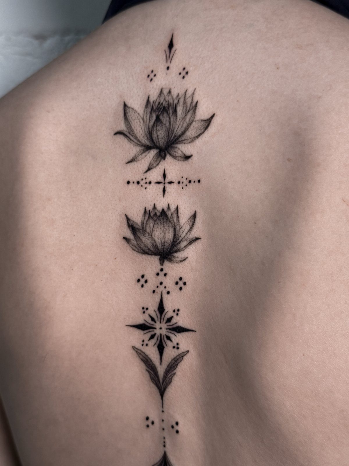
A lotus and geometric line tattoo sits naturally along the spine because both the flower and the symbols favor symmetry.
Lotus petals can be drawn open or closed, and that choice changes how much detail the artist needs to pack in. I’d go open for shading that gives the piece depth.
5. A Spinal Line
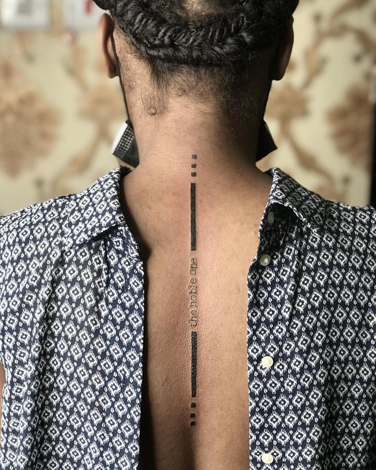
A single vertical line with text turns the spine itself into the design, and the result is subtle enough to hide under most clothing while still reading clearly when you want it seen.
Black ink on bone hurts more than the same line over muscle, but the placement also means the tattoo won’t stretch or blur as your body changes.
Text this small needs clean lettering.
Script that’s too ornate or letters that sit too close together will merge as the ink spreads slightly over the years, so I’d choose a font with open spacing and stick to a short phrase.
6. Celestial Tattoos
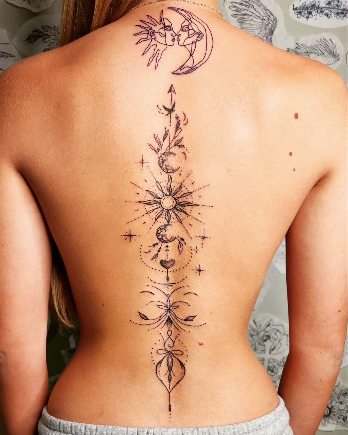
Moons, suns and stars stacked along the spine give you a vertical design that can grow or stop at any point, and each symbol carries its own weight without needing connective elements.
The spacing between shapes matters more than the shapes themselves; too tight and it reads as one blur, too loose and it looks like separate tattoos that happened to land in a line.
Black ink keeps the celestial theme clean, and the center placement means any asymmetry will show. I’d size each symbol large enough that the details stay sharp as the tattoo ages.
7. Snake Tattoos
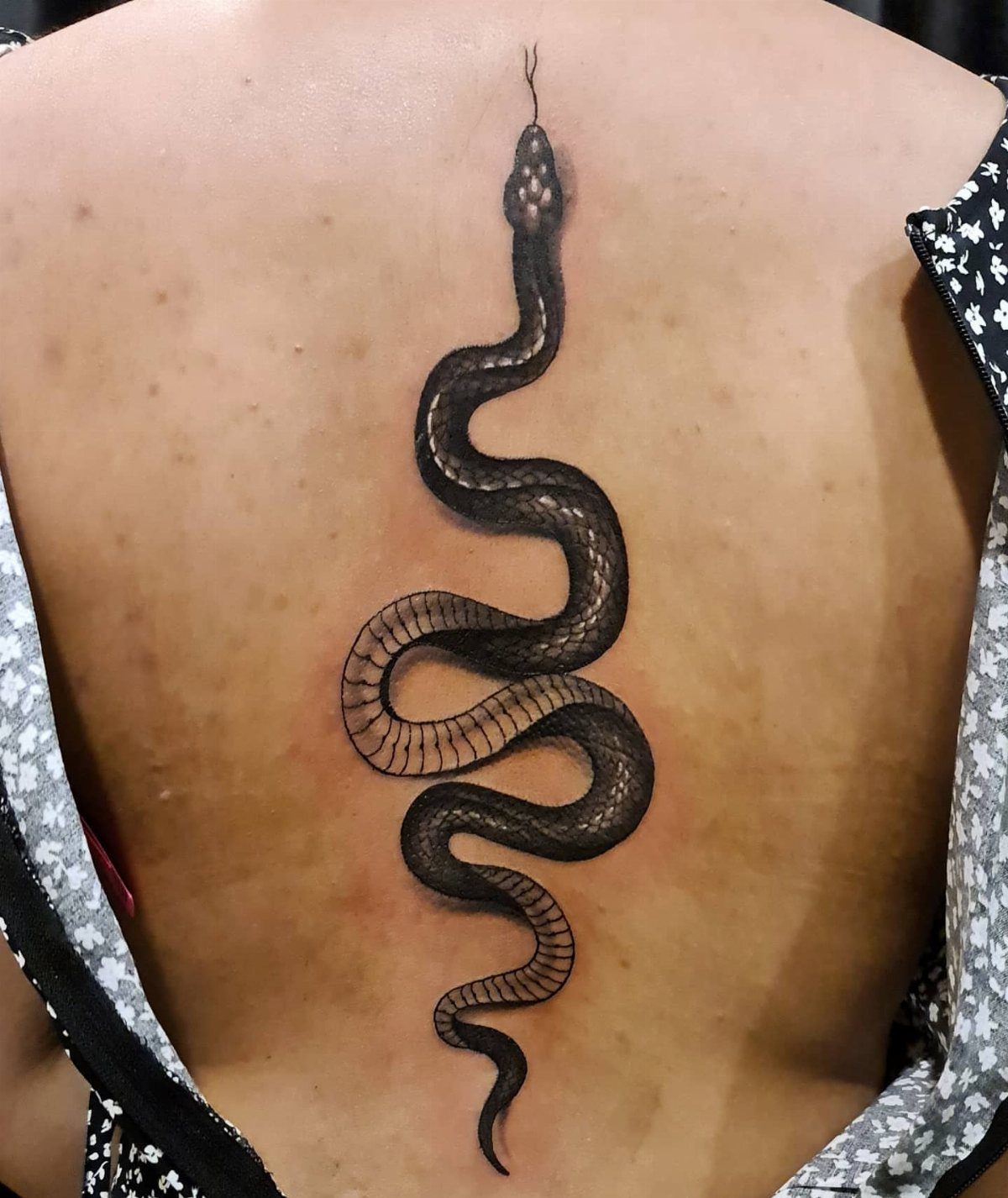
A snake wrapping down the spine follows the body’s natural curve, and the length of the design means you can add as much detail in the scales as the artist can fit without crowding the line.
Black and grey shading keeps the contrast high, which matters when the tattoo sits over bone that shows every line.
The winding shape hides small imperfections in symmetry better than a straight vertical design, so if your spine curves slightly, the snake adjusts with it. Placement over the mid-spine hurts less than work near the neck or lower back.
8. Koi Fish Tattoos
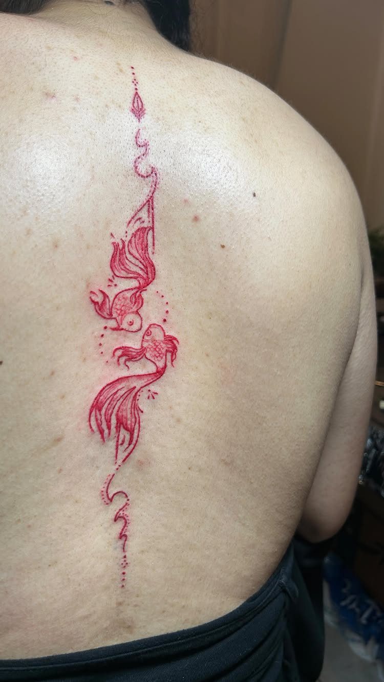
Two koi swimming in opposite directions balance the composition, and the movement in the fins gives an artist room to extend the design up or down the spine without adding more fish.
Red ink loses intensity sooner than black, so a touch-up keeps the color bold.
The swirls and water elements fill the gaps between vertebrae where bone sits closest to the surface, which spreads the pain across softer tissue. Koi scales take time, so expect a longer session than a simpler spine piece.
9. Dragon Tattoos
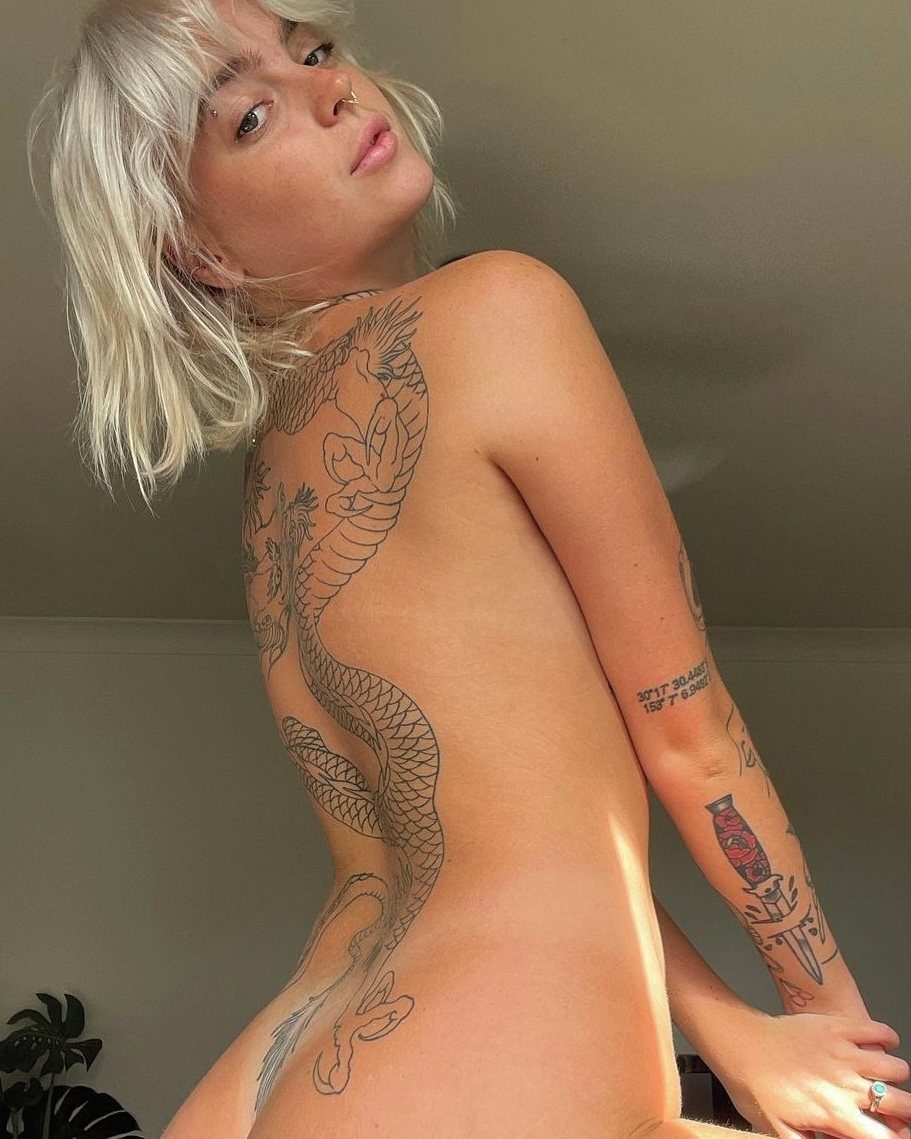
A dragon running the full length of the spine gives you space for wings, claws and flames without cramping the details, and the vertical layout keeps the head and tail from wrapping awkwardly around your sides.
Black ink holds up well on a high-movement area, and the spine flexes less than ribs or shoulders, so line work stays sharp.
The size of this piece usually means multiple sessions, and sitting for work directly over bone gets harder after the first hour. I’d plan breaks and expect soreness between appointments.
10. Dagger Tattoo
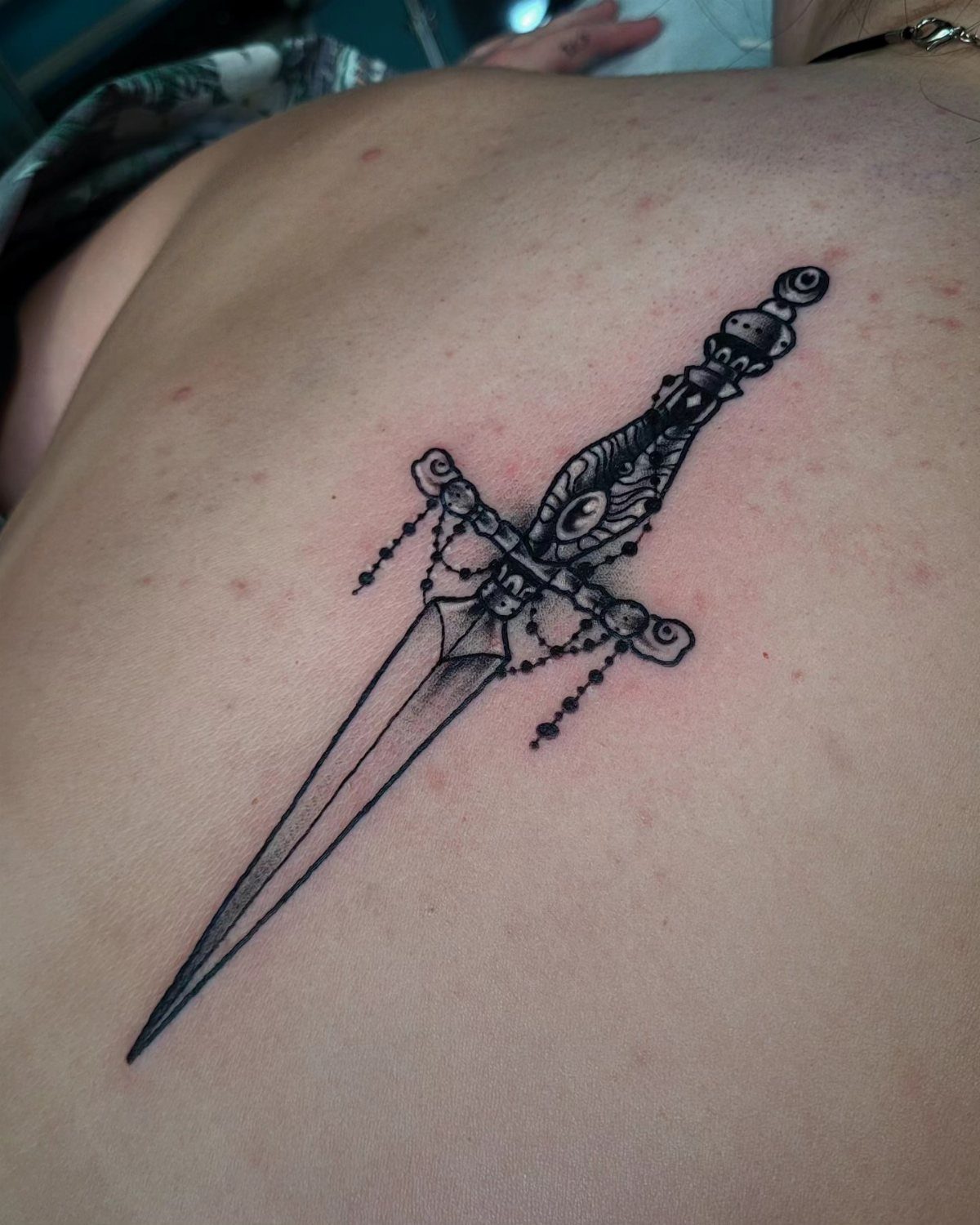
A dagger blade running straight down the spine reads clearly from across a room, and the handle detail at the top gives the piece a natural starting point without needing extra decoration.
The ornamental hilt adds width where the shoulders are broader, which balances the narrow line of the blade.
Placement over the mid-spine keeps the tattoo visible in most backless tops, and the straight line means any wobble in the artist’s hand will show. I’d choose someone with a strong portfolio of geometric or weapon work.
11. Sword Tattoo
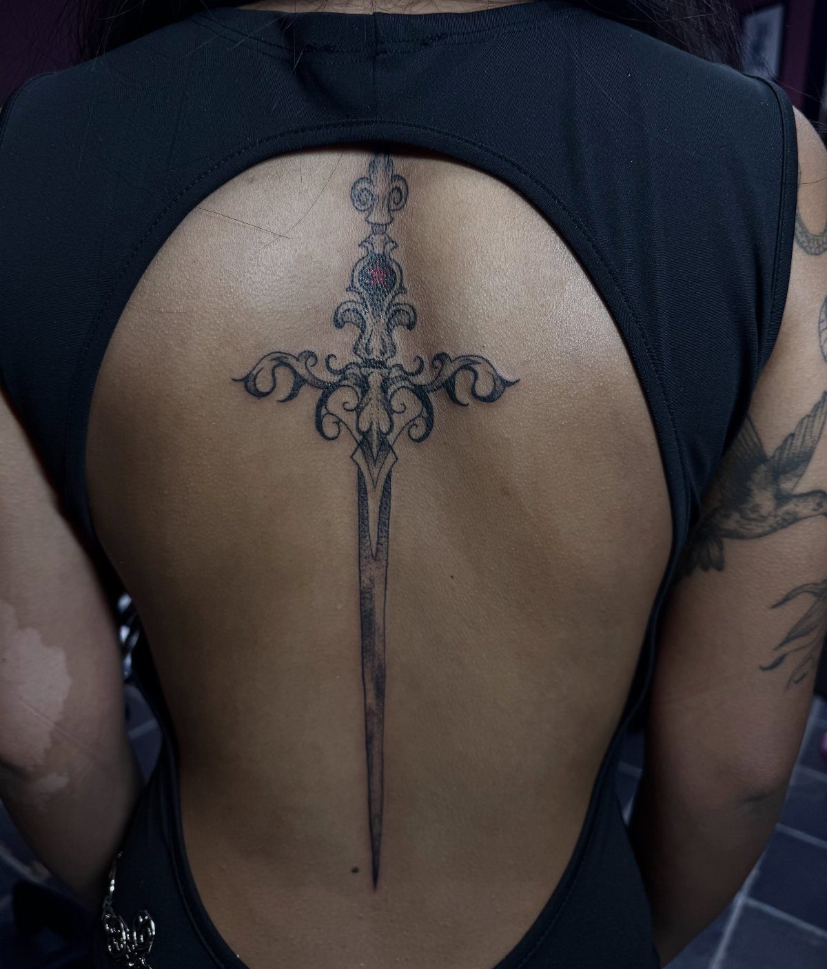
A sword centered along the spine uses the body’s natural line as the blade, and ornamental details on the hilt and guard let you add width at the top without unbalancing the design.
Black ink over bone shows every detail, which means this piece needs clean linework and steady shading.
Expect the session to hurt more than rib or shoulder work, and the time depends on how much detail you add to the metalwork.
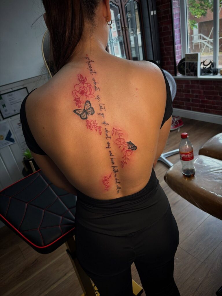
12. Inspirational Quote Tattoo
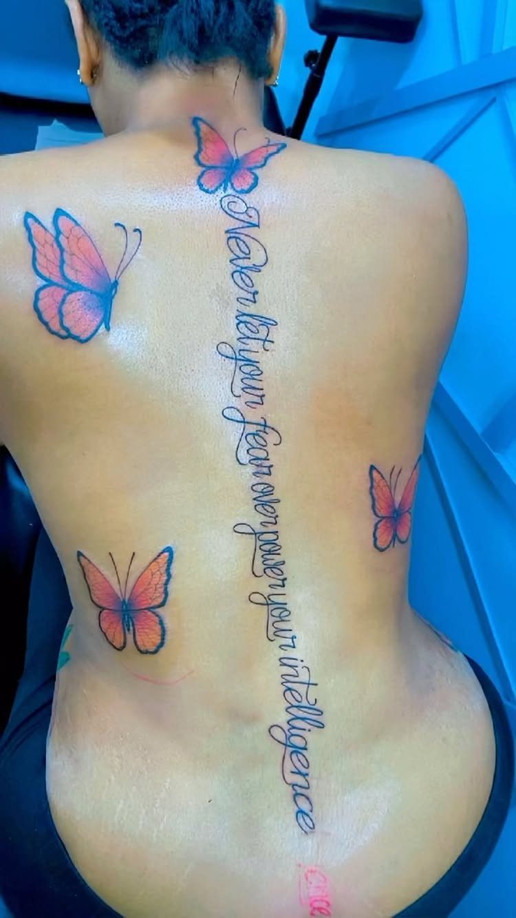
A phrase running vertically down the spine reads top to bottom, and the butterflies break up the text so it doesn’t look like one long sentence stamped on your back.
Orange and blue contrast well enough that both colors stay readable as the ink ages, though the orange will lighten faster.
The spacing between words matters more than the font.
Too tight and the letters blur together within a year, too loose and it reads like separate tattoos. I’d keep the script simple and size the butterflies large enough that the wings don’t fade into solid shapes over time.
13. Geometric Spine Tattoos
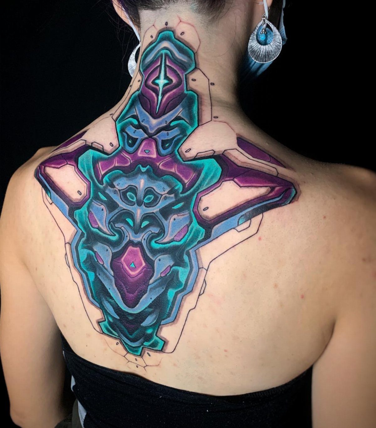
Mandala patterns and geometric shapes stack along the spine without needing connective imagery, and the abstract forms let an artist adjust the width at each vertebra to match how your back curves.
Color work this detailed needs regular touch-ups to keep the edges sharp, and the placement over bone means longer sessions hurt more than the same design on muscle.
The symmetry has to be exact or the whole piece reads as off-center, so I’d check an artist’s portfolio for clean geometric work before booking.
There’s so much space to work with when it comes to getting a spinal tattoo, and social media proves yet again that the possibilities for designs are endless.
— Bustle
14. Biblical Verse Tattoo
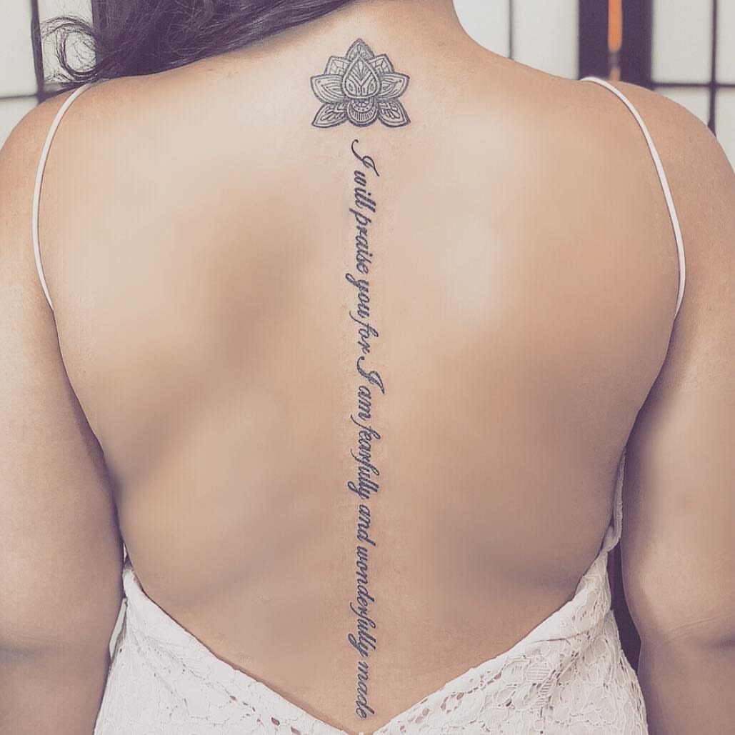
A verse placed vertically down the spine keeps the text readable without wrapping awkwardly, and adding a lotus or other symbol at one end gives the design a visual anchor.
Fancy lettering will blur as the ink spreads, so I’d choose a clean serif or simple cursive with spacing between the words.
15. Ornamental Tattoos
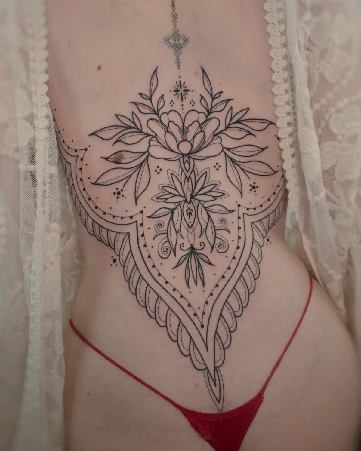
Ornamental work like lace patterns and mandalas fits the spine because the vertical space lets the design build without needing a background to fill gaps.
Black ink over bone shows every line, so this style depends on an artist who can keep the details tight and symmetrical.
Expect the session to take longer than a simpler piece because the shading and line density require more passes.
16. Phoenix Tattoo
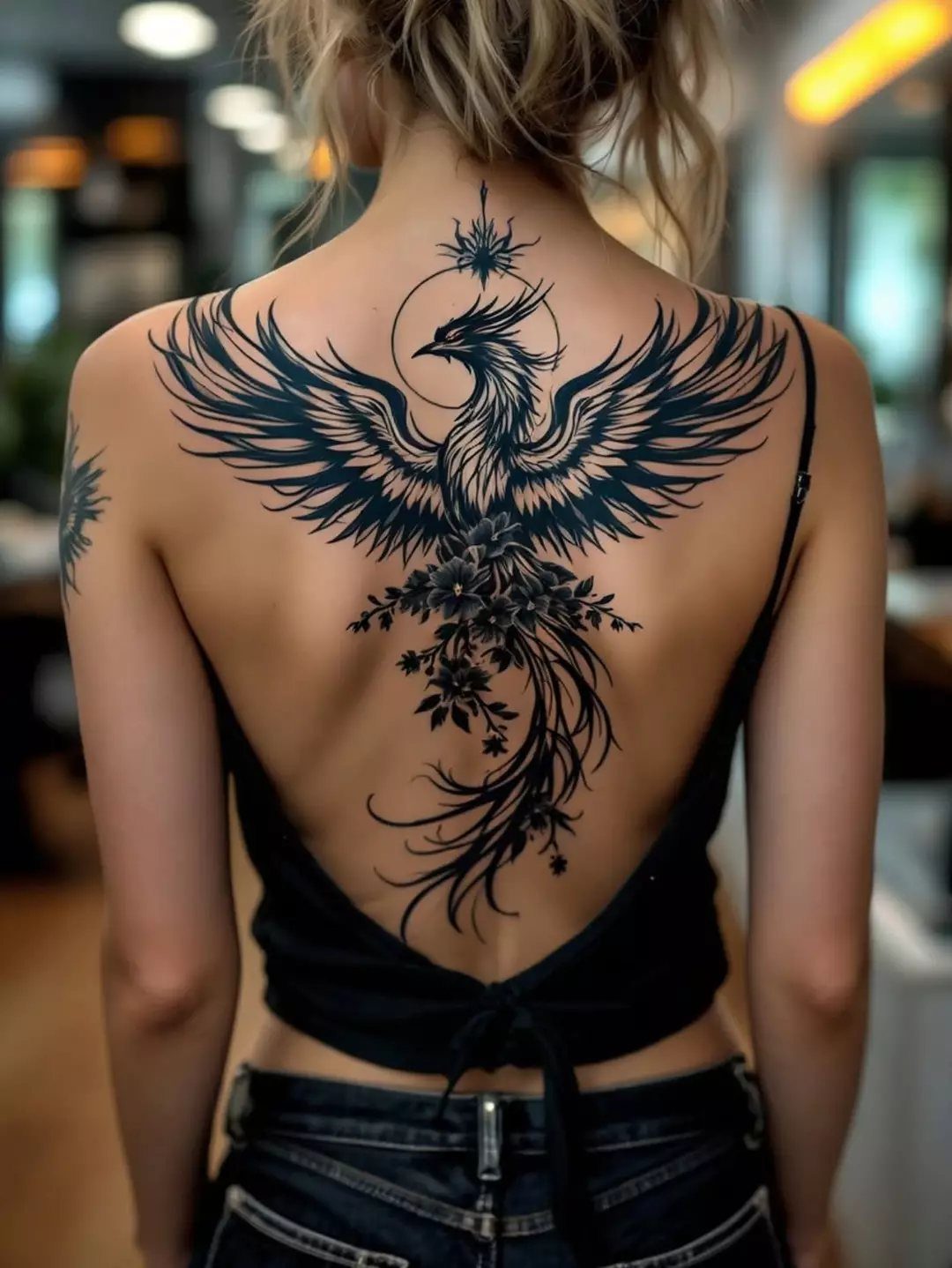
A phoenix with wings spread and tail feathers extending down the spine uses the full length of your back, and the outstretched shape balances the width at the shoulders with the narrow line below.
Black ink holds detail well here, and the solid shading means fewer touch-ups than a piece with thin lines or color.
This design usually takes multiple sessions because of the size and the amount of black fill. Sitting for hours over bone gets harder as the session goes on, so plan breaks.
17. Minimalist Spine Tattoos
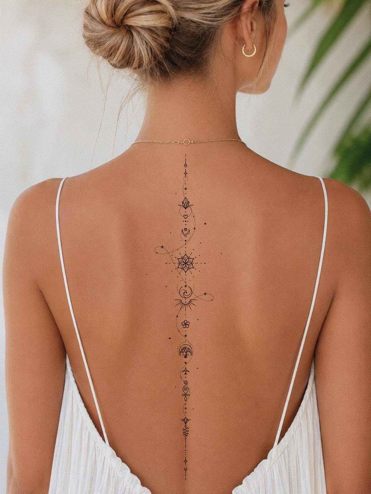
Small geometric symbols lined up along the spine stay visible in backless clothing without covering your whole back, and the minimal line work means less time under the needle.
Too close and they read as one smudge from a distance, too far apart and the vertical line breaks up.
18. Sea Life Spine Tattoo
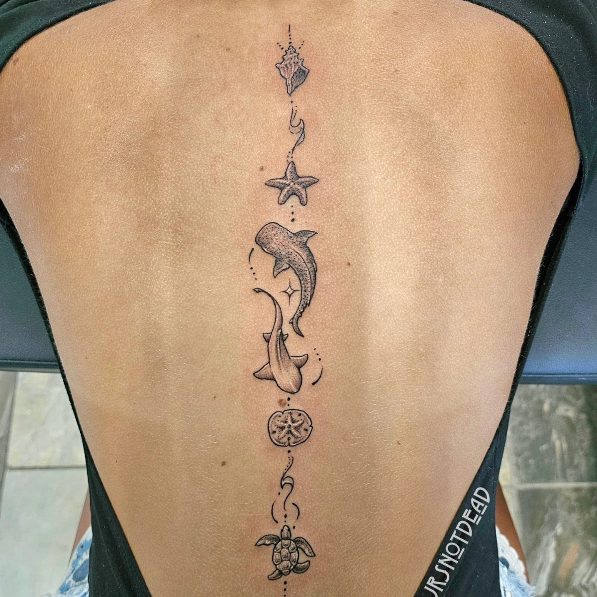
The variety in shapes keeps the piece from looking repetitive, and black ink on the sharks and turtle holds contrast better than shading alone.
The center placement means symmetry will show if one animal pulls to the side.
19. Hanging Spider Spine Tattoo
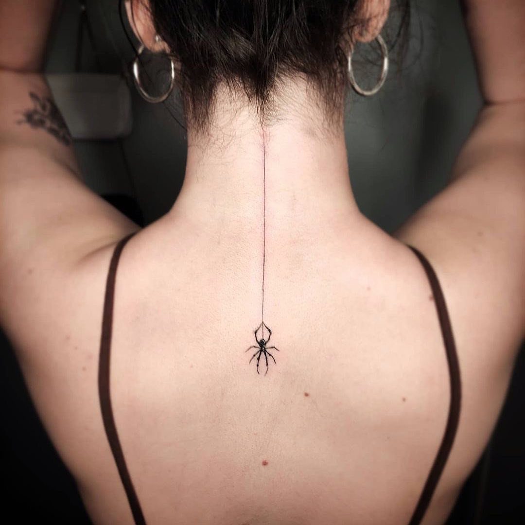
A spider on a thread centered on the upper spine reads clearly without needing much width, and the thin line above it uses the body’s natural vertical to anchor the piece.
Black ink this delicate needs an artist who can hold fine lines without the thread fading into a blur after a year or two.
Placement high on the spine sits over bone, so expect sharper pain than the same design over the mid-spine where muscle cushions the needle.
20. Abstract Splatter Spine Tattoo
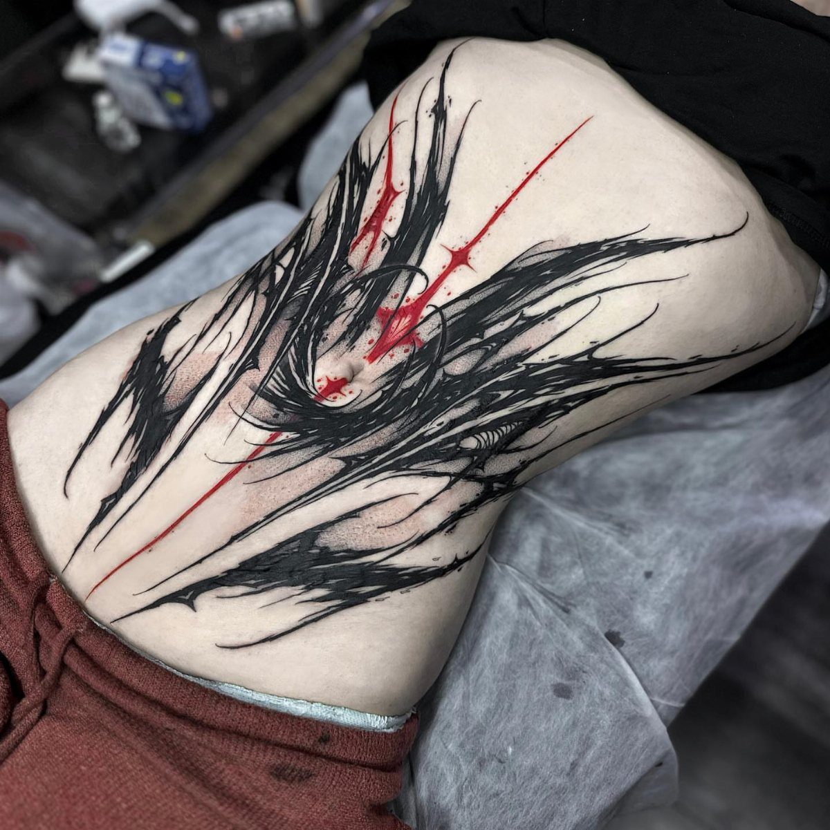
Sharp black strokes with red accents across the lower spine give you an abstract piece that doesn’t rely on recognizable imagery to hold attention.
The color contrast keeps both shades visible as the tattoo ages, though red will fade faster and may need a touch-up to stay bright.
Placement over the lower back spreads the design across a flatter surface than the mid-spine, which gives an artist room to balance the splatters without fighting the curve of your vertebrae.
The looser composition hides small shifts in symmetry better than geometric work.
21. Symmetrical Tiger Lower Spine Tattoo
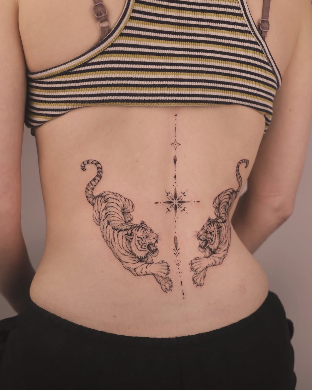
Mirrored tigers facing a center line use the lower spine as the axis, and the symmetry has to be exact or one side pulls heavier than the other.
Black ink keeps the detail readable, and the face-forward pose means the eyes and stripes carry most of the visual weight.
This placement sits lower than most spine work, so it shows above low-rise pants and stays hidden under anything that covers your waistband.
The size and mirroring make this a longer session than a single animal, and the shading in the fur takes multiple passes to build depth.
Pain Level of Spine Tattoos
The closer you get to your neck or your lower back, the sharper the pain gets, though the intensity drops slightly in the middle where a bit more muscle covers the area.
The discomfort is temporary, and most people manage it by breaking a large piece into multiple sessions.
Healing takes extra care because your spine moves every time you sit, bend or sleep.
Loose clothing keeps fabric from rubbing the fresh ink, and you’ll want to avoid anything that puts pressure on your back for the first few weeks.
Symbolism of Spine Tattoos
Spine tattoos carry weight because the spine itself holds you upright, and that physical fact translates directly into the symbolism people attach to the placement.
Strength, survival and the ability to stand under pressure are the most common meanings, and many people choose text that names those qualities outright.
A sword or dagger along the spine reinforces that idea because the blade becomes the structure that supports you, and the weapon’s edge speaks to cutting through what holds you back or finding truth in a hard situation.
Quotes about surviving hardship or believing in yourself fit the vertical space well, and the placement keeps the words private until you choose to show them.
The spine is a natural axis for a design that represents your own center or the path you’ve taken.
Choosing the Right Design
Personal meaning should lead the design choice, not just the look of it.
A tattoo this visible in backless clothing and this permanent on a high-movement area needs to say something you’ll stand behind years from now, so start with what the image or text represents to you before you settle on the style.
Work with your artist to adjust a design rather than copying one exactly.
You can pull elements from different references, change the color or line weight, or add a symbol that ties the piece to your own story. The best spine tattoos feel specific to the person wearing them.
Size and detail matter more on the spine than on flatter areas because the narrow vertical space limits how much an artist can pack in without the image reading as cluttered.