Jack Skellington, Sally, Oogie Boogie, Zero, and the whole Halloween Town crew cover placements from the forearm to full sleeves, with sessions running anywhere from 1 to several depending on how much of the cast you fit into the piece.
Black and grey ages cleanly and suits most of these characters, but color makes the difference when you’re adding Oogie’s bugs spilling through burlap seams or Christmas lights wrapped around Jack.
1. Colorful and Detailed Full Sleeve
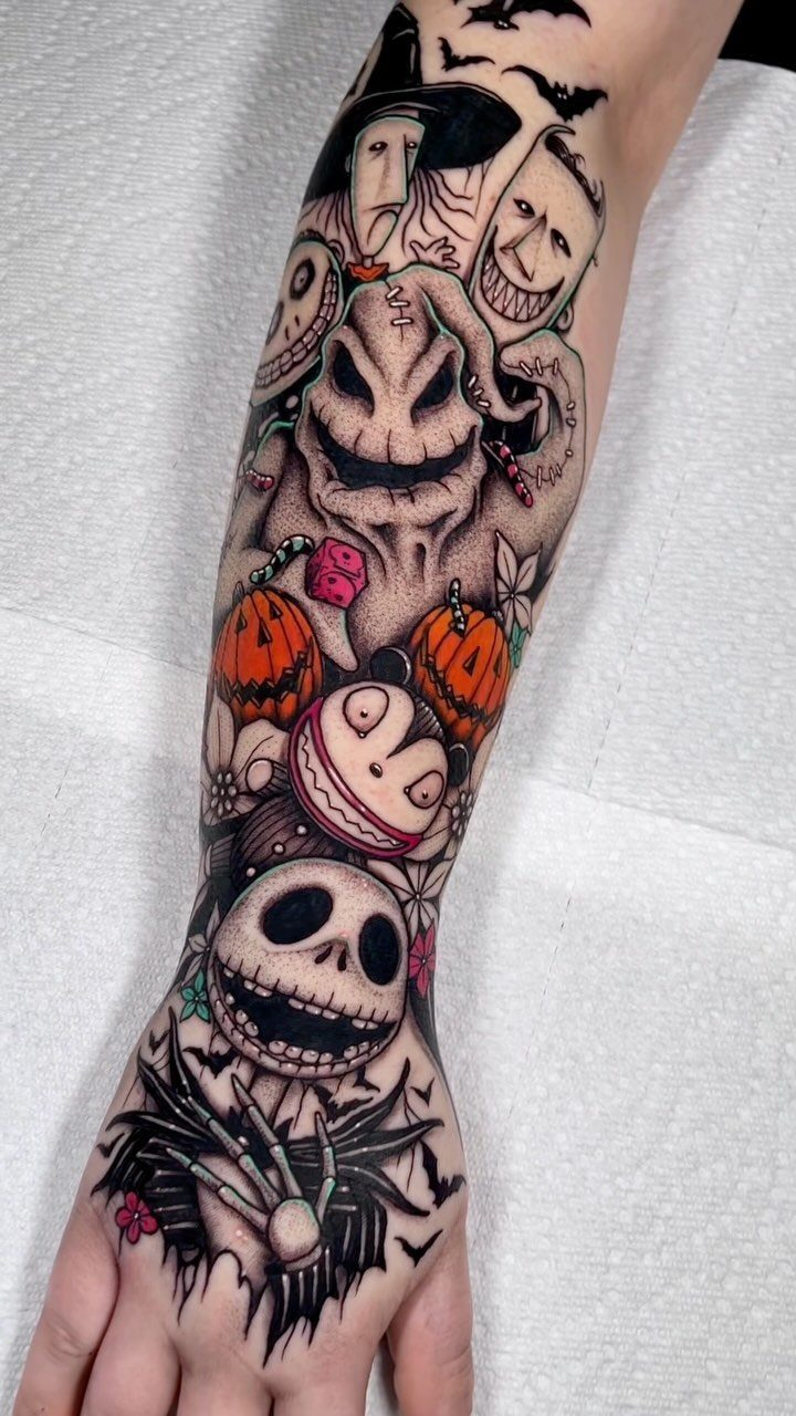
This placement pulls together Jack, Oogie Boogie, and the rest of the cast into one continuous scene. The color makes each character stand out without losing the cohesion of the piece, and the detail holds up when the arm moves.
Sessions depend on how fast the artist works and how much shading the design needs. Pain varies by section: the inner bicep and elbow ditch are rough, the outer arm less so.
It’s the cleanest way to fit the whole film on one arm.
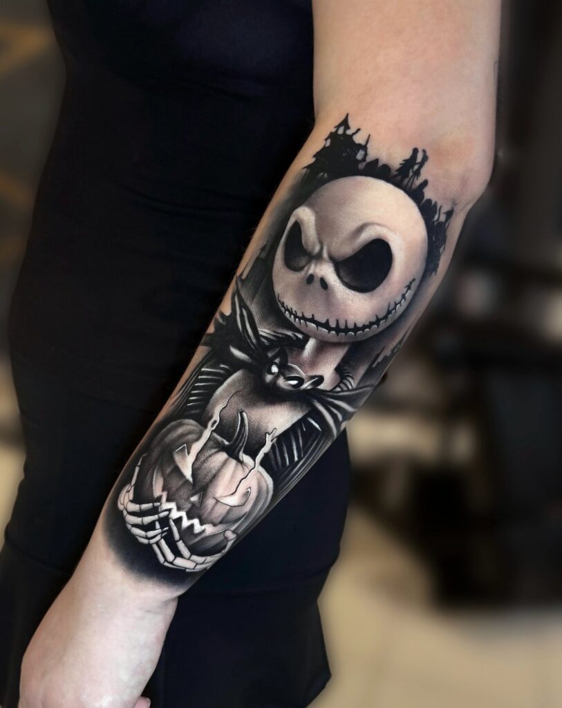
2. Forearm Sleeve of Jack Skellington
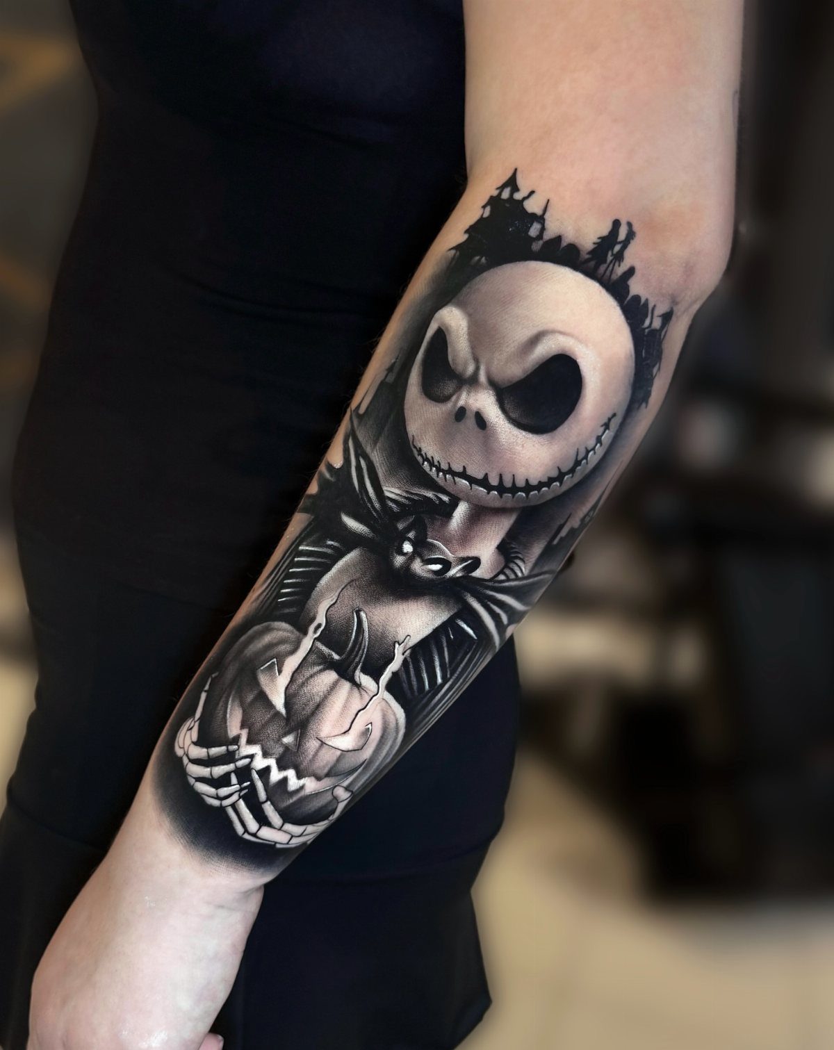
Jack in black and grey reads well from a distance and ages cleanly. The shading gives him dimension without relying on color, and the pumpkin grounds the piece in Halloween instead of just the film.
Forearm placement puts the design where you see it daily. The flat surface makes it easier to tattoo and heals faster than a joint or the inner arm.
Most artists finish a piece this size in 2 sessions. The second pass tightens the black and adds contrast where the first session settled.
3. Jack and Oogie Boogie Tattoo
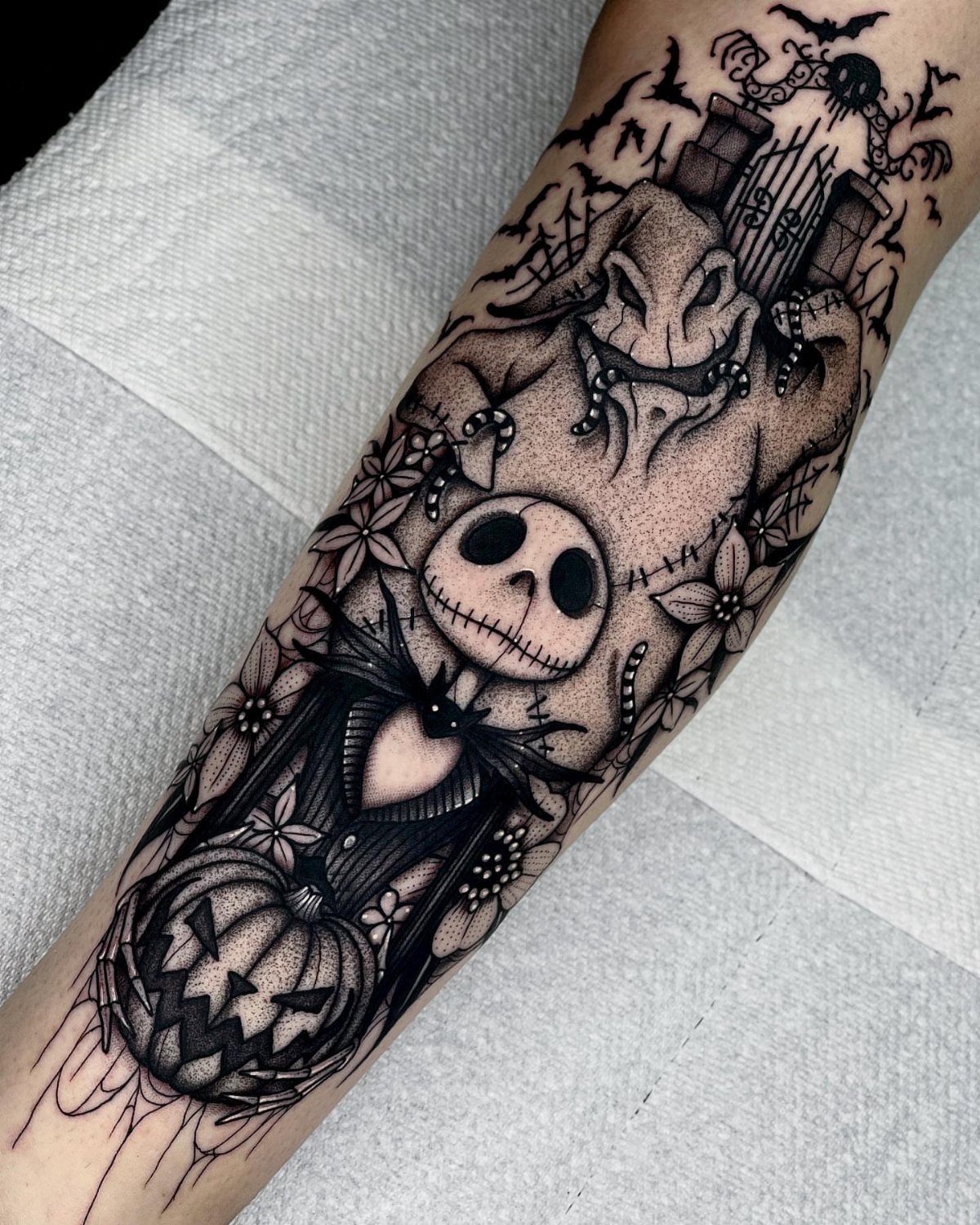
Pairing Jack with Oogie Boogie gets you the hero and the villain in one piece. The contrast between Jack’s clean lines and Oogie’s textured burlap suit gives the tattoo visual weight without adding color.
Black and grey suits this matchup. Oogie’s sack texture comes through in grayscale, and Jack’s stark whites pop against darker shading.
Plan for 1 or 2 sessions depending on size. The pumpkin fills negative space and ties the Halloween theme together.
4. Barbed-wire Heart Surrounding Sally and Jack in Love
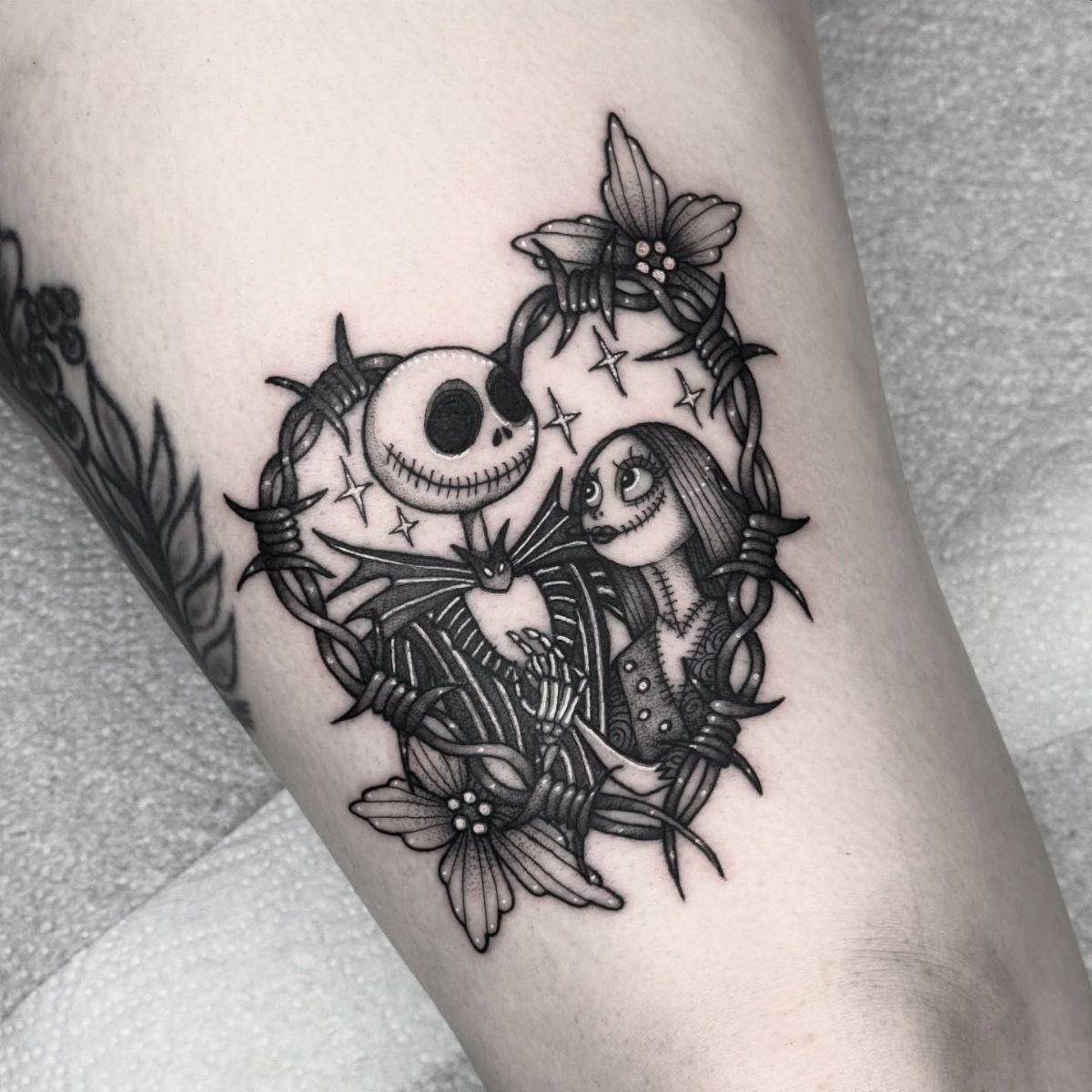
The barbed wire heart frames Jack and Sally without softening the edge. The flowers add a small romantic detail, but the wire keeps the piece from reading as purely sentimental.
This design works well on the upper arm or chest where there’s enough room for the heart to sit proportionally. The barbed wire needs clean, tight lines or it looks muddy once healed.
Expect 1 session for a piece this size. Black and grey lets the composition stand on its own instead of competing colors.
5. Sewn-together Family Portrait Tattoo
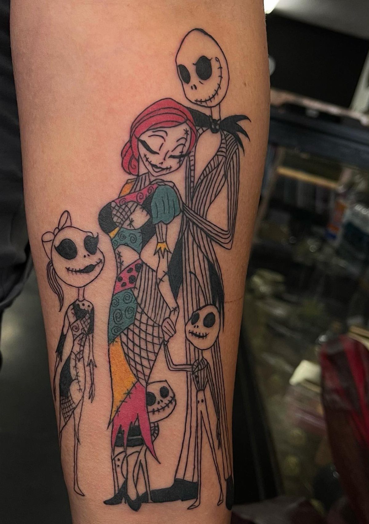
A family portrait puts Jack and Sally with kids, a version of the characters that extends beyond the film. The sewn-together look ties Sally’s signature aesthetic into the whole group.
This works if you see the characters as stand-ins for your own family or just want a version of them in a domestic scene. The design reads clearly on the forearm.
The stitching detail takes time but holds the concept together.
6. Puppy Zero
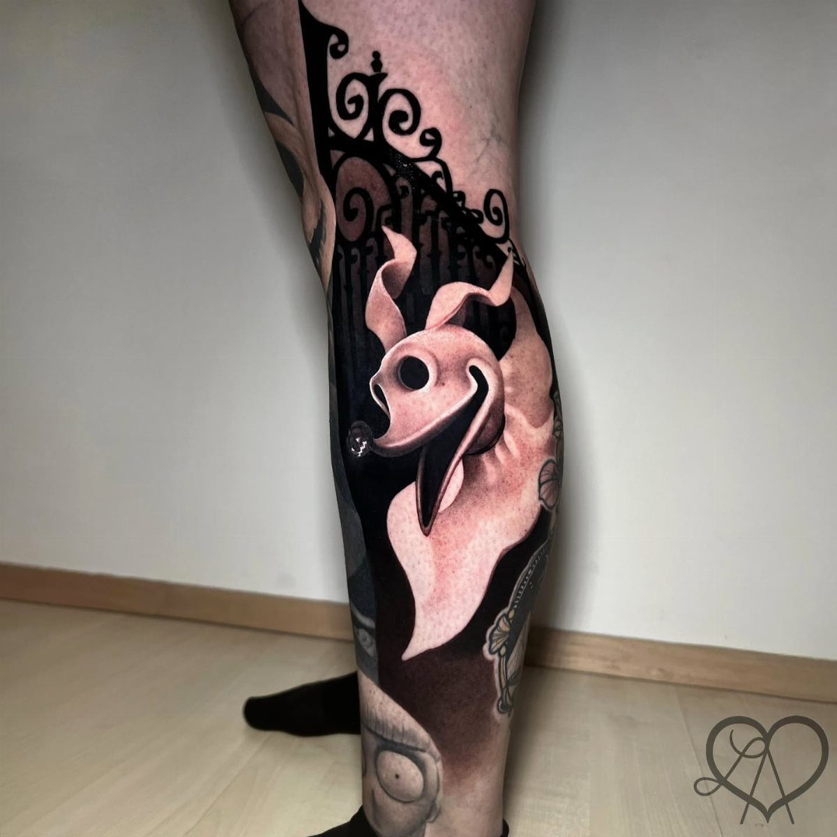
Zero alone makes a clean, simple piece. The ghost dog’s shape is recognizable even without Jack, and the dark background elements give the tattoo depth while leaving the character visible.
Calf placement suits a smaller design like this. The muscle curve adds dimension, and the area heals well since it’s rarely bent.
Black and grey keeps Zero’s glow effect subtle instead of relying on white ink that fades quickly.
7. Oogie Boogie Breaking Colorfully at the Seams
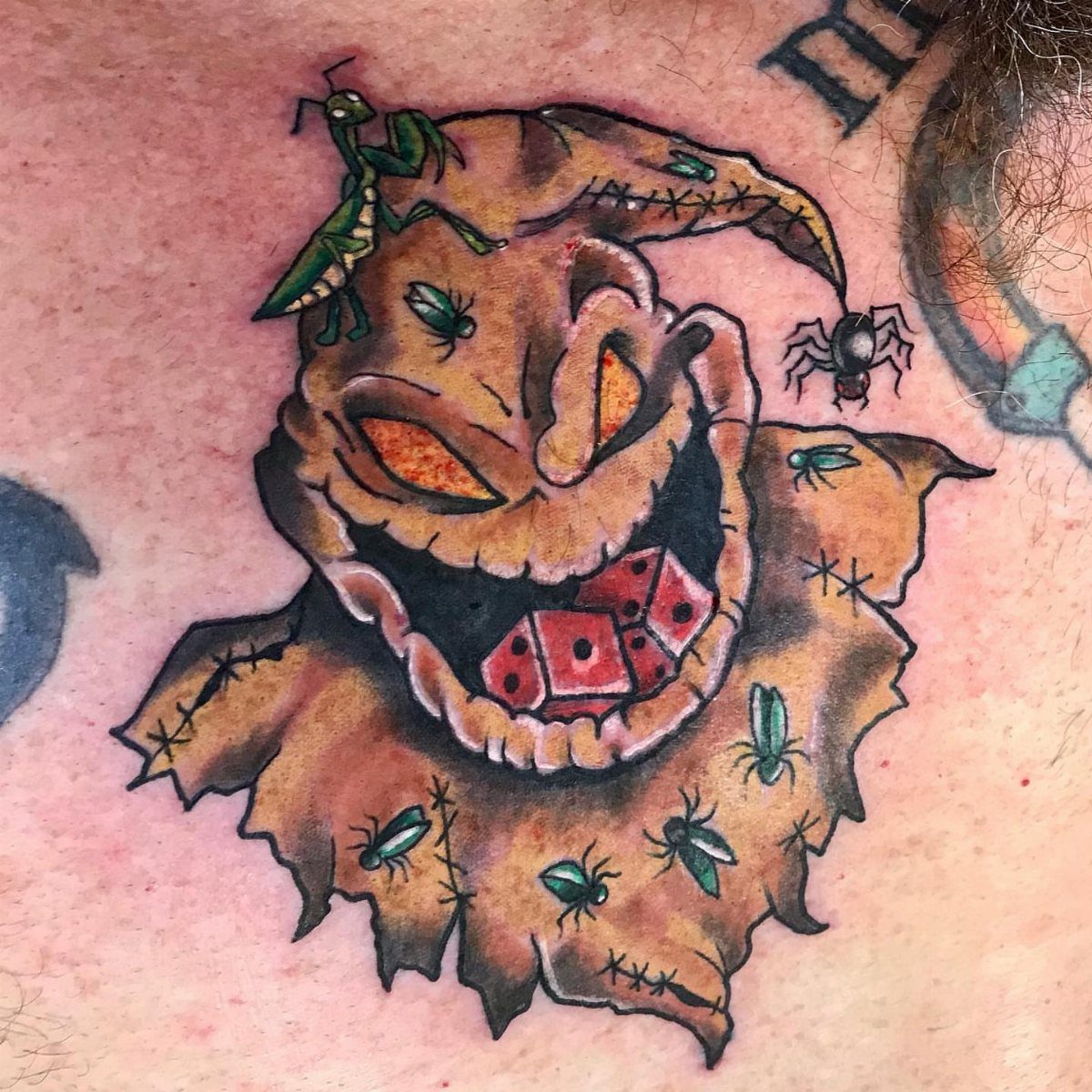
Color brings out the detail that makes Oogie Boogie unsettling: the insects, the dice, the gaps where bugs spill through. Black and grey captures his outline, but color lets you see the bugs spilling through the seams.
The forearm suits this kind of close-up character portrait. Placement where the skin stays flat keeps the linework tight, and the bugs read clearly once healed.
One session covers this if the artist works fast. The dice and insects fill negative space without needing a separate background element.
8. A Colorful, Cute and Happy Zero!
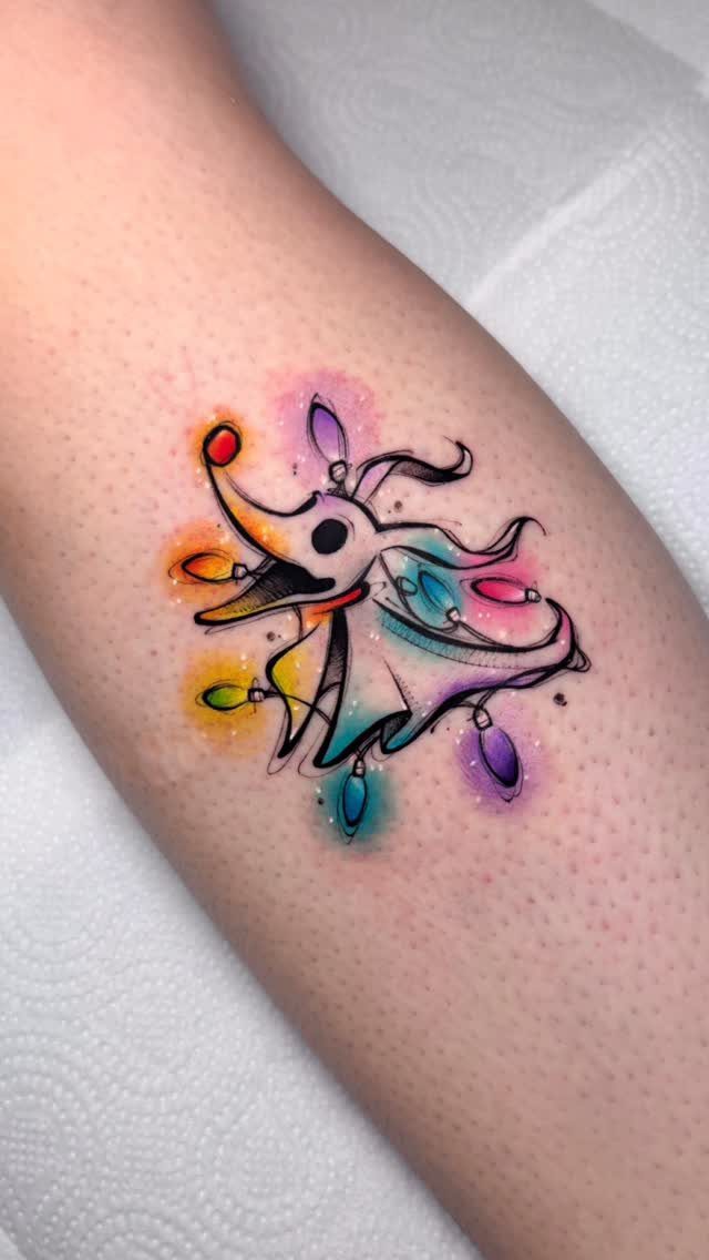
Watercolor splashes behind Zero give the ghost dog a playful energy the film only hints at. The Christmas lights wrapped around him tie the piece to the holiday side of the story instead of just the Halloween half.
Color suits Zero better than black and grey. His glow reads as warmth instead of just contrast, and the lights need that brightness to register as lights at all.
Calf or forearm works. The design stays compact enough that it doesn’t need a large canvas, and the splashes fill space without requiring extra characters.
9. An Enraged Black and White Oogie Boogie
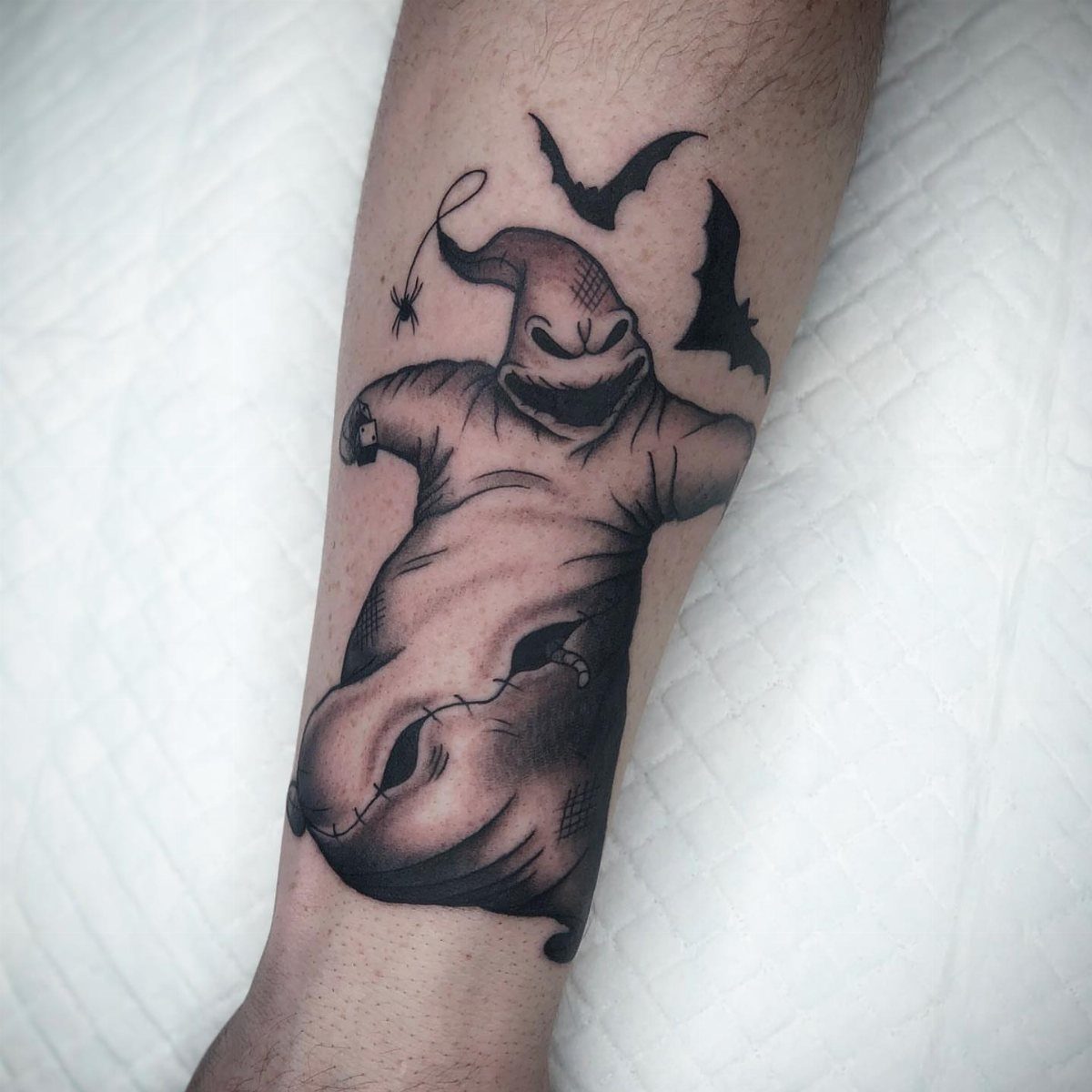
Anger changes Oogie’s whole read. The bats and spider add motion, and black and grey pulls attention to his snarl rather than the burlap.
The flat surface lets the face sit square to the viewer, and there’s no joint to distort the eyes or mouth when the arm bends.
Plan for 1 session. Oogie’s shape is simple enough that the line work and shading don’t need multiple passes.
10. Colorful Leg Sleeve Tattoo
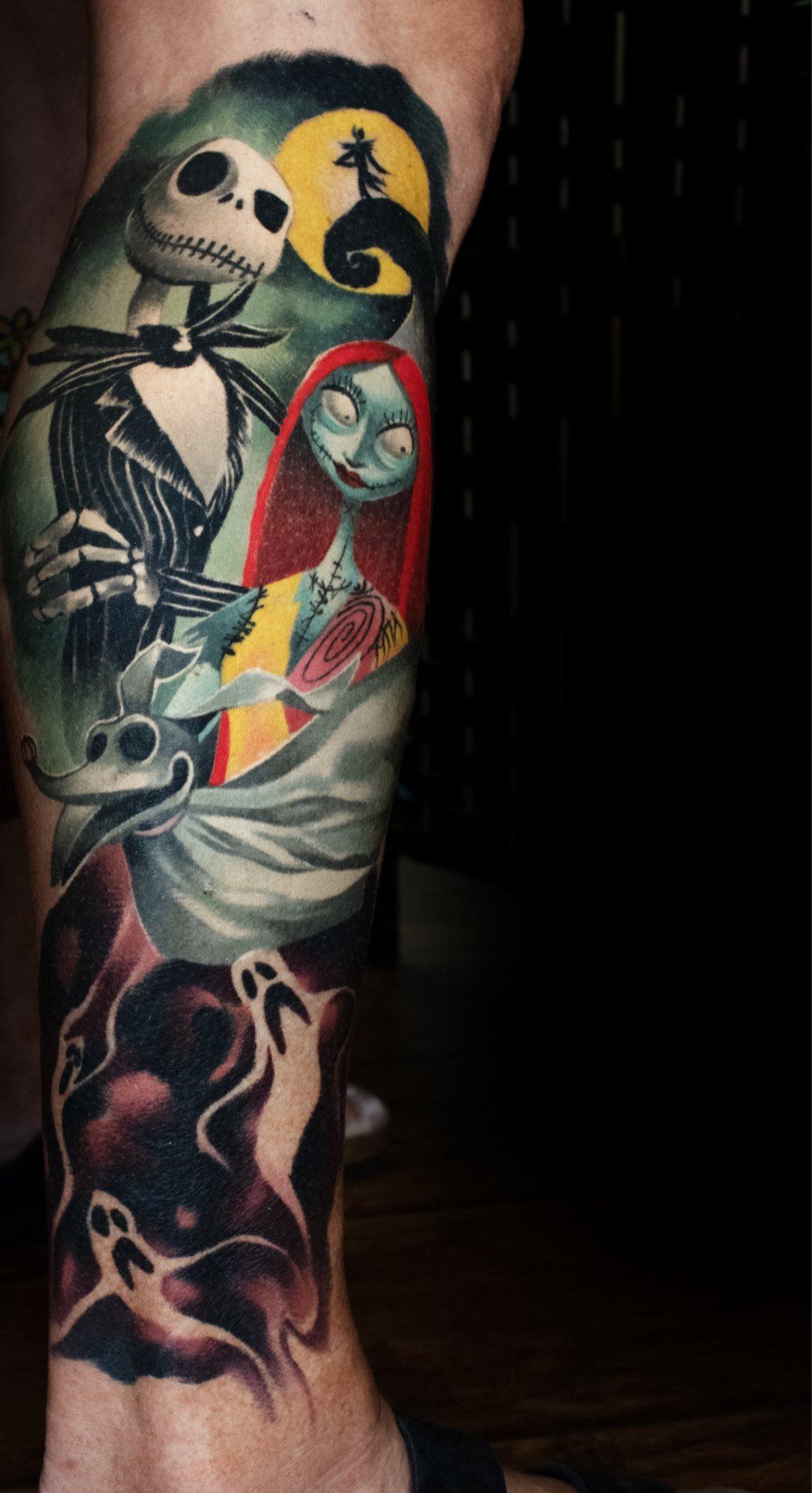
Getting Jack, Sally, Zero, and the ghosts onto one leg builds a full scene without needing the back of the calf or wrapping around. The moon in the background ties the characters together, and the color separates each figure clearly.
Lower leg placement works when you want a vertical composition. The muscle curve adds depth without cutting through faces or details the way a knee or ankle would.
Sessions depend on saturation. Bold color like this often needs a second pass to even out the fill.
11. Jack and His Dog Tattoo
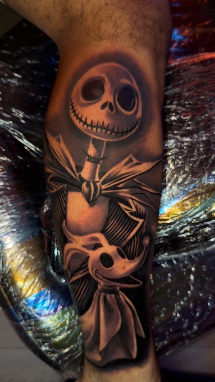
Jack and Zero together make a complete piece without adding Sally or the rest of the cast.
Black and grey keeps the line work sharp, and the pairing feels like the quieter moments in the film instead of the big scenes.
Lower leg or forearm both work. The design doesn’t need much width, so it fits narrow placements without shrinking the characters down to where detail gets lost.
The lack of heavy shading speeds up the process.
12. Un-mixed Character Tattoos
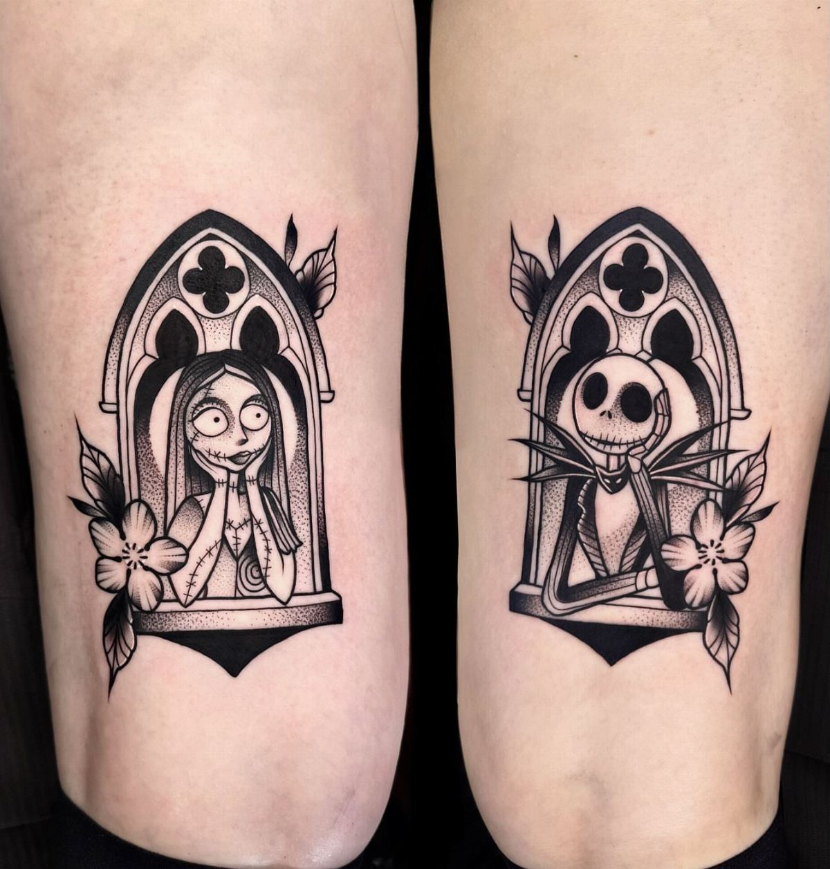
Separating Jack and Sally onto opposite calves gives each character their own frame instead of competing for space in one piece. The gothic windows and flowers match the film’s aesthetic without blending the two into a single composition.
A mirrored pair lets you carry both characters while keeping each side clean and separate. The placement reads as a pair when your legs are together, but each tattoo stands on its own.
Adding color to one and not the other would break the balance.
13. Simple Solo Jack Skellington
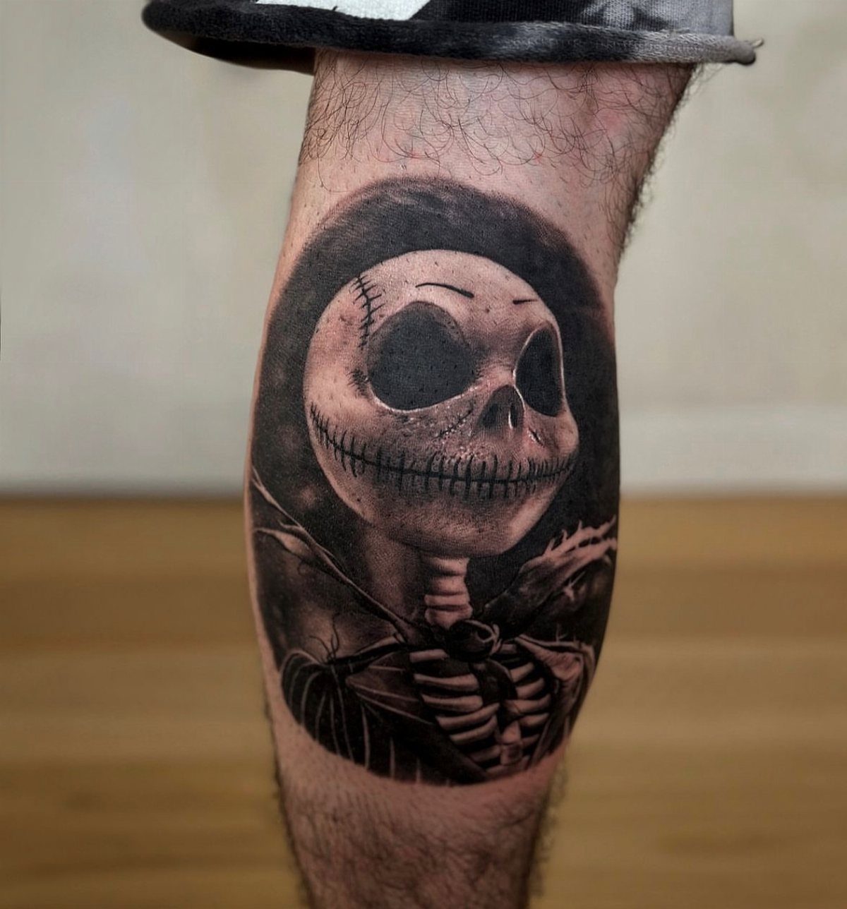
Jack alone on the calf keeps the piece simple and lets the shading do the work. The black and grey gives him depth without needing a background or supporting characters.
The muscle creates natural dimension, and you get clean healing since there’s no joint flexing through the design.
Calf tattoos hurt less than ribs or feet, and the flat surface makes it easier for the artist to keep lines clean.
14. The Lovers Tarot Card Tattoo
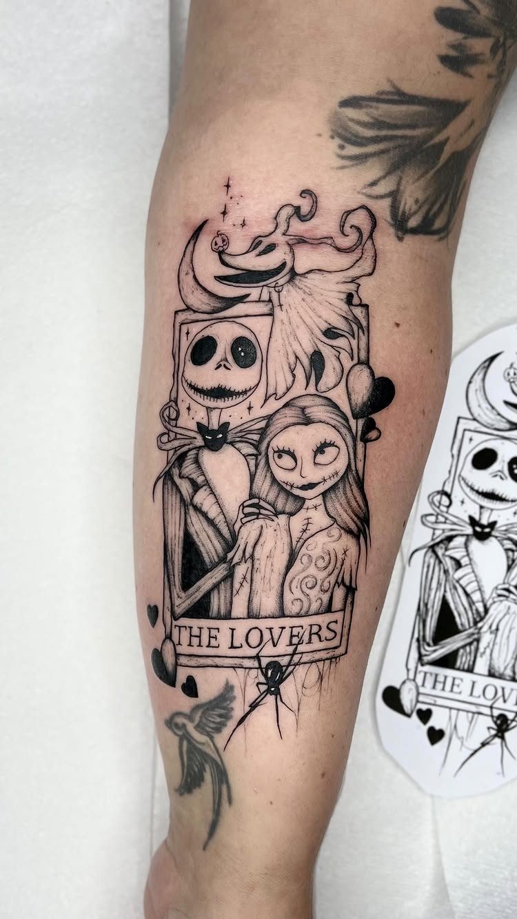
Framing Jack and Sally as ‘The Lovers’ tarot card adds a layer of meaning beyond just the film. The card format gives the piece structure, and Zero ties the composition together without crowding the couple.
Black and grey suits the tarot aesthetic. The shading creates contrast, and the vertical format fits the upper arm or forearm without needing to wrap.
Tarot card tattoos read clearly when the lines stay crisp.
15. Matching Jack and Sally Tattoos
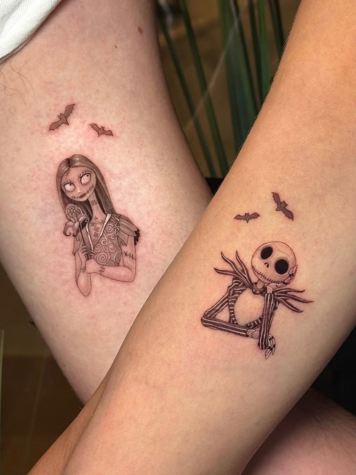
Splitting Jack and Sally as separate tattoos turns them into a matched set instead of a single standalone piece. The bats fill space around each character without adding heavy background detail.
Matching tattoos work when both people want individual designs that still connect. Black and white keeps the pair cohesive, and the simple composition ages cleanly.
Forearm placement puts the tattoos where you see them together. Each piece finishes quickly since the characters stay small and the shading is minimal.
16. Solo Sally Portrait Tattoo
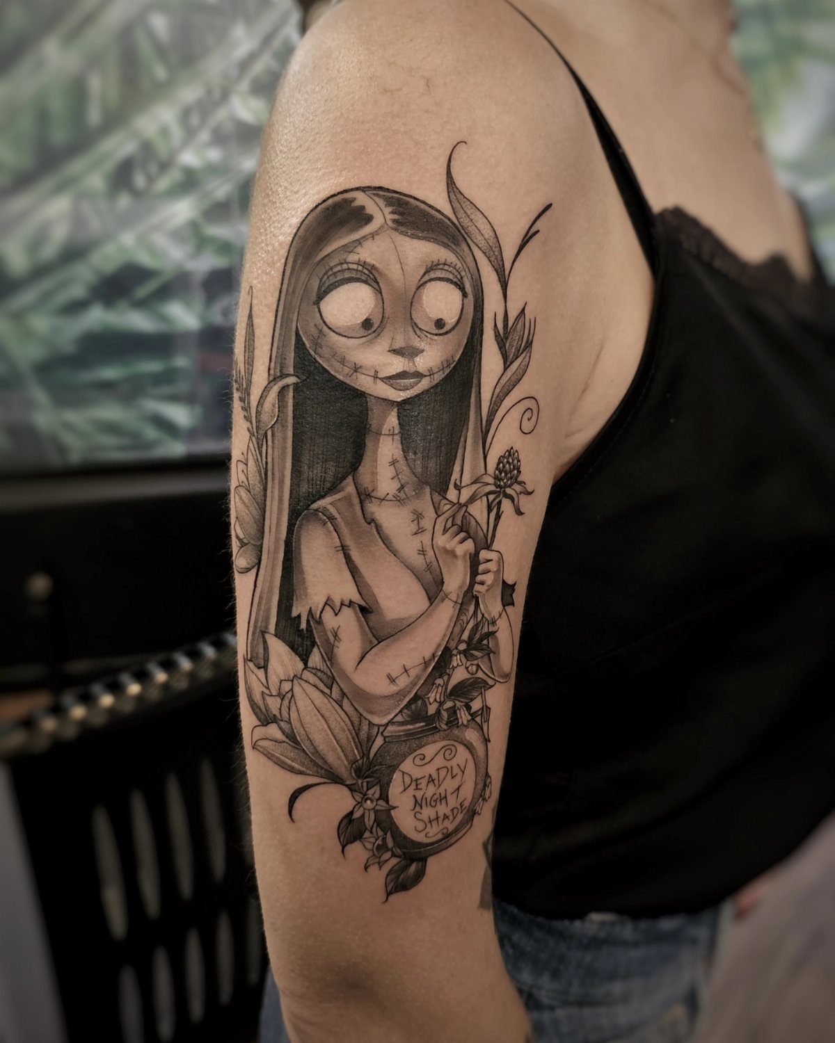
Sally on her own gets space to show the details that make her recognizable: the stitching, the flowers, the patchwork dress. The ‘Deadly Night Shade’ plaque references her expertise with herbs.
Upper arm placement gives the portrait room to breathe. The flowers soften the composition without turning it sentimental, and black and grey keeps the focus on Sally’s face.
The plaque adds a small text element that holds up better in a simple typeface.
17. Black and Grey Zero Tattoo
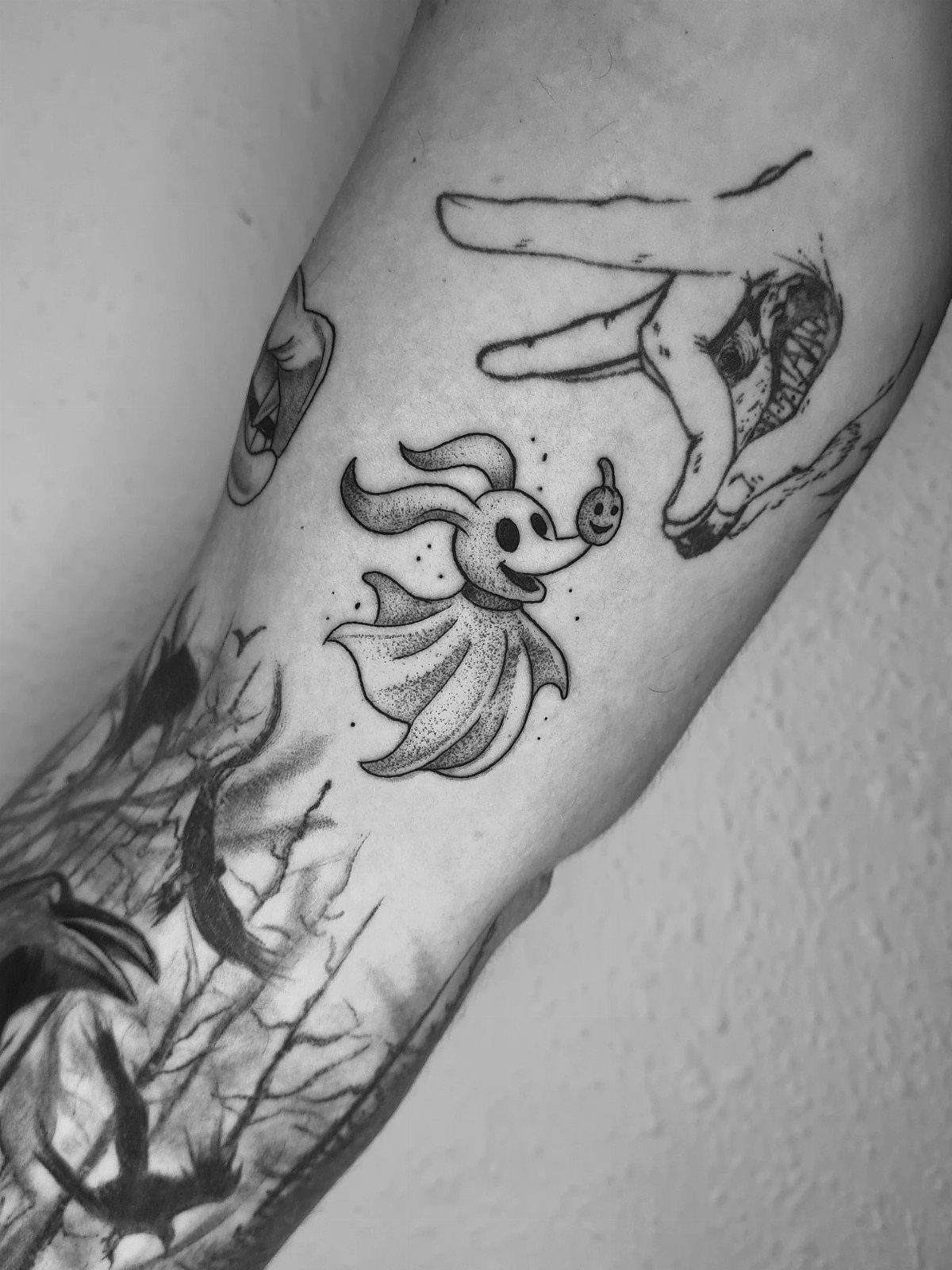
Zero paired with a skeletal hand pulls the ghost dog into a Halloween context beyond just the film. The hand adds a darker edge, and black and grey keeps the piece from reading as too cheerful.
Forearm or upper arm both work. The design stays compact, and the shading gives Zero dimension without relying on white ink that fades fast.
18. Lock and Shock Coffin Tattoo
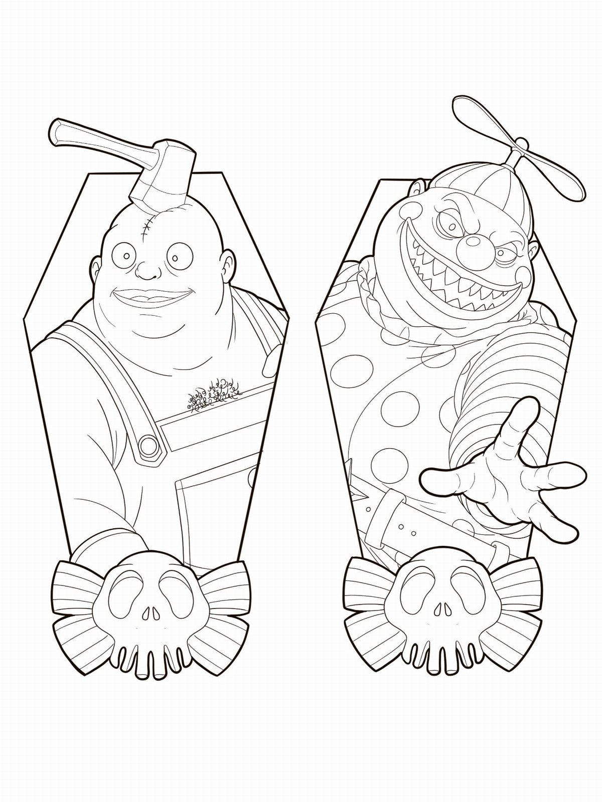
Lock and Shock inside coffin frames separates the 2 troublemakers into a clean, matched pair. The skulls at the bottom tie the coffins to the Halloween theme, and the line work stays simple enough to age well.
This design works as a matching set or as one piece with both characters. The coffin shape fits narrow placements like the forearm or shin.
Line work without heavy shading finishes faster and heals cleanly. Barrel could be added for a full trio, but the pair balances better.
19. Sally with Stitched Heart Tattoo
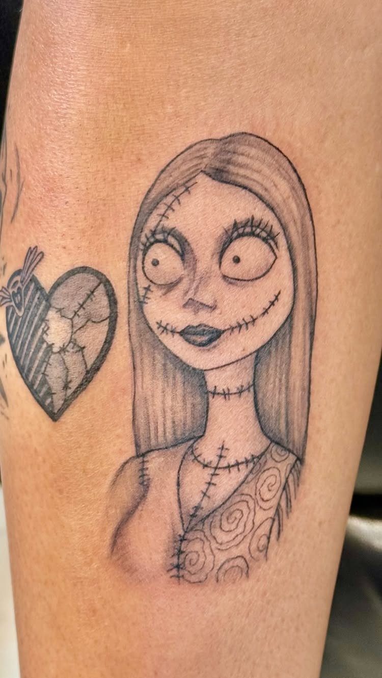
Sally with a stitched heart and arrow pulls 2 images together: the character and a clear symbol that doesn’t need explanation. The arrow through the heart adds an edge that keeps the piece from reading soft.
Black and grey suits this pairing.
The vertical format fits narrow placements, and the design finishes in 1 session.
20. Framed Jack and Sally Tattoo
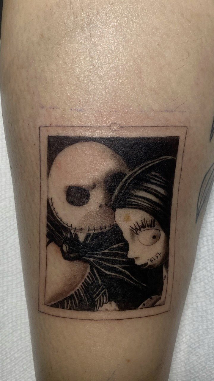
A rectangular frame turns Jack and Sally into a contained composition instead of characters floating on skin. The border gives the piece structure, and black and grey keeps the focus on the couple instead of background details.
Framed designs work when you want clear edges. The format suits the forearm or upper arm, and the straight lines make it easier for the artist to keep the tattoo symmetrical.
The frame also helps if you plan to add more tattoos nearby. It marks this piece as finished and separate.
21. Jack, Zero, and Oogie Boogie Scene
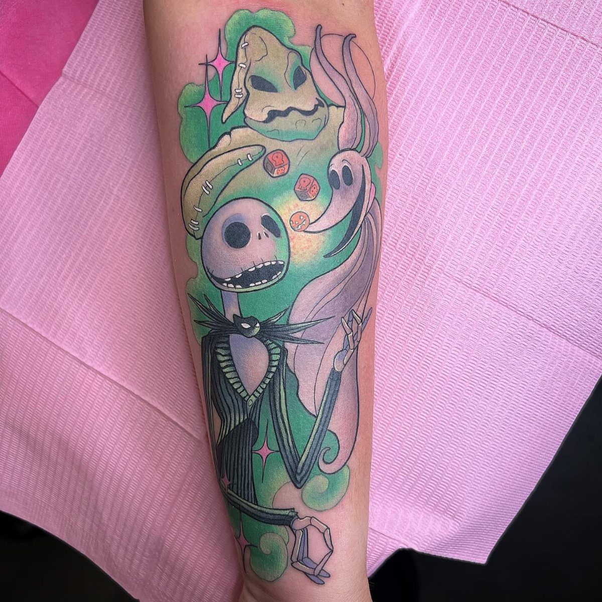
Adding Oogie Boogie to Jack and Zero gets you the villain without losing the lighter side of the story. The glowing starry background separates the characters from plain skin and gives the piece depth.
Color makes the difference here. The green and yellow glow reads as eerie instead of cheerful, and the contrast between Jack’s whites and Oogie’s darker tones keeps both characters visible.
22. Black and Grey Spiral Hill Collage
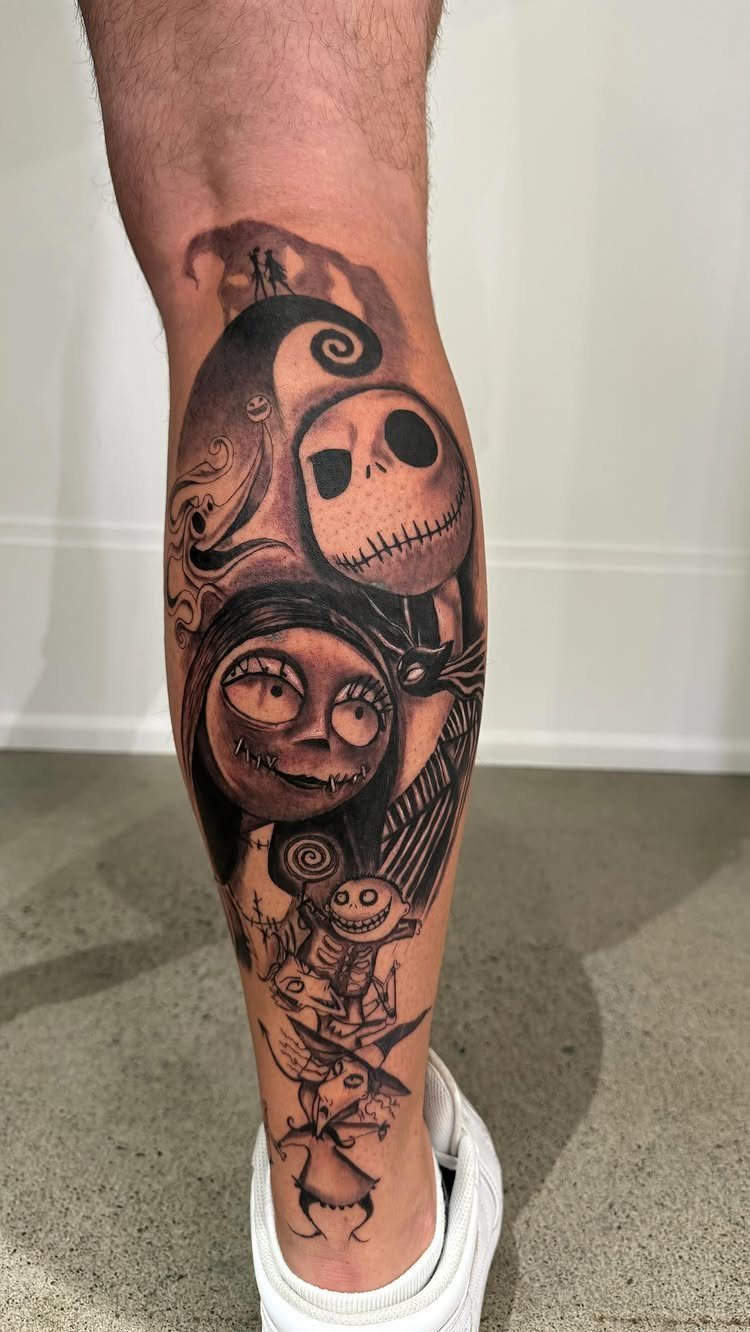
Spiral Hill grounds the collage in a specific location from the film. Pairing it with Jack, Sally, and Zero builds a scene instead of just stacking characters, and black and grey keeps the composition from competing with itself.
Lower leg placement gives you vertical space for the hill and the figures without wrapping around.
The collage format lets you fit multiple elements without needing a full sleeve.
23. Jack Skellington in Christmas Lights
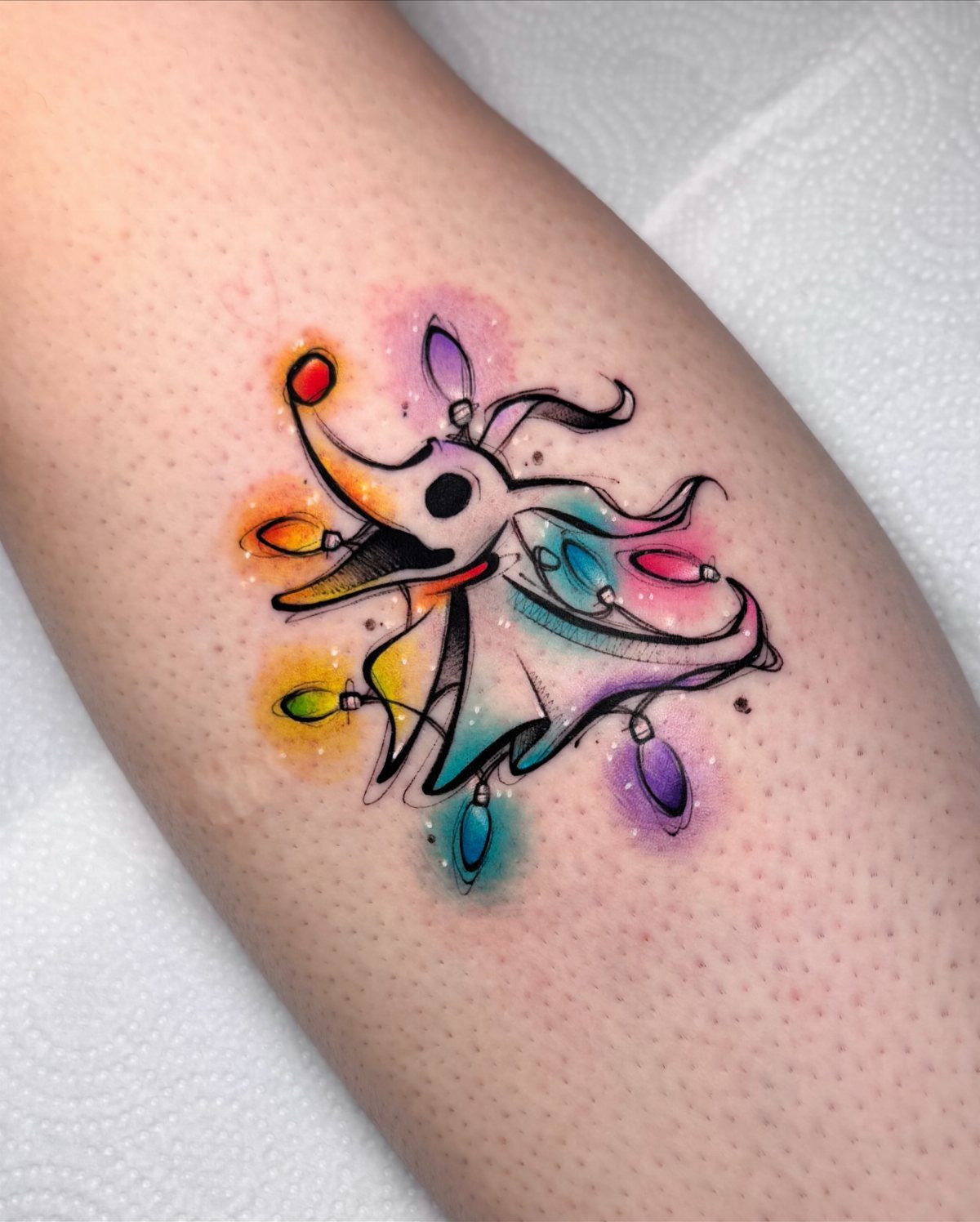
Wrapping Jack in Christmas lights ties him directly to the holiday crossover that drives the film.
Color is required here. Black and grey would flatten the lights into generic shapes, and the watercolor effect only works with saturation.
The splashes fill space without needing a heavy background element, and the piece finishes in 1 session if the artist works efficiently.
24. Lock, Shock, and Barrel Tattoo
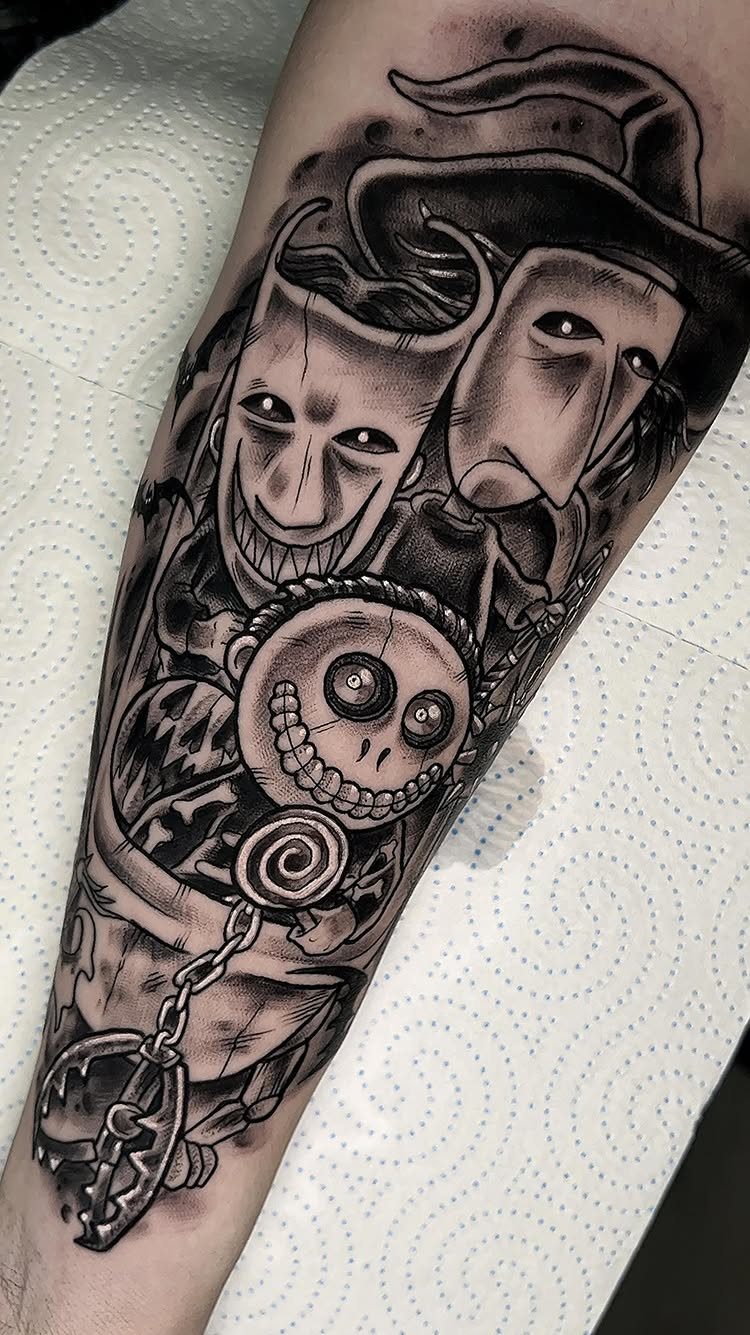
Lock, Shock, and Barrel as a trio give you all three troublemakers in one piece. The masks are their most recognizable feature, and black and grey keeps the line work sharp without competing colors.
The masks alone make the characters identifiable even without the full costumes or background details.
25. Vibrant Jack and Sally Forearm Tattoo
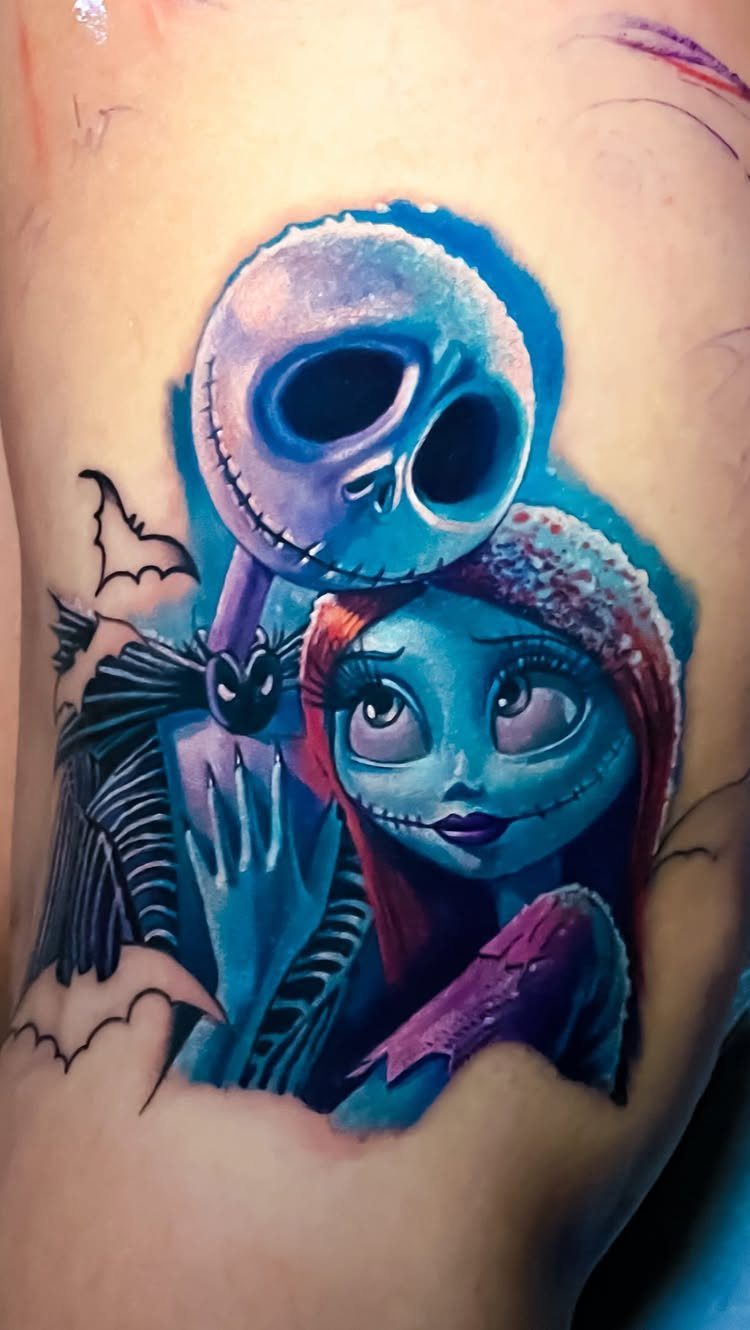
Saturated color like this pulls Jack and Sally into a more stylized space than the film’s muted palette.
The blues and purples give the piece a glow that black and grey can’t replicate, and the small bat fills the gap without adding another character.
Forearm placement keeps both faces visible without wrapping. The composition stays narrow enough that it doesn’t need the full width of the arm, and the flat surface heals cleanly.
Most artists pack color in 2 passes so the intensity stays even as it heals.
26. Sandy Claws and Oogie Scene
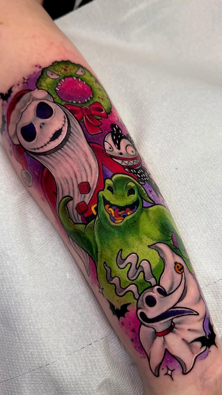
Jack in his red Santa suit shifts the focus to the Christmas half of the film instead of just the Halloween side.
Pairing him with Oogie and Zero covers both villain and sidekick in one piece, and the purple and pink background separates the characters from plain skin.
Color makes the Santa suit read clearly. Greyscale would bury the red lantern glow in mid-tone shadow, and this design lives on contrast.
Forearm gives you space for 3 characters without cramping the composition.
27. Black and Grey Jack and Sally
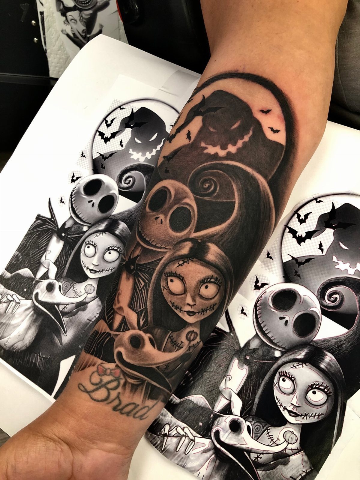
Black and grey without background detail keeps the focus on Jack and Sally’s faces. The shading gives them dimension, and the simple pairing ages well since there’s no color to fade or heavy background to compete with the characters.
Forearm works for a vertical pair. The placement sits where you see it often, and the muscle curve adds depth without distorting the faces when the arm bends.
This finishes in 1 session if the shading stays minimal.
28. Oogie Boogie and Zero Tattoo
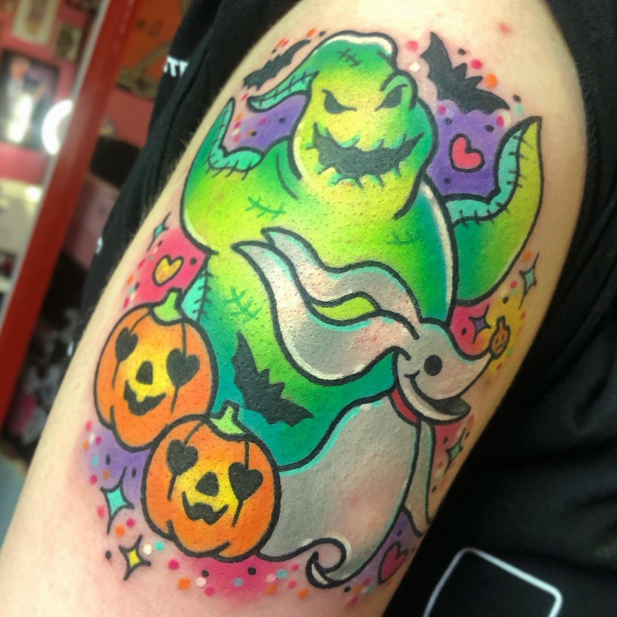
Pairing Oogie with Zero and carved pumpkins covers villain and sidekick while pulling in the Halloween imagery. The bats and stars fill space without crowding, and color lets the pumpkins glow the way they do in the film.
The upper arm lets you group characters side by side instead of forcing them around the curve. The composition sits on flat muscle, so the details heal cleanly.
Color keeps the pumpkins recognizable. Black and grey would flatten them into shapes instead of glowing carved faces.
Meaning of Nightmare Before Christmas Tattoos
These tattoos signal loyalty to Tim Burton’s 1993 stop-motion film and the aesthetic it brought with it: gothic lines, whimsy without softness, Halloween and Christmas crashing into each other.
The film became a cult classic by treating both holidays as equal territory instead of picking one, and fans who tattoo it usually connect to that refusal to choose sides.
Jack Skellington represents the urge to try something new even when it goes wrong. Oogie Boogie is mischief without apology.
The film’s 1993 release brought stop-motion back into view, and you can see its mark on Coraline and Corpse Bride.
A tattoo of it is often tied to nostalgia for the era when that style first reached wide audiences, or to childhood memories of watching it on repeat.
Popular Styles for These Tattoos
Traditional style gives you bold outlines and flat color blocks that hold up cleanly over time. The thick lines hold up well as the tattoo ages, and the limited palette keeps the piece readable.
The style fits characters like Sally, where detail in the stitching or dress matters, or Oogie Boogie, where texture in the burlap separates the design from a flat silhouette.
Illustrative work pulls directly from the film’s animation style.
Line weight varies, shading is softer, and the tattoo reads more like a still from the movie than a reimagined version of the character. This style works when you want the design to match the source material exactly.
Cultural Significance
The film sits at the center of a specific subculture: people who grew up on Hot Topic aesthetics, who still wear striped tights and skeleton jewelry, who treat Halloween as the year’s main event.
A tattoo from it signals membership in that group.
Its staying power comes from the fact that it never aged into a relic of the 90s.
The animation style, the Danny Elfman score, and the character designs still feel current because they weren’t chasing a trend when the film was made.
Burton’s gothic sensibility found a wide audience with this film, and it became a gateway for people who later moved into darker animation, horror, and alternative fashion. The tattoo often represents that first exposure to something outside the mainstream.