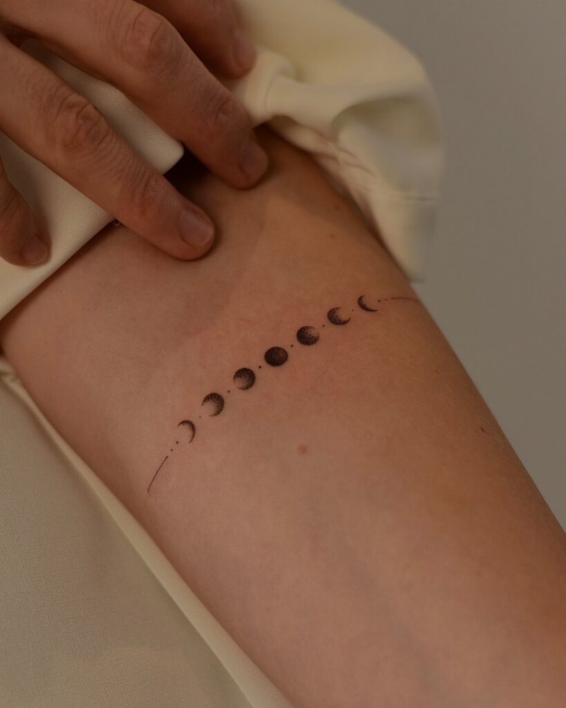
Moon phase tattoos range from simple black line sequences in the lower to mid hundreds to detailed designs with florals, chakras or geometric frames that cost more and take longer.
1. Moon Phase Tattoos as Symbols of Personal Transformation
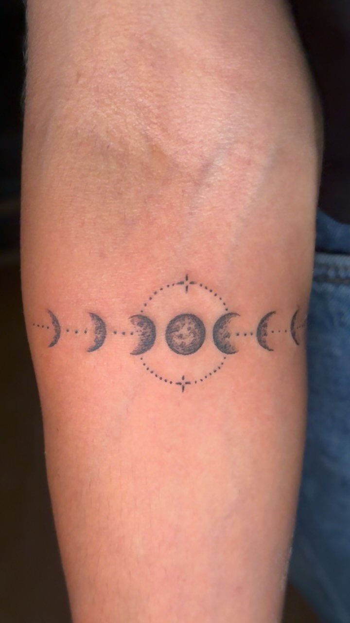
The phases run horizontally, usually across the forearm or upper arm, and the dotted circle around the full moon centers the sequence.
People reach for this because the cycle reads as change that returns, the kind you live through and come out different on the other side.
Placement matters. The forearm keeps it visible to you, which suits a piece tied to your own path.
Upper arm or ribcage work just as well if you want it more private. A simple black line version typically runs in the lower to mid hundreds, more if you add shading or detail inside each phase.
The line format lets you adjust: you can stretch it along a collarbone, wrap it around a wrist, or stack it vertically down the spine.
2. Floral Moon Phase Tattoo
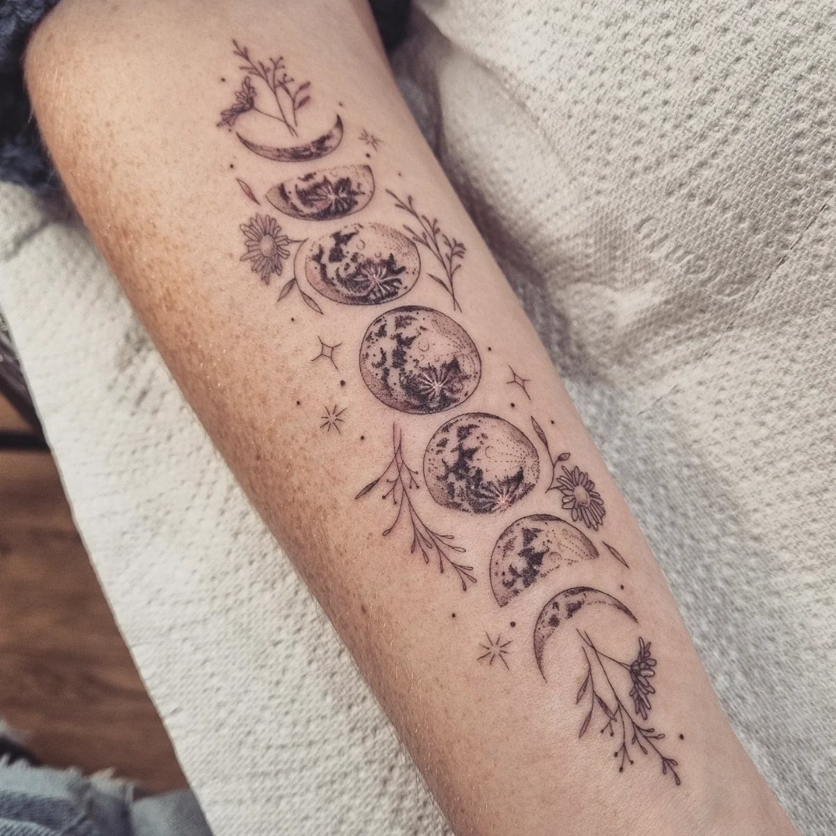
Flowers woven between the moon phases soften the geometry and tie the cycle to growth, not just time. The visible example shows leaves, petals and a small butterfly filling the gaps, which keeps the piece from reading as purely astronomical.
This approach works best when the florals mean something on their own.
A birth flower, a plant tied to a memory, or even just a shape you like all justify the addition. If the flowers are only decoration, the piece can look busy without adding much.
Scale up for detail.
A design this dense needs several inches of length so the phases stay readable and the petals don’t blur together as the ink settles. Forearm and thigh give you that space without forcing the design into awkward proportions.
3. Geometric Moon Cycle Tattoo
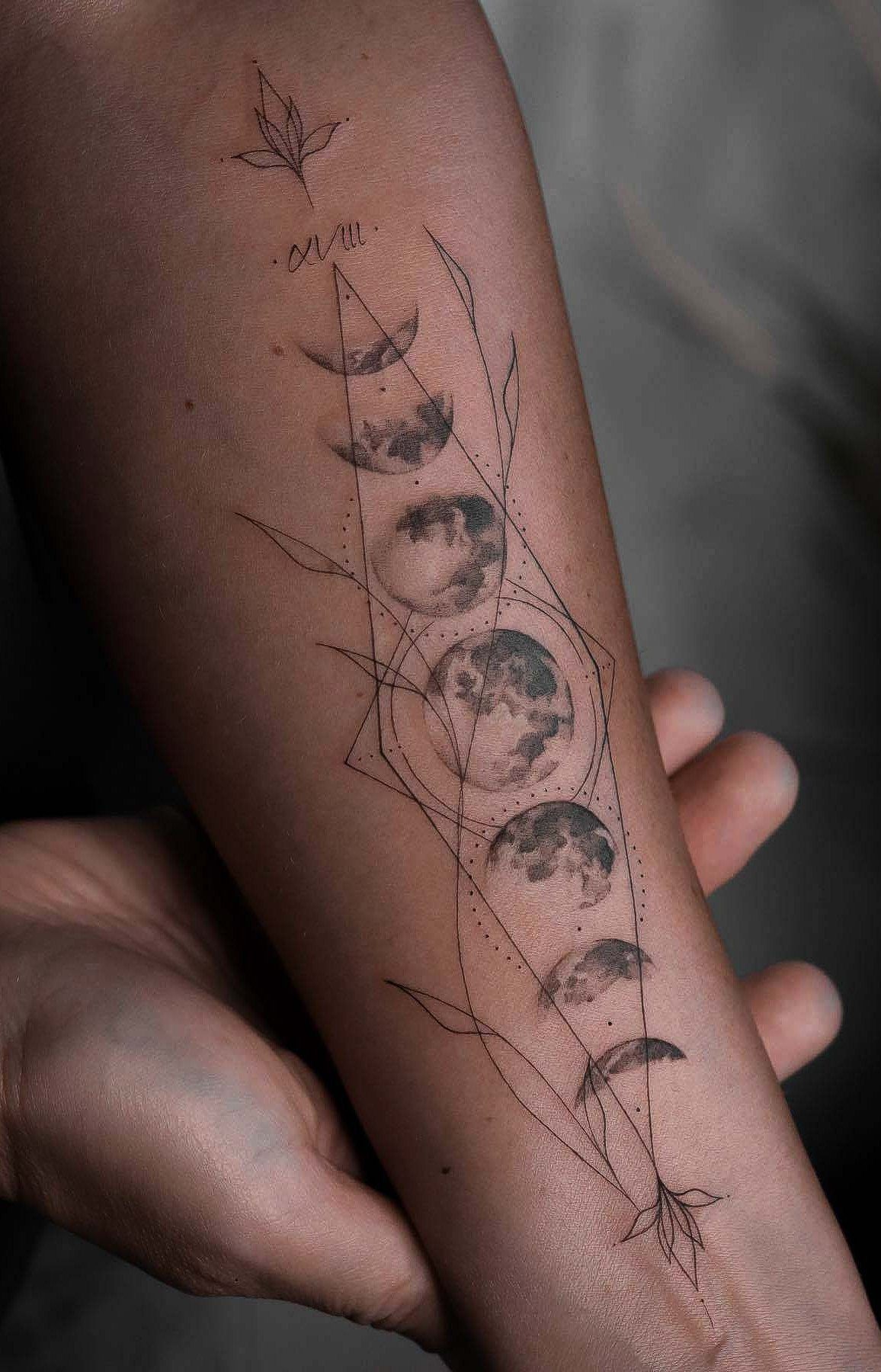
The phases sit inside a geometric frame, often a diamond or triangle, with linework that divides the space into sections.
This style suits people who already lean toward minimalist or line-based work. The clean edges age well because there is no shading to fade unevenly, just black lines that either hold or need a touch-up.
Artist choice matters here. Someone who works in fine line or geometric styles will give you crisp angles and consistent weight.
A traditional artist may round the corners or thicken the frame, which changes the feel entirely. Bring references that match the sharpness you want.
4. Vertical Moon Phases Tattoo
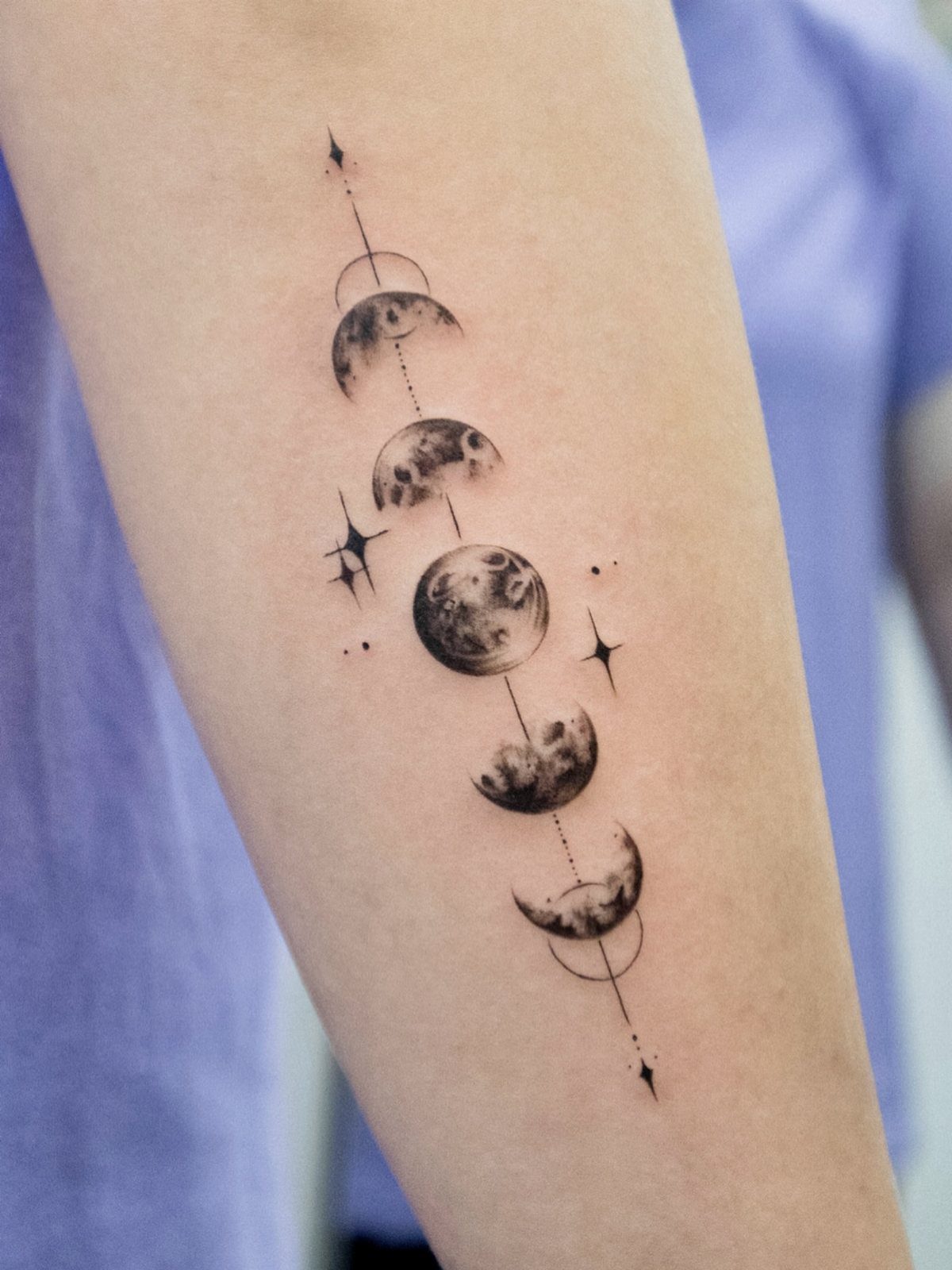
Vertical alignment fits narrow spaces: the spine, the side of the forearm, the back of the calf. The phases stack from new moon to full and back, often with small stars or a connecting line so the eye keeps moving.
This orientation reads quickly, which matters if you want something that registers at a glance rather than asking people to tilt their head.
The downside is that vertical pieces on the forearm can look stretched if the phases are spaced too far apart. Keep the intervals tight or add filler elements like stars or dots to bridge the gaps.
A piece this size with shading on the moons typically runs in the low to mid hundreds. Simple line work costs less, but the phases lose dimension without at least a gradient inside the crescents.
5. Cat Moon Phases Tattoo
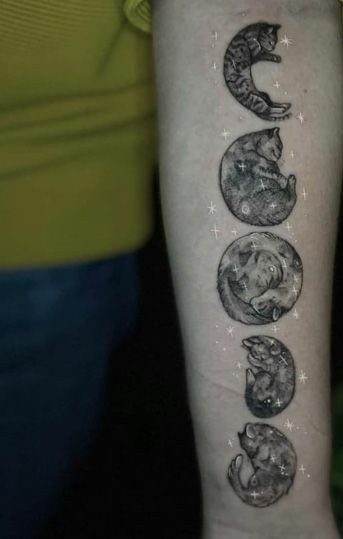
Cats replace the moons, curled into crescent and full shapes, with their bodies forming the phases. The example shows 5 cats across the arm, which covers new moon through full and back to waning crescent.
This reads as playful without losing the cyclical meaning, and it suits people who want something recognizable but not literal.
The cats make it personal in a way that plain moons do not, especially if you already have a cat or just prefer animals to symbols.
The design needs an artist comfortable with animal forms.
A cat curled wrong looks stiff, and the phases only work if the curve of the body matches the actual shape of that moon. Look for portfolios with organic linework and animals that have weight to them.
Stars fill the negative space, which keeps the piece from floating. Without them, the cats can look disconnected.
6. Butterfly Moon Phases Tattoo
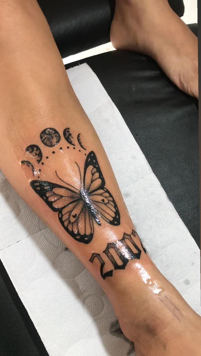
The visible piece includes a year, which grounds the design in a specific moment rather than leaving it abstract.
Butterflies already symbolize change, so pairing them with the lunar cycle doubles down on transformation. That works if both ideas resonate, but it can feel redundant if the phases alone would have been enough.
I prefer this when the butterfly has its own meaning: a memorial date, a personal milestone, something that justifies adding another symbol.
The year makes this version specific.
If you are marking a birth, a loss, or a turning point, the date anchors the design. Without it, the butterfly and phases can read as generic.
Placement follows the same logic as a floral version: forearm, thigh, or upper arm, anywhere with enough length so the elements don’t crowd.
7. Chakra Moon Phase Tattoo
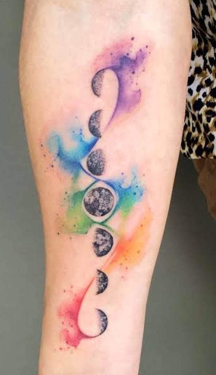
The watercolor chakra background ties the moon cycle to energy centers in the body, which matters if you already work with chakras or want the phases to read as internal rather than just celestial.
Color changes the maintenance.
Watercolor fading is real, and the bright splashes behind the moons will soften faster than black linework. Budget for a touch-up every few years if you want the colors to stay vivid.
This version suits people who want something more spiritual than a standard phase sequence. Without the chakra layer, plain moons would have done the job.
8. Moon Phases Tattoo with Stars
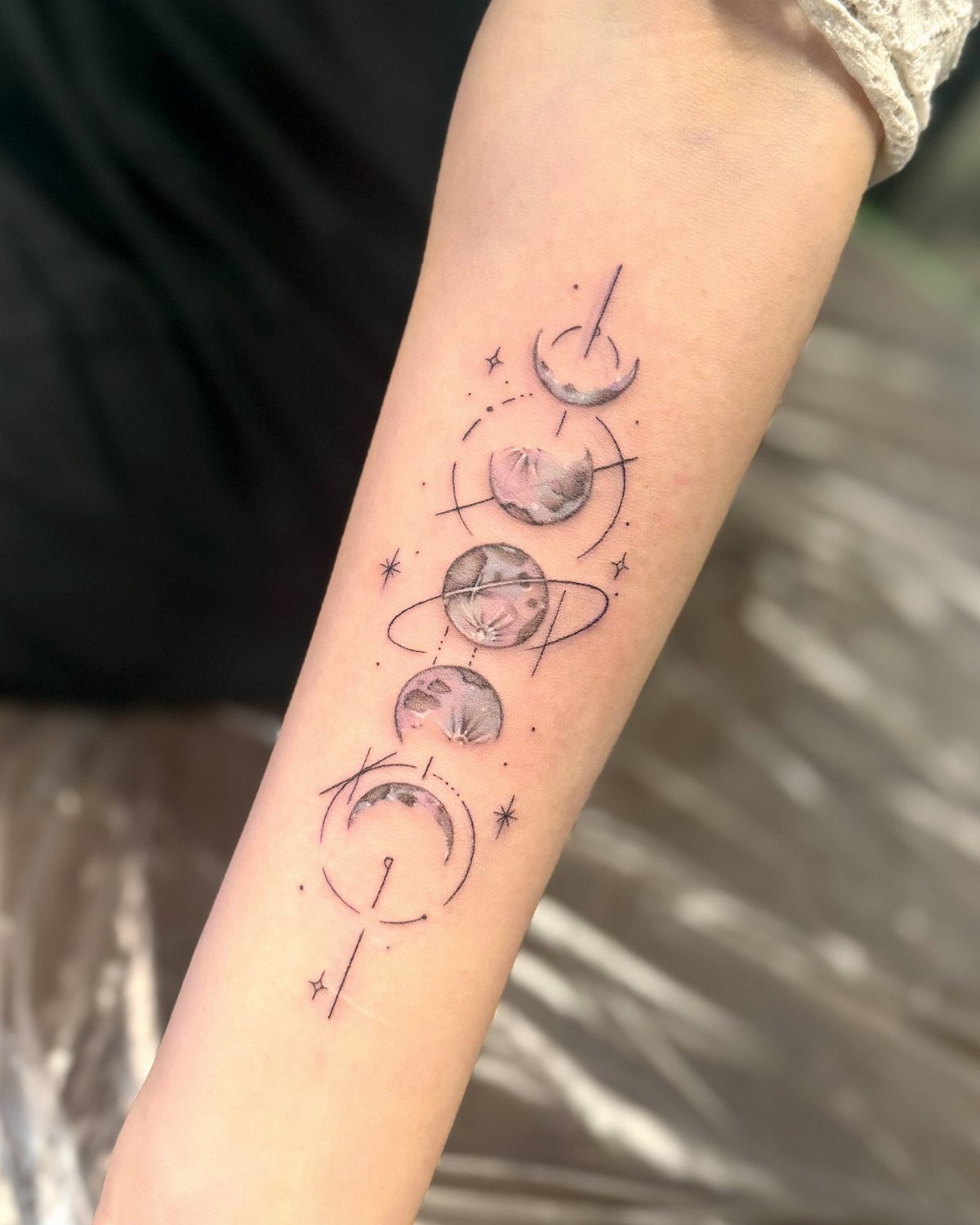
Stars and small planets fill the space between phases, which keeps the design from looking sparse and adds depth without changing the core meaning.
The vertical format fits narrow placements better than horizontal, and the added elements let you adjust length without stretching the moons themselves. More stars mean more coverage; fewer keep it cleaner.
This approach works if you want the phases to feel cosmological rather than symbolic. The stars make it about the sky, not just the cycle.
9. Simple Moon Phase Tattoo
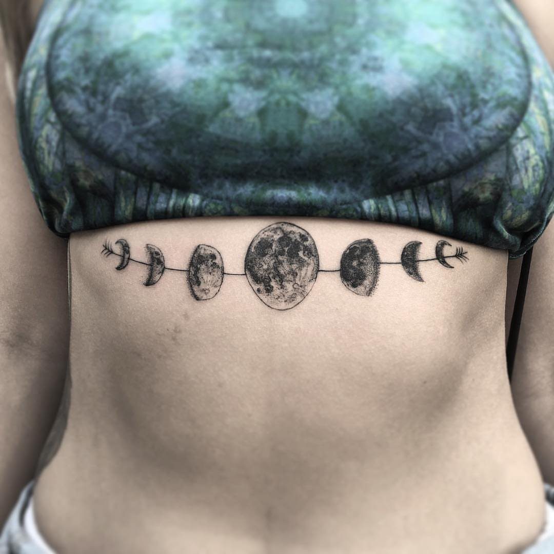
A black ink sequence with no filler, no frame, no added symbols. The phases run across the stomach in a straight line, readable at a glance.
This version costs less and heals faster because there is less ink going in. A simple design like this typically runs in the lower hundreds, depending on size and artist rates.
Placement on the stomach means it moves with your body, so the phases may not stay perfectly aligned if your weight changes. Forearm or upper arm hold shape better over time.
Meaning of Moon Phase Tattoos
Moon phase tattoos mark personal cycles: change you move through, recover from, or choose to repeat. The crescent-to-full-to-crescent sequence reads as transformation with a return built in, which suits anyone tracking growth that does not move in a straight line.
A vertical arrangement with a central full moon and orbital line keeps the design centered on one moment in the cycle, while a simple dot-and-crescent progression spreads the focus evenly across all stages.
Black ink keeps the meaning readable.
Shading inside the moons adds dimension, but a flat silhouette version works just as well and costs less. The design does not need extra symbols to carry weight; the phases alone say enough.
Placement Ideas for Moon Tattoos
The spine gives you a straight vertical line that fits the phases without forcing them into awkward spacing.
The design runs from the base of the neck down, with each phase stacked in sequence. Shading and small stars fill the gaps so the piece does not look disconnected.
Horizontal or vertical both work here, though vertical fits better if your forearm is narrow.
The back offers more width, so you can space the phases farther apart or add larger elements between them without crowding.
A piece on the back stays private unless you choose to show it, which suits designs tied to internal change rather than public milestones.
Combining Elements in Moon Tattoos
Stars and curved lines around the phases make the design feel cosmological rather than purely symbolic.
A vertical arrangement with stars scattered between crescents keeps the eye moving and fills space without adding new meaning. The stars work as filler, nothing more.
A full moon with radiating sunbeams in the center of the phase sequence combines lunar and solar imagery, which shifts the design toward balance between opposing forces.
That addition only makes sense if both symbols resonate; otherwise the sun reads as decoration.
Generic petals just make the piece busier.