A Disney sleeve can stack characters vertically in black and grey, layer them with florals, sit them against swirling color, or keep them as simple line art depending on how much coverage and detail you want.
The choice between watercolor characters, full color, black and grey or line art comes down to how much detail you want and how often you plan to book touch-ups.
Mixing characters with large florals gives the piece breathing room and keeps a crowded collage from feeling too dense, while a vertical stack works best on the narrower canvas of the lower leg.
1. Princess Portraits
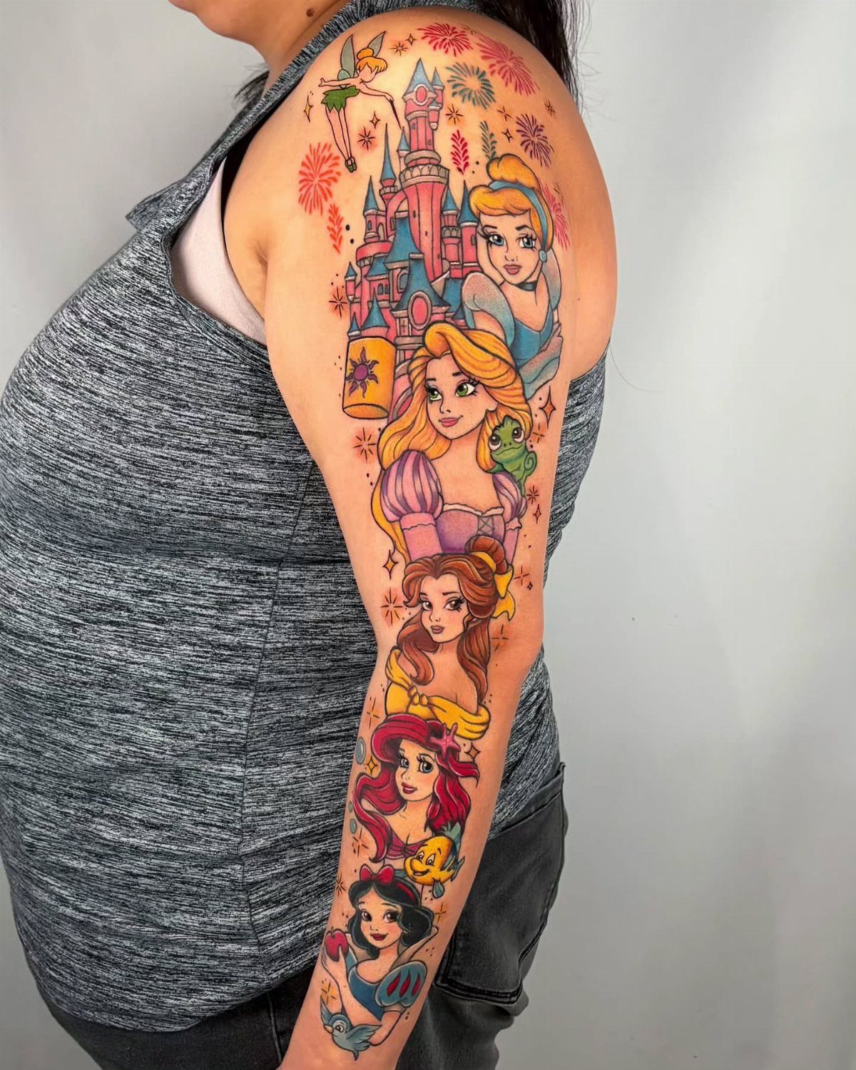
Classic princess faces lined up along the arm, each one in full color with enough space to let every portrait read clearly.
The piece keeps each character recognizable from a distance, which matters when you’re packing multiple faces into one sleeve.
Most princess sleeves lean heavily on pink and purple, so adding a castle or other architectural detail gives the composition something to anchor against.
The portraits can run shoulder to wrist or stop at the forearm, depending on how many characters you want to fit.
2. Vertical Arrangement of Characters in Black and Grey
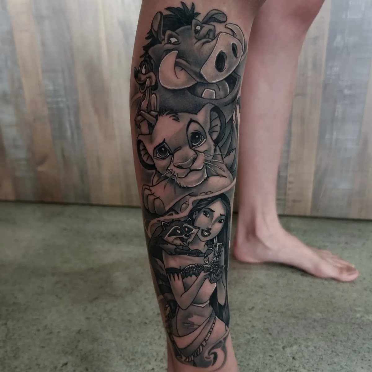
Stacking characters vertically in black and grey keeps the focus on line work and shading instead of competing colors. I like this approach when you want a cohesive look across different movies without worrying about clashing palettes.
The lower leg offers a narrow canvas that suits a vertical stack, and black and grey ages more predictably than bright color.
Each character gets its own section, separated by negative space or subtle background elements. Simba, Pumbaa, and Jasmine sit at different scales here, which adds rhythm to the piece.
3. Watercolor-style Characters
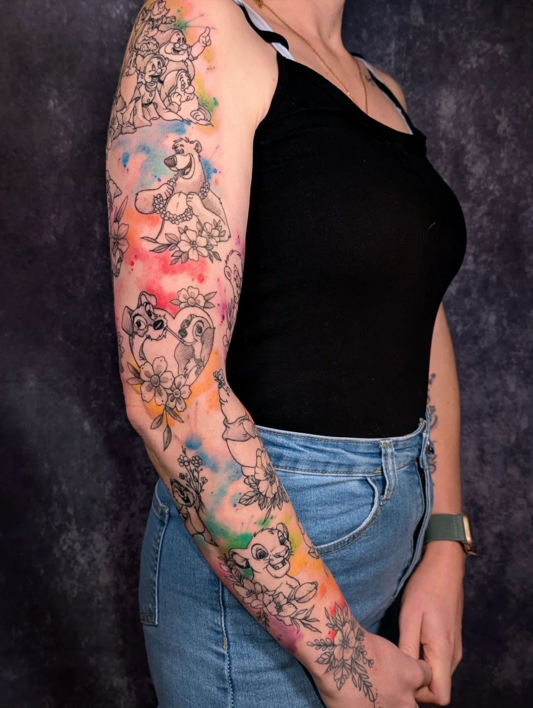
Watercolor splashes soften the edges of each character and tie the whole sleeve together without needing a single background scene.
The splashes bleed into one another, so the arm reads as one piece instead of separate tattoos placed side by side.
This style works best when the character outlines stay crisp and the color bleeds outward, not into the figure itself.
Watercolor fades faster than solid color, so plan on a touch-up every few years if you want the splashes to stay bright.
4. Colorful Full-sleeve
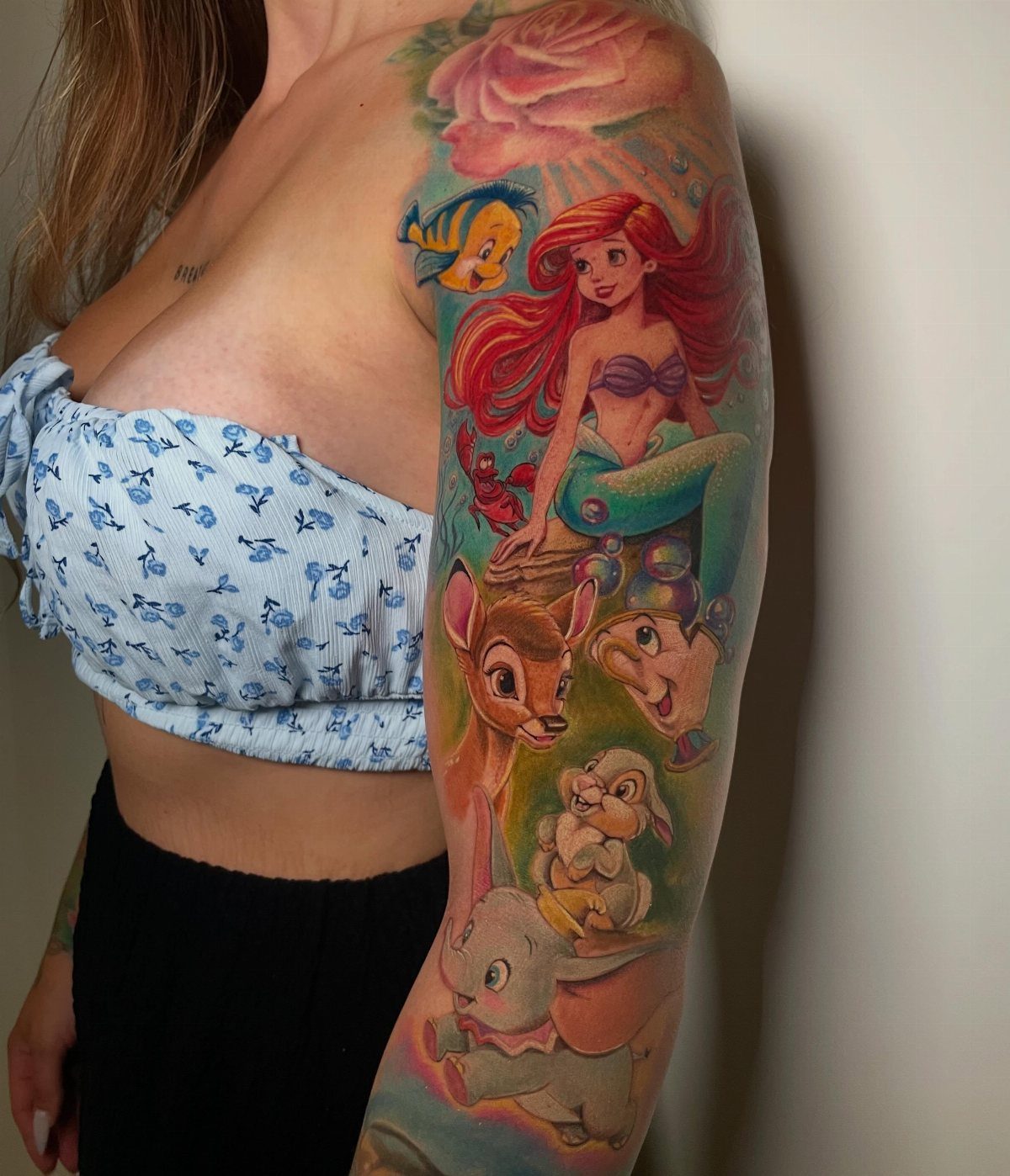
Mix characters from different eras, each one rendered in its original animation style. Ariel, Bambi, Dumbo, and Flounder sit at different sizes, which lets you balance the composition without forcing every face to the same scale.
The colors stay true to the source material, so the piece reads immediately as Disney even from across the room.
This approach takes longer to complete than a black and grey sleeve, with multiple sessions depending on how much detail you want in each character.
More than 10 Disney movies represented in one tattoo, with a hidden Mickey to boot.
— BuzzFeed
5. Vertical Stack of Characters
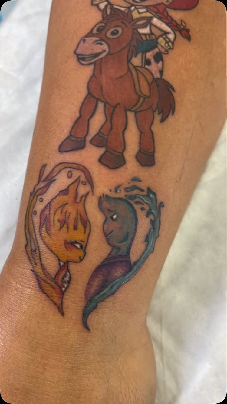
This sleeve combines characters from Toy Story and Elemental, stacked vertically with Bullseye at the top and the fire and water spirits below.
A vertical stack works well when the characters differ in shape and color. Bullseye’s brown and white contrast with Ember’s orange and Wade’s blue, so each one holds its own space without blending into the next.
6. Characters Interspersed with Floral Designs
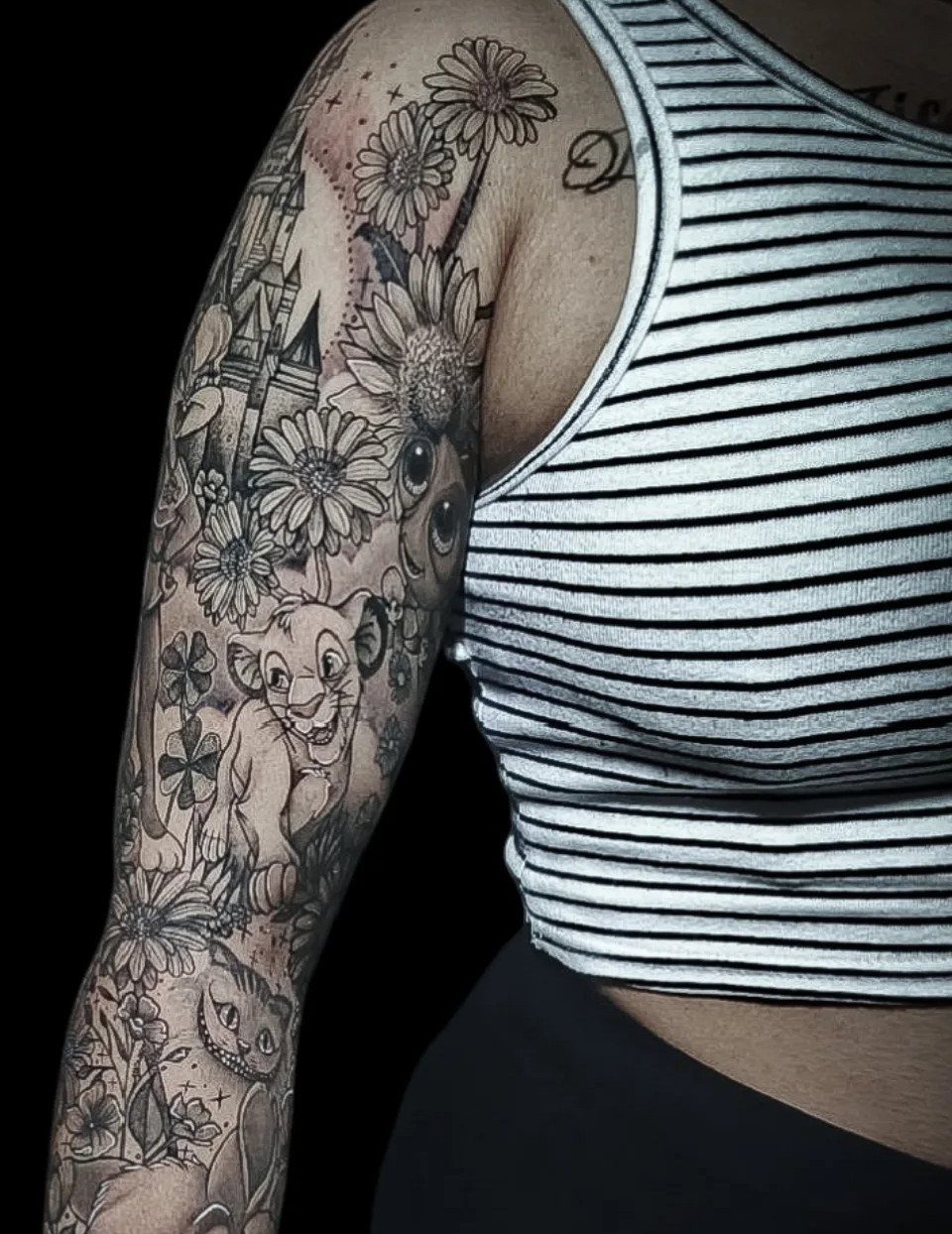
Mixing Disney characters with large florals gives the sleeve breathing room and breaks up what could otherwise feel like a crowded collage.
Simba and the Cheshire Cat sit among daisies here, all in black and grey, which keeps the piece from feeling too busy.
Flowers fill negative space naturally and give the artist something organic to wrap around the arm’s contours.
I prefer this approach when you want a softer look than an all-character sleeve but still want the characters to be the main focus.
7. Characters Set Against a Swirling Colorful Background
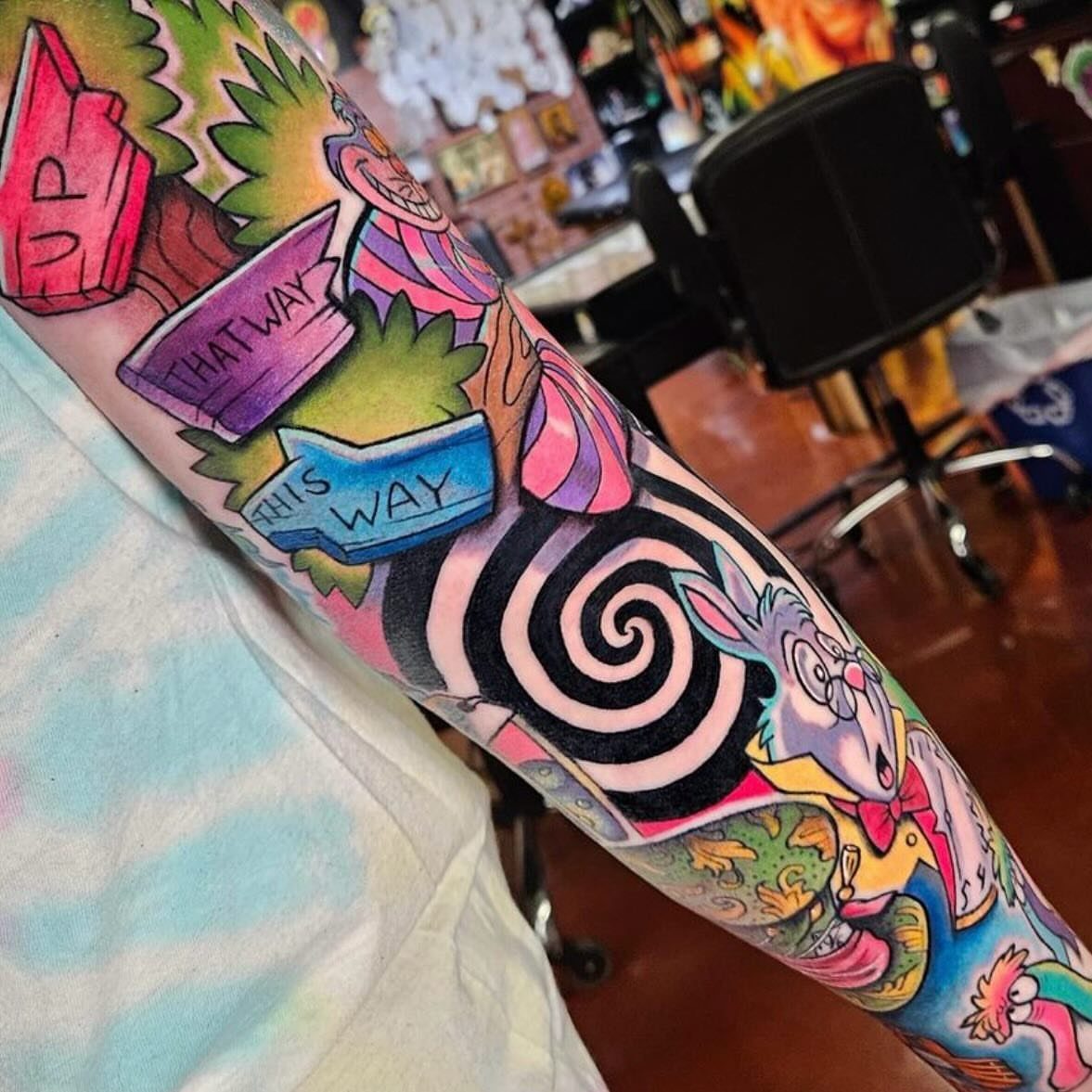
The spiral anchors the composition and gives the eye somewhere to land between characters. Alice in Wonderland lends itself to this treatment because the story already moves through distorted space and shifting scale.
Bright pastels against black and white geometric elements create contrast without needing a single unifying background scene.
The directional signs add motion and reinforce the disorientation that makes Wonderland work as a tattoo theme. This approach suits readers who want color but prefer graphic structure over scenic illustration.
8. Simple Line Art of Characters
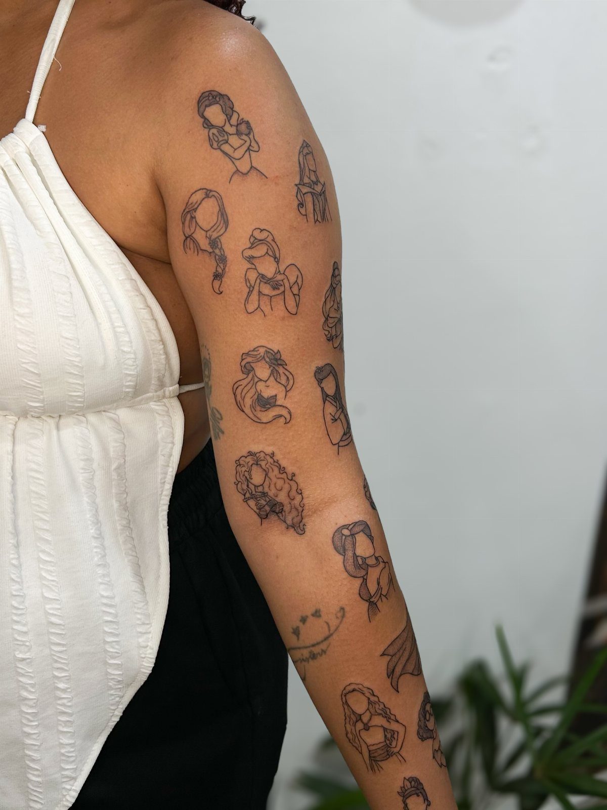
Line art strips each character down to its silhouette, which makes it possible to fit more faces into a smaller area without the piece feeling dense.
Belle, Ariel, and Jasmine stack vertically here, each one small enough to sit above the elbow.
This style ages well because there is no color to fade and no fine shading to blur.
Simpler features hold up better at this scale, while intricate details start to blur. I’d choose this when you want a collection that can grow over time without committing to a full-color sleeve.
Tattoo Styles and Techniques
If the splash runs through the figure itself, the character loses definition as the tattoo settles.
Black and grey holds detail longer than full color because there’s no saturation to fade. Shading can blur over time, but the contrast between light and dark stays readable where bright hues might shift or pale out.
Minimalist line art scales down better than rendered portraits. A 2-inch face in full color needs enough detail to read as that character, while a line silhouette stays recognizable at half the size.
Character Choices
Princesses dominate most Disney sleeves because their faces are distinct and their color palettes are already designed to stand out.
Ariel’s red hair, Belle’s yellow dress, and Jasmine’s teal outfit each anchor a section of the arm without blending into the next character.
Classic figures like Dumbo, Bambi, and Simba work when you want an all-ages feel instead of a princess-heavy piece.
Their outlines are cleaner and their poses more compact, so you can group them tightly or spread them across the sleeve without building a single backdrop to hold them all together.
Villains show up less often but offer stronger graphic contrast. Maleficent, Ursula, and Cruella have sharper lines and darker palettes, so they balance a sleeve that might otherwise lean too soft or pastel.
Placement Options
Covering shoulder to wrist opens room for 8 to 12 characters depending on their size and how much background you add. Stopping at the forearm cuts that number roughly in half but keeps the piece visible in short sleeves.
Leg sleeves suit vertical stacks because the calf is narrower than the tricep and bicep. Characters sit one above the other instead of wrapping around, which simplifies the composition and makes each figure easier to read from the front.
Half sleeves end at the elbow and work when you want a complete piece without committing to a full arm.
You can always extend it later, but starting smaller lets you test how a Disney theme sits on your body before covering more skin.
Frequently Asked Questions
Can you get a Disney tattoo?
Yes, Disney sleeves are common and include everything from princess portraits to classic characters like Dumbo and Simba.
You can arrange them vertically, mix them with florals, or set them against a colorful background depending on how much coverage you want.
Most artists are familiar with Disney work and can match the animation style or simplify it into line art.
Is $10,000 too much for a tattoo sleeve?
A complete wrap from shoulder to wrist with 8 to 12 characters in full color can easily reach that range, especially if you’re adding detailed backgrounds or watercolor effects.
Black and grey work costs less per session because it skips the color packing, and stopping at the forearm instead of the wrist cuts the total hours roughly in half.
Price scales with detail, so line art or simple silhouettes cost less than rendered portraits.