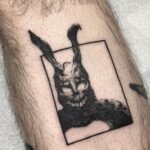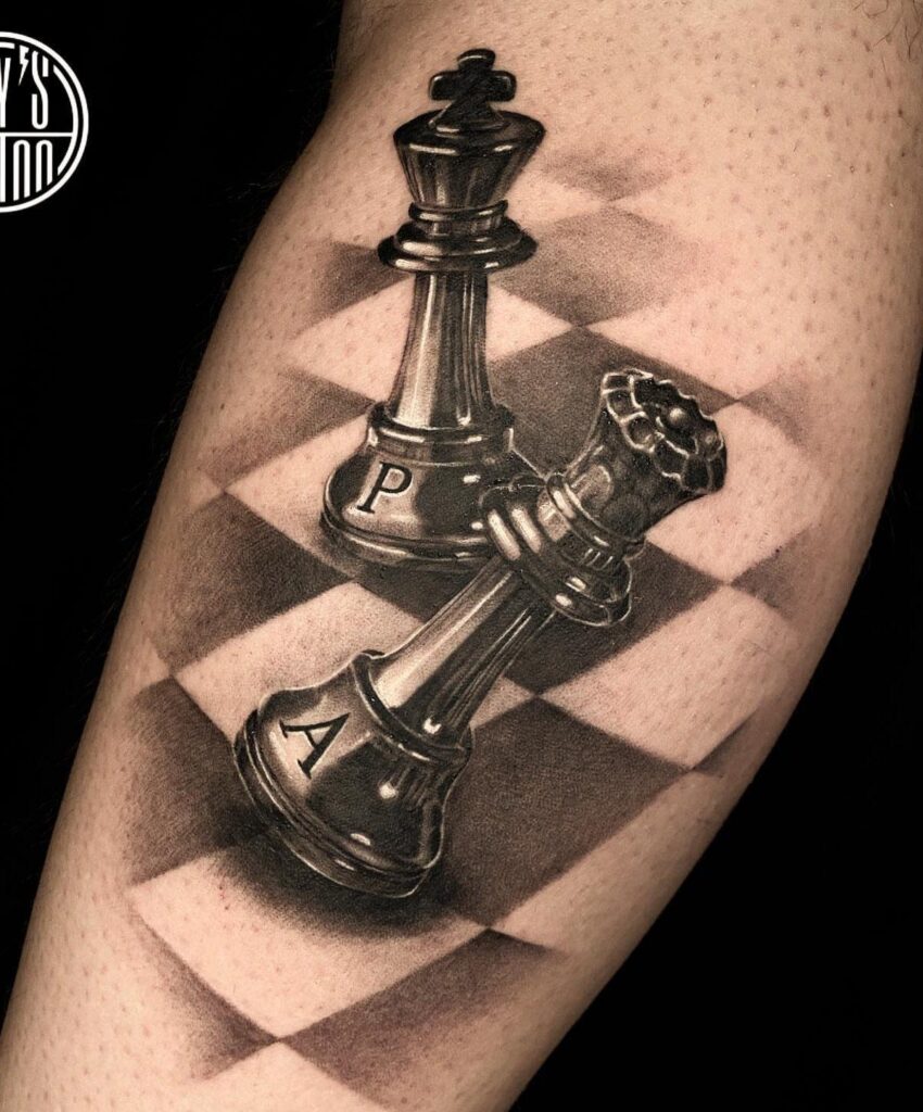
A pawn casting a shadow in the shape of a king tells the underdog story in one image, while a metallic king piece in black and grey realism looks carved from steel.
Placement decides readability: forearm gives you flat space for crisp lines and vertical length for stacked elements, while ankle keeps the piece small and easy to cover but limits fine detail over time.
1. Queen Chess Piece Tattoo
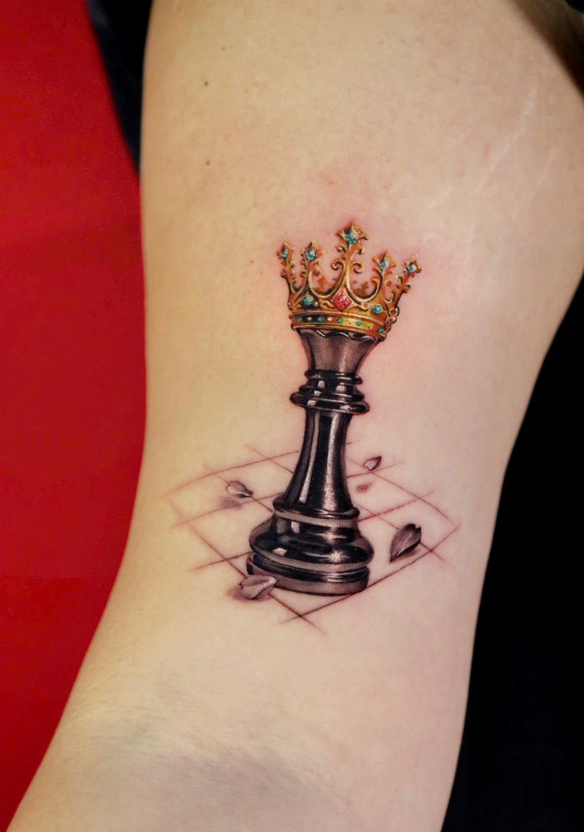
The queen stands as the most powerful piece on the board, and that strength translates well to ink. Most people place this one on the forearm or upper arm where the vertical shape of the piece reads cleanly.
Adding a crown in gold or color gives the design a regal accent without turning it busy. A sketched chessboard beneath the piece grounds it in context, and the perspective grid adds depth while keeping the background minimal.
This works as a standalone piece or as the start of a chess-themed sleeve.
2. Matching King and Queen Tattoos
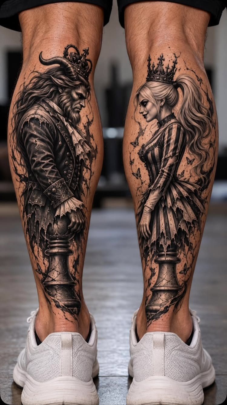
Matching king and queen pieces work when both people want something that signals the relationship without spelling it out in script. Placing them on the same body part, like calves or forearms, keeps the mirror effect strong.
Human figures carved into the pieces add character and make the design feel less like a symbol and more like a portrait. Black ink with gradual shading keeps the details sharp and focused.
If one of you wants more detail than the other, sizing the king slightly larger balances the composition.
3. Geometric Rook Tattoo
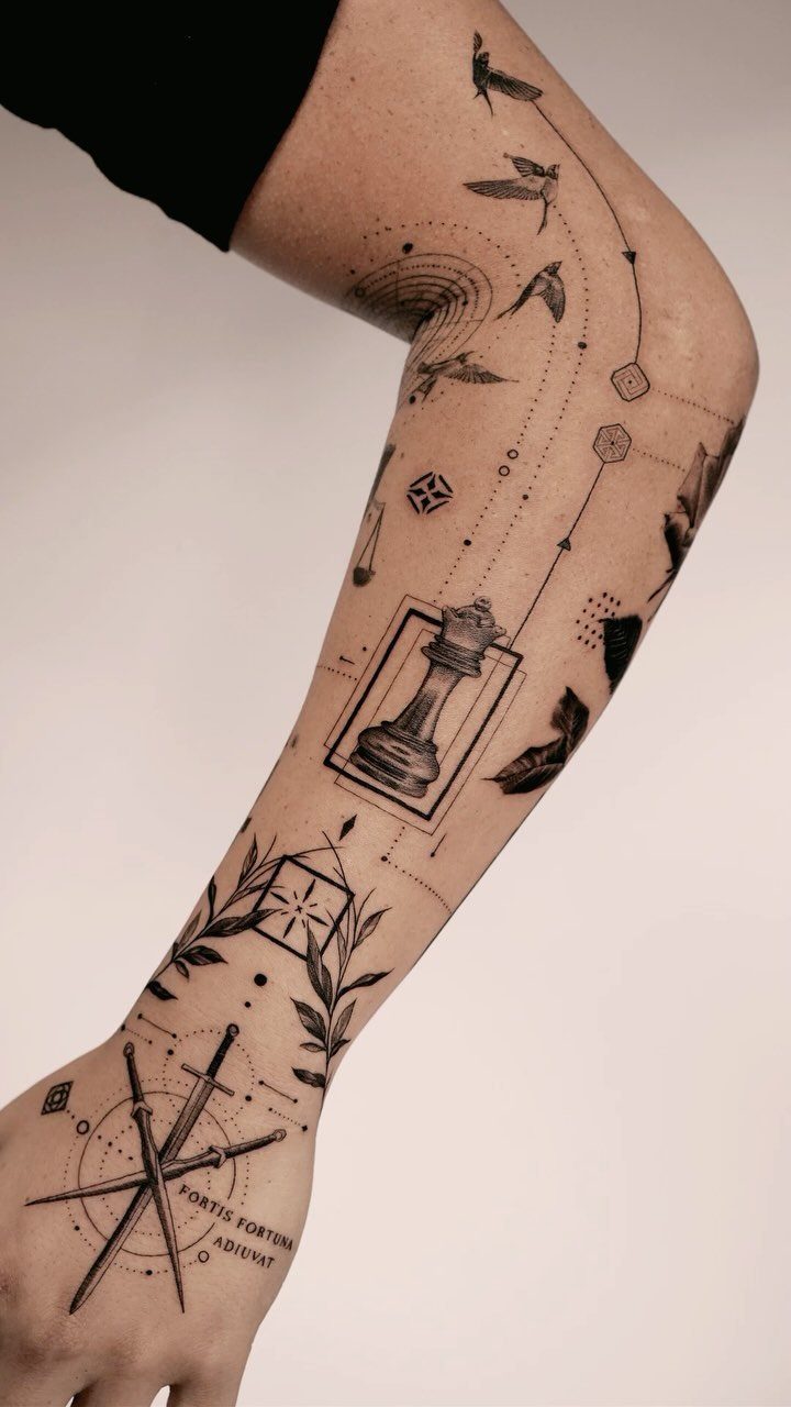
Geometric frames turn the rook into something architectural. The piece itself is already angular, so surrounding it with triangles, hexagons or linework plays to its shape instead of fighting it.
This style works well when you’re building a sleeve and need each piece to share a visual language.
The straight edges of the rook make it easier to fit into a grid or repeat pattern than a knight or bishop would be.
Placement on the lower leg or forearm gives you enough flat space for crisp, even lines.
4. Realistic Black and Grey Chess Pieces
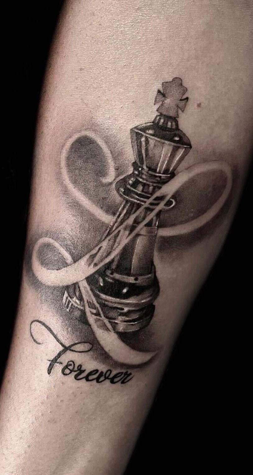
Black and grey realism gives chess pieces the weight and dimension they have in your hand.
Smooth gradients in the shading make the piece look carved from wood or stone, and a ribbon wrapped around it softens the hard edges without losing the structure.
Adding a word underneath, like "Forever," turns the piece into a memorial or dedication. The ribbon gives you a natural place to put text that reads as part of the design rather than an add-on.
Forearm or bicep placement works best for this one since the curves of the ribbon follow muscle contours.
5. Abstract Chess Piece Tattoo
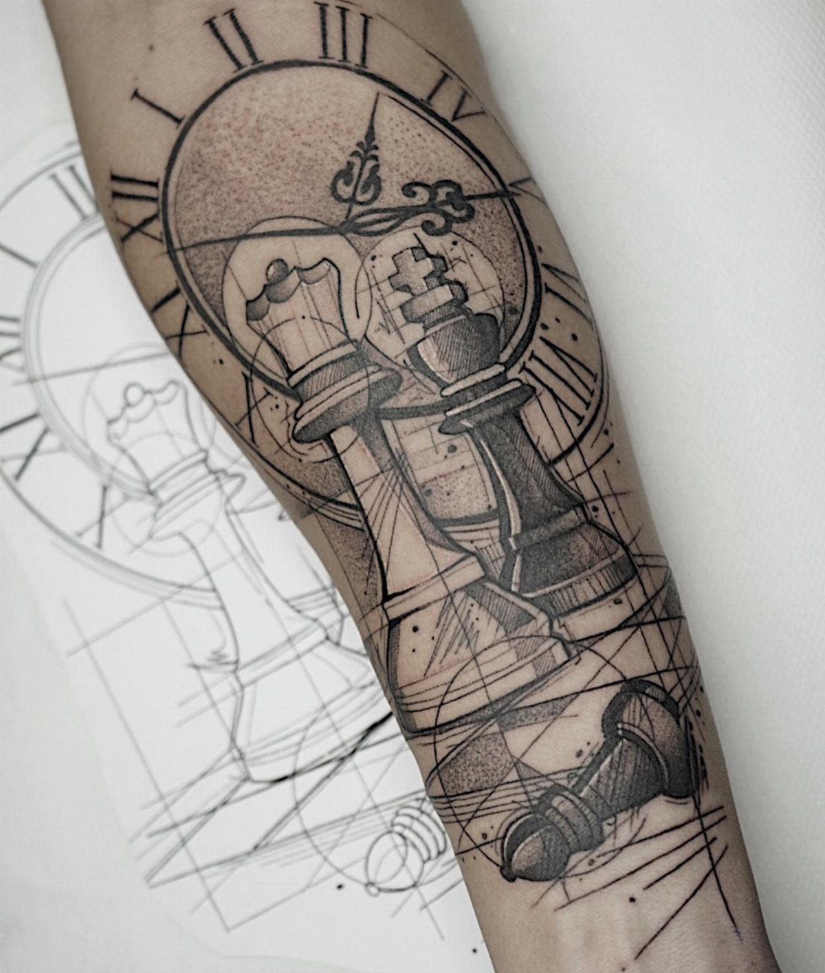
Abstract chess pieces let you layer in other elements without the design reading as cluttered. A fallen piece suggests a game in progress, and a clock face adds the pressure of time running out.
Geometric lines connecting the pieces give the composition structure and keep your eye moving through the tattoo instead of landing on one part and stopping.
This approach works when you want the piece to tell a story but don’t want script to do the telling.
Forearm placement gives you the length to stack elements vertically without crowding them.
6. Knight Chess Piece Tattoo
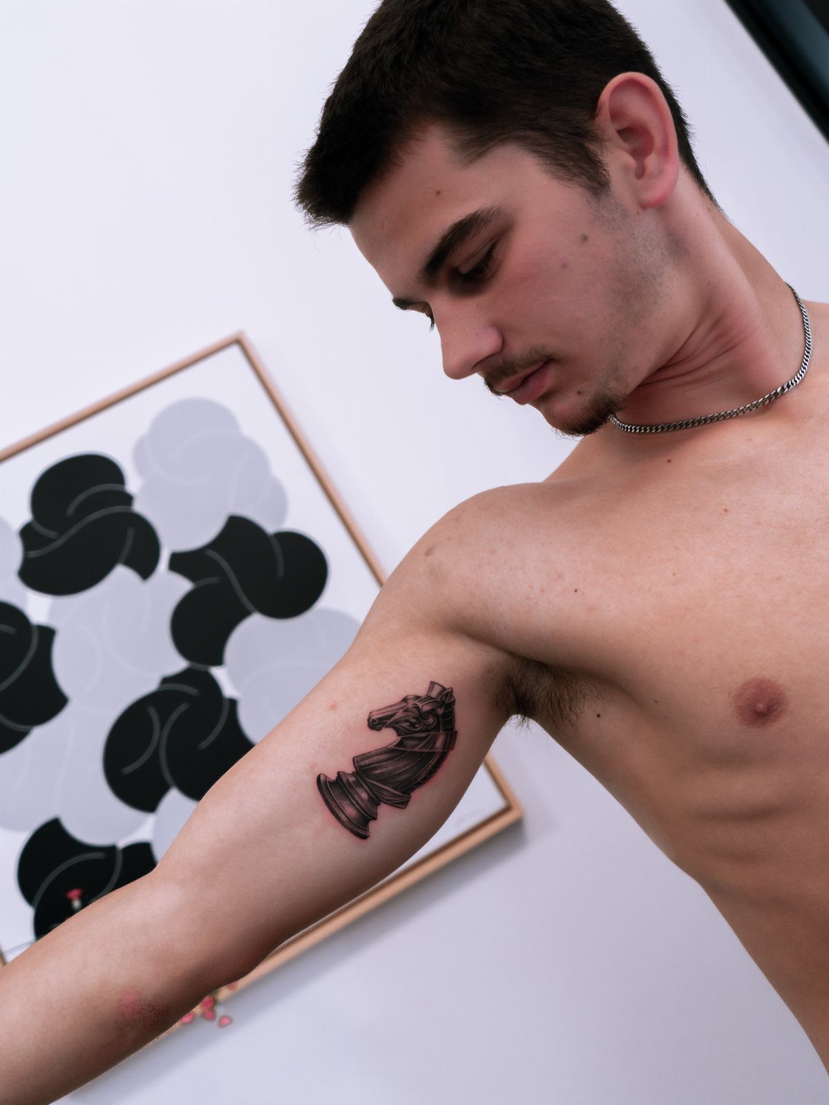
The knight’s horse head shape makes it the most recognizable piece after the king and queen. Placing it on the upper arm gives you a rounded surface that matches the curves of the piece itself.
Stylized versions, where the mane or base gets simplified or exaggerated, keep the design from looking like a product photo. Black ink with minimal shading reads fast and ages well since there’s less fine detail to blur over time.
This one works alone or as the anchor piece in a chess set spread across multiple sessions.
7. Pawn Casting Shadow
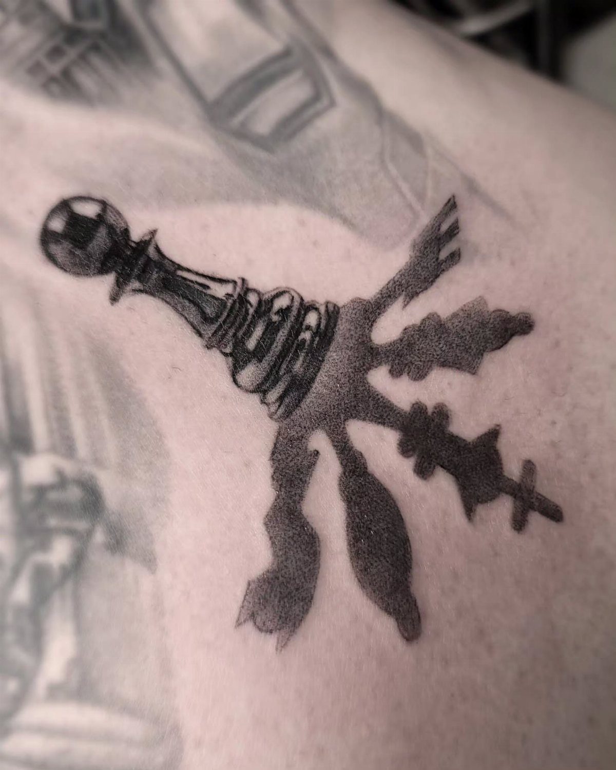
A pawn casting a shadow in the shape of a king tells the whole underdog story without text. The contrast works because the 2 shapes are both simple and instantly recognizable.
Shading in black keeps the shadow looking natural rather than graphic. The gradient from the base of the pawn into the king silhouette makes the transition read as light, not as 2 separate elements pasted together.
Forearm placement gives you a flat canvas where the shadow can stretch without distortion.
8. King Piece Tattoo
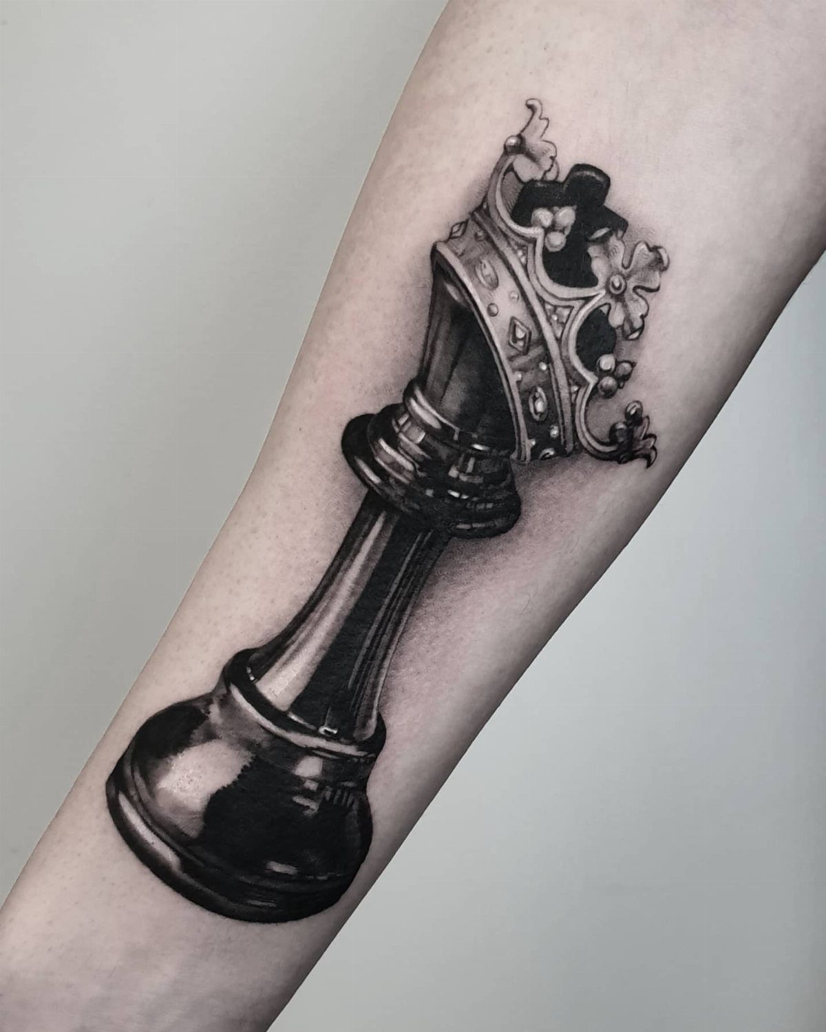
A metallic king piece done in black and grey realism looks carved from steel or polished silver. The highlight and shadow work makes the cross on top catch light the way actual metal would.
Forearm placement centers the piece where you can see it clearly, and the vertical shape of the king fits the length of the muscle without needing filler around it.
This one stands alone without needing context or other pieces to make sense.
9. Chess Piece with Checkered Background
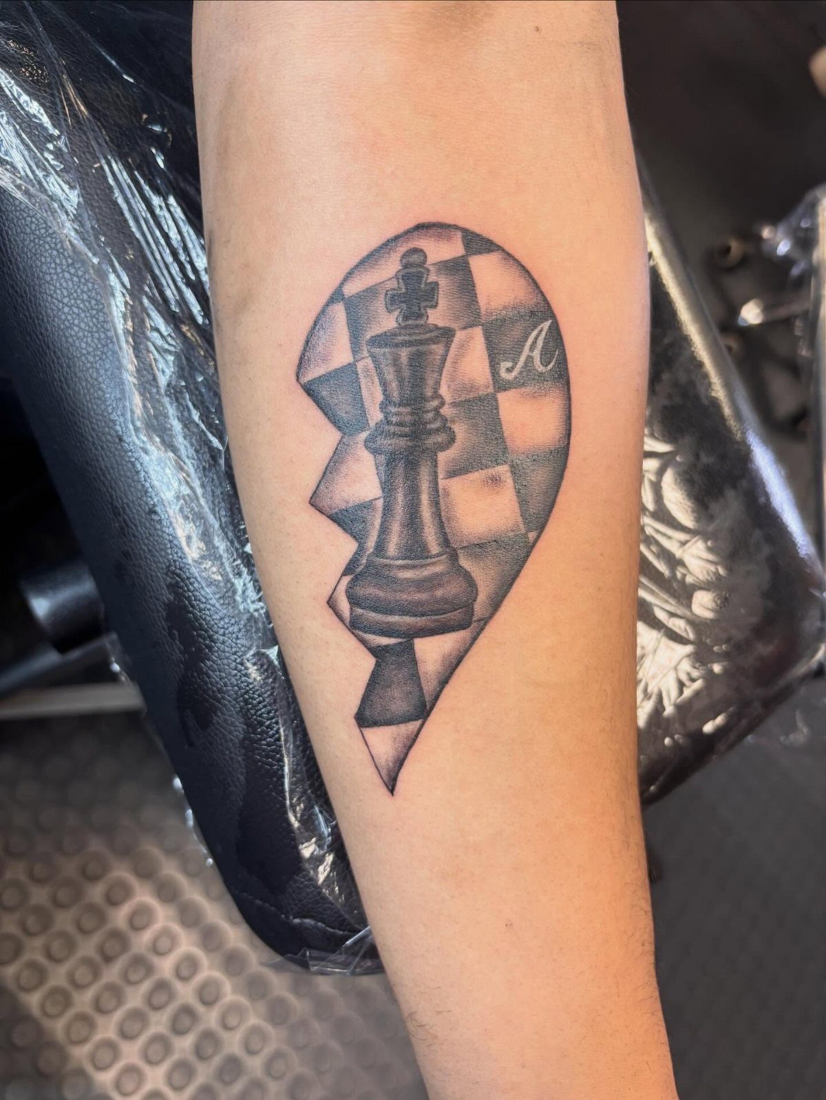
Framing the king against a checkered board pattern roots the piece in its context without needing the full game setup. The alternating squares give the background structure and keep the negative space from feeling empty.
Adding a letter in script personalizes it, though the design reads fine without one. The checkered pattern can extend as far as you want or stop at the edges of the piece, depending on how much coverage you’re after.
Upper forearm gives you enough width for the board squares to stay readable.
Symbolism of Chess Pieces
The pawn represents the starting point, the player still building toward something bigger.
The rook carries connotations of defense and stability, tied to its role protecting the back rank. Bishops, moving diagonally across the board, often signal adaptability or a willingness to approach problems from an angle.
Combining pieces in one tattoo can layer these meanings. A pawn standing in front of a fallen queen reads as sacrifice.
A knight paired with a rook balances strategy with structure. The specific pairing decides what the design says, and most people pick pieces based on which roles they connect with rather than trying to capture the whole game.
Negative space inside a larger piece, like a pawn carved into a king, shifts the symbolism toward transformation or potential.
Placement Ideas for Tattoos
Chest placement centers a single piece over the heart, a common choice for memorial designs or pieces tied to a specific person.
The flat surface works for symmetrical compositions, though muscle contours can distort horizontal lines if the design extends too far toward the sides.
Ankle tattoos keep the piece small and easy to cover, but curved surfaces limit how much fine detail will read clearly over time.
Shoulder placement follows the natural curve of the deltoid, which suits rounded pieces like the knight or designs that wrap slightly toward the back.
Back of the calf gives you vertical length without the visibility of a forearm, and the muscle holds ink well with minimal distortion during movement.
Tattoo Styles and Techniques
Blackwork relies on solid fills and negative space to define the piece.
No shading means faster sessions and bolder lines that stay crisp years down the line. The style works best when the chess piece silhouette is strong enough to read without gradients.
Dotwork builds tone through clustered dots rather than smooth shading. The texture adds visual interest to flat surfaces like the board or the base of a piece, and it ages differently than fine lines, holding detail longer in most cases.
Linework minimalism strips the piece down to its outline. The design reads fast and works at smaller sizes, though placement on areas with less movement keeps the lines crisp.