Black and white traditional tattoos skip color entirely, so they age more predictably and dodge the uneven fading that happens when reds and yellows drop out at different rates.
Blackout sleeves with reversed white linework need more commitment than bold flash: white ink fades faster than black and loses brightness within a few years.
1. Black and White Contrast
Traditional tattoos lose none of their punch when you strip the color out.
The high contrast between solid black ink and bare skin makes every element read sharp, which matters when you want the design to stay legible as it ages.
Black and white forces you to commit to bold shapes. The look stays clean because there’s no color to fade unevenly, just black ink that settles into a softer grey over the years while the design itself remains clear.
2. American Traditional Tattoos
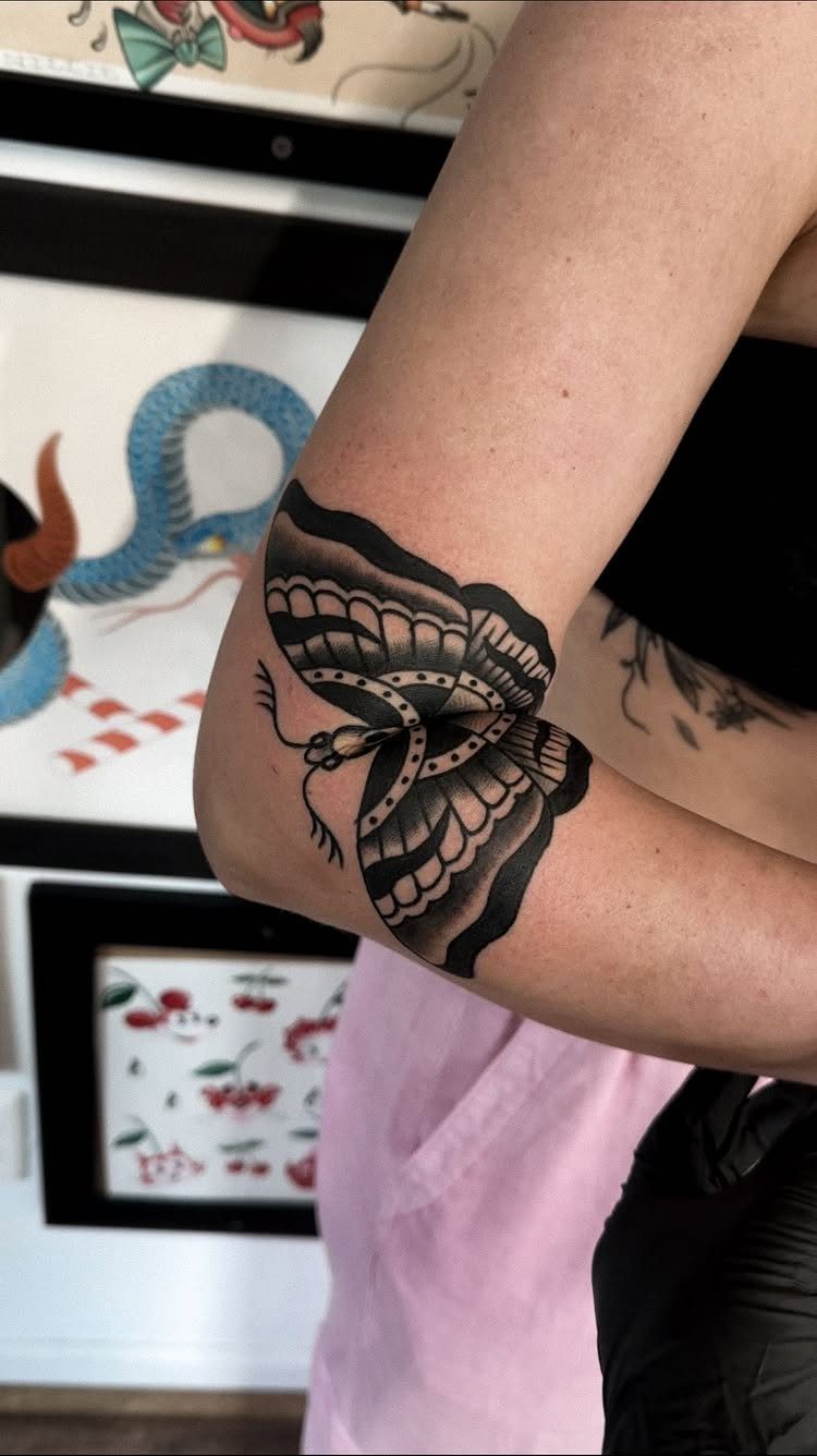
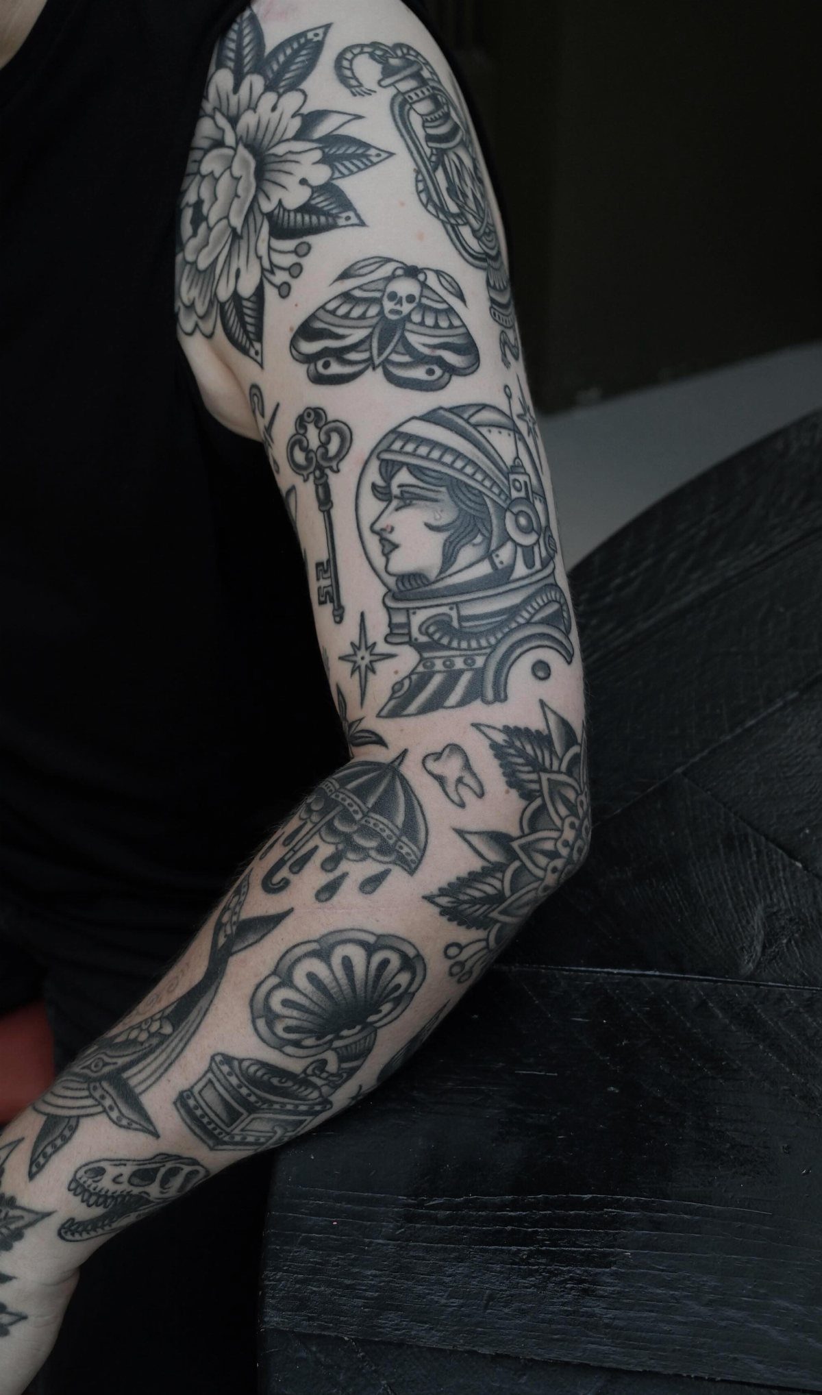
Old School designs translate surprisingly well to black and grey. The thick outlines and simple shapes that defined the style still carry the same weight without the traditional red, yellow, and green palette.
A moth on the inner elbow works because the design wraps naturally around the joint.
That spot moves constantly, so simpler shapes last longer than fine detail. Black and grey also softens the overall look compared to full color, which suits people who want the traditional structure without the bold sailor aesthetic.
3. Caught in Your Web 🕸️🕷️🖤
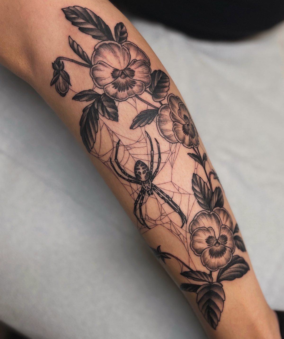
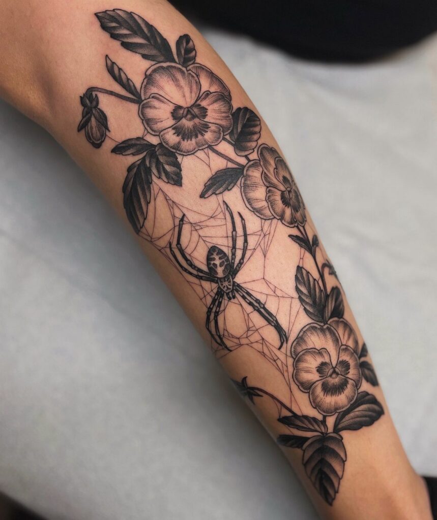
A spider centered in its web surrounded by pansies reads as both delicate and unsettling.
The web gives you a geometric frame that contrasts with the organic curves of the flowers, and in black and grey the whole piece stays grounded rather than decorative.
Forearm placement lets the web sit flat across the surface with room for the flowers to frame it.
Pansies carry their own symbolism around remembrance and free thought, so pairing them with a spider adds tension to what could otherwise be just another floral piece.
The black and grey shading keeps the focus on the shapes rather than pulling attention with color.
4. Bold Outlines
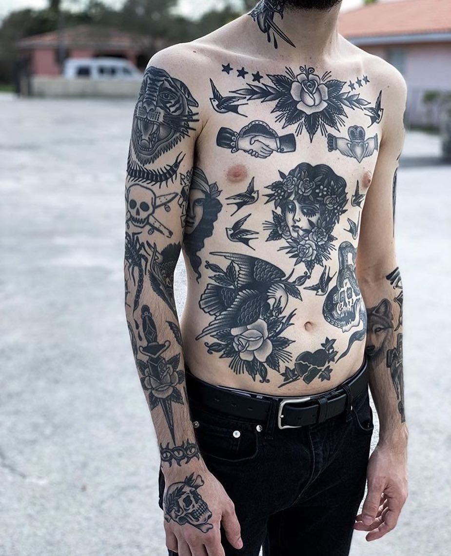
Thick black outlines define where one tattoo ends and the next begins, which matters when you’re covering large areas with multiple pieces. The bold perimeter around each design keeps them from blending together as your collection grows.
Bold outlines work well across the chest and arms, where the body’s curves can distort fine lines.
A thick outline holds its shape over time and stays readable even as the ink spreads slightly under the skin. The look is unmistakably traditional: solid, structured, and built to last decades without touch-ups.
5. Traditional Tattoo Roses
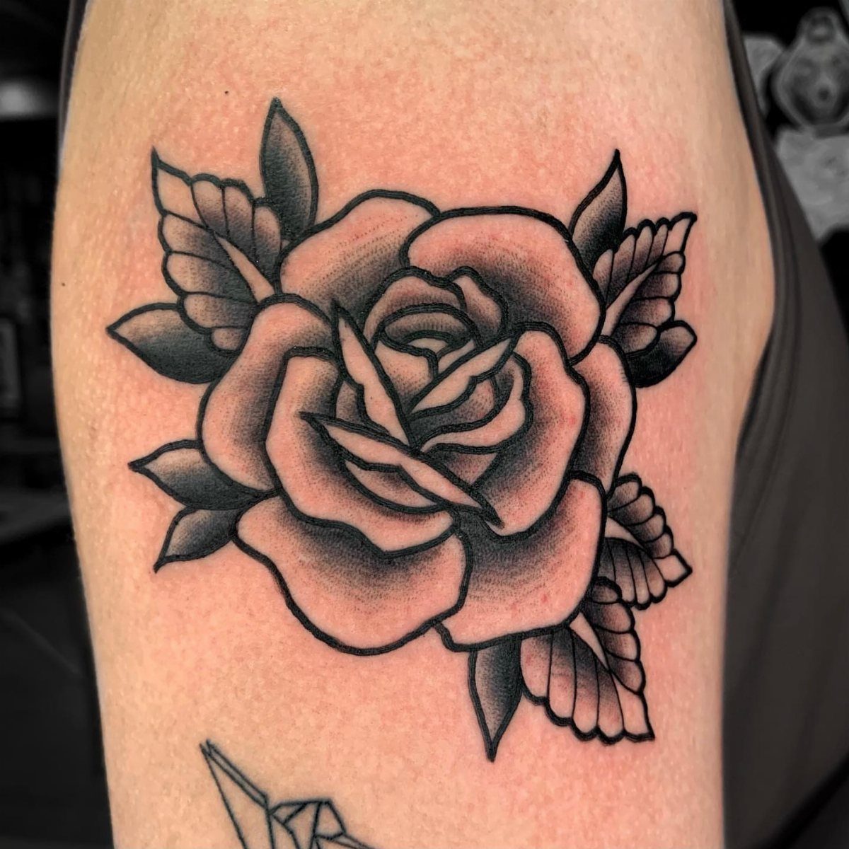
Roses show up in traditional work more than any other flower because their layered petals give you natural depth even in a simple design.
In black and grey, the shading inside each petal becomes the main focus instead of relying on red to carry the shape.
A single rose reads clearly from any angle.
The thick outline holds the form, and grey shading inside the petals creates dimension without needing color gradients. Pair it with an anchor, dagger, or banner for a fuller composition, or leave it alone for a cleaner look.
6. Black and Grey Shading
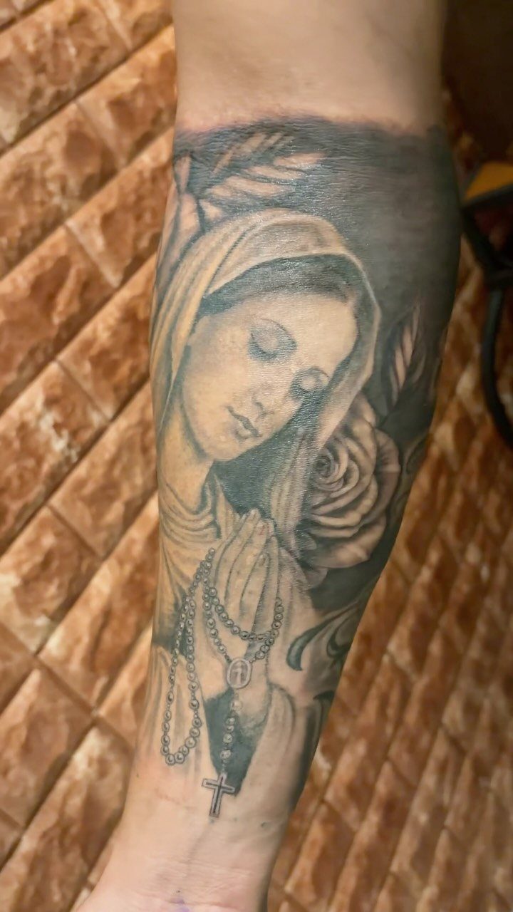
Shading with black and grey ink alone gives you a tonal range that can handle religious imagery, portraits, and other subjects that need more subtlety than flat color blocks.
The artist dilutes black ink to different strengths, building up layers from light grey to solid black.
A praying figure with a rosary and rose needs multiple passes of shading to create smooth transitions.
The forearm gives you a vertical canvas that suits upright compositions, and the technique ages well because there’s no color to shift or fade unevenly. The result reads softer than bold traditional work but still holds its structure.
7. Eagle and Snake Tattoo
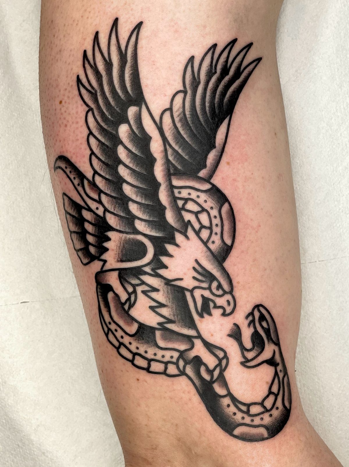
An eagle gripping a snake in its talons or beak gives you a composition built on tension.
The 2 figures wind together in a way that fills the space naturally, with the snake’s coils wrapping around the eagle’s body and wings spread for balance.
The leg offers a long vertical surface that suits the way these 2 animals stack. In black and grey, the feather detail and scale texture rely entirely on shading rather than color to separate the 2 creatures.
The design reads as conflict frozen mid-strike, which is the whole reason this pairing stuck around in traditional work.
8. Traditional Flash Sheet Designs
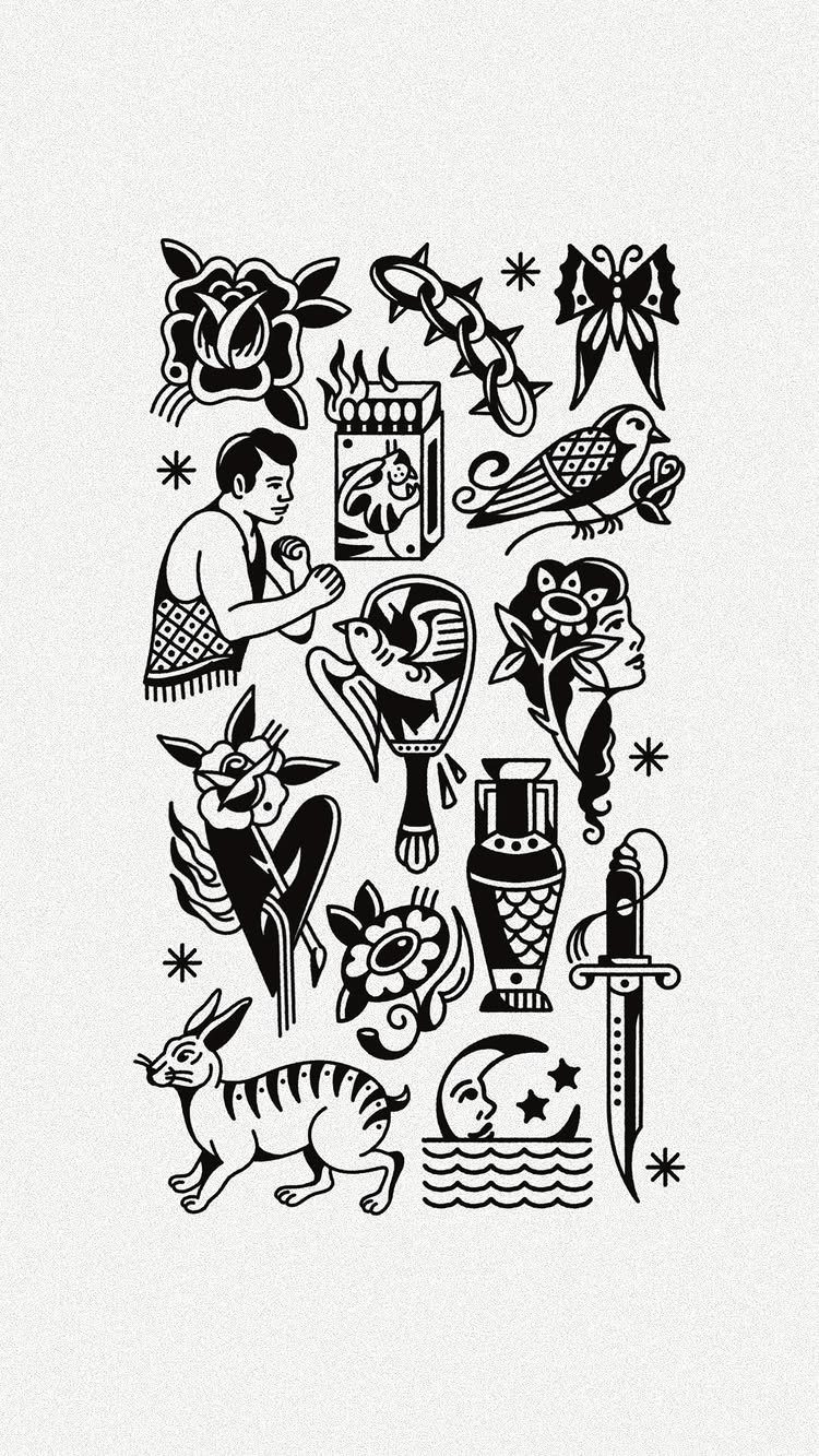
Flash sheets collect multiple designs on one page so you can see how different motifs scale and compose next to each other.
A sheet laid out in black ink alone shows you the skeleton of traditional work: roses, daggers, birds, skulls, anchors, and banners stripped down to their outlines and shading.
These sheets work as reference for picking a design or planning how several pieces will sit together on the same limb.
Many people print or frame them as art on their own. The black and white versions stay closer to how flash was originally drawn before color became standard, and they show clearly which shapes will still read decades from now.
9. Blackout Sleeve with White Linework
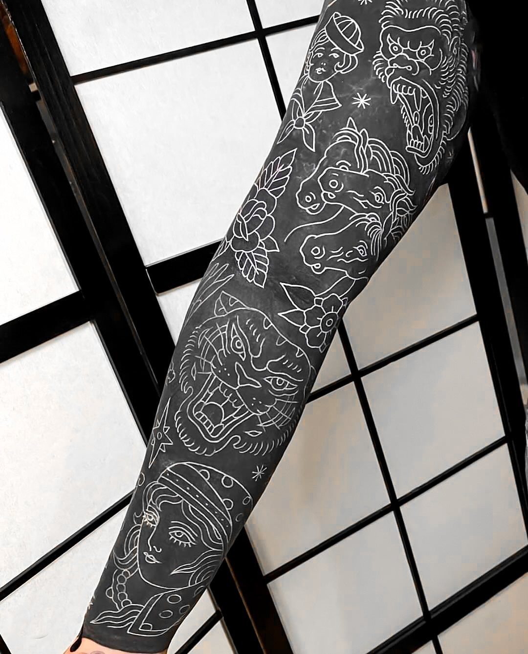
Covering the arm in solid black ink first gives you a flat backdrop that makes white linework stand out sharper than it would on bare skin.
Traditional figures like panthers, women, horses, and demons etched in white over blackwork reverse the usual contrast, and the result reads heavier and more committed than a standard sleeve.
White ink loses its brightness sooner than black and may need touch-ups every few years to stay crisp.
The blackout itself takes multiple sessions to build up evenly, and you lose the option to add color or rework the design later. This approach suits someone ready to dedicate the limb to one permanent direction.
Aesthetic Differences
Black and white strips the tattoo down to its structure.
Without color to guide the eye, the composition itself has to do the work: where the black sits, how the negative space opens up, and whether the shading creates enough separation between elements.
The contrast pulls focus in a way color doesn’t.
A red rose tells you it’s a rose immediately, but a black and grey version makes you look at the petal shapes, the way the shadows stack, and the outline holding it all together.
That shift puts the craft front and center.
The aesthetic reads more serious because there’s less decoration. Color can soften a design or make it feel celebratory, but black and white commits to the form.
Maori tribal work and lacework patterns became iconic partly because the high contrast makes them impossible to ignore, and the viewer has to interpret the meaning rather than have it handed over through a familiar palette.
Evolution of Tattoo Styles
Advances in black ink formulation made finer detail possible without color to fill gaps.
Artists could pack more information into a smaller area, and the precision available in modern black and grey work opened up designs that would have blurred or bled in earlier decades.
Minimalism as a broader art movement changed how people looked at tattoos.
Simpler compositions started to feel more intentional than busy ones, and black and white fit that shift. The focus moved from covering skin with as much color as possible to letting negative space and contrast do more of the talking.
The move away from color also reflects a generational change in how tattoos are read socially.
Full-color traditional pieces carried specific subcultural markers, but black and grey let you hold on to the traditional structure while sidestepping some of the sailor or biker associations that came with the classic palette.
Impact of Color Schemes
Color directs emotion faster than line work does.
A yellow banner feels optimistic, red reads as passion or danger, and green can soften a piece or tie it to nature. Black and white removes that shortcut, so the design has to communicate through shape and weight alone.
The absence of color pushes depth and shading to the front.
A skull in full color might rely on red shading or yellow highlights to give it dimension, but a black and grey version builds that same depth through tonal layers.
The result often reads more somber or contemplative because the visual language is slower and less declarative.
Meaning becomes more open to interpretation.
A colored anchor in red, white, and blue signals patriotism or nautical pride clearly, but the same anchor in black ink could mean stability, loss, or a dozen other things depending on who’s wearing it.
That ambiguity suits people who want the symbolism without the explicit statement.